I currently work at GM Financial as a Senior UX Designer. The company is the wholly owned captive finance subsidiary of General Motors and is headquartered in Fort Worth, Texas. We are a global provider of auto finance solutions, with operations in North America, South America, and Asia. Through our long-standing relationships with auto dealers, we offer attractive retail financing and lease programs to meet the needs of each customer. We also offer commercial lending products to dealers to help them finance and grow their businesses.
My initial duties were working with GMF’s Spanish and Brazilian-speaking countries (called International Operations, IO for short; Mexico, Chile, Colombia, Peru, and Brazil) to provide web design insights and UX best practices for these established and emerging markets. As priorities have shifted, I designed and researched various internal and external-facing projects. I am now on the Mode refinancing team to help redesign the experience for customers who are wanting a lower refinance rate and save on their monthly payments.
Click the links below to see a few of the projects I worked on.
︎︎︎GMF Mexico insurance and value added products page
︎︎︎myAccount app clip research
︎︎︎Designing Good Forms presentation
︎︎︎myDealership app
︎︎︎Mode by GM Financial
----
GMF Mexico insurance and value added products page
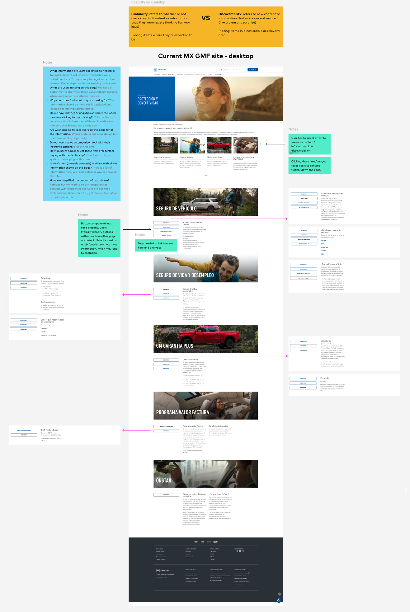
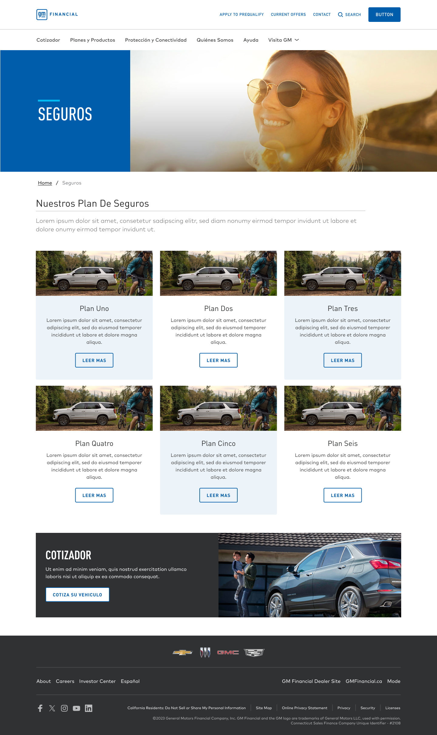
The IO team in Mexico was struggling to get users to connect with the content on their insurance and value added products page. My first task was to run an audit on the existing page and see where users were hung up. One if the issues was the use of a carousel on the main product feature was getting very low clicks past the first four “cards”. Most users just scrolled right past the carousel quick navigation and scrolled down to read the content. Second issue was the use of buttons instead of a tab or other component to show information. Users were confused that the buttons would take them to another page and would have to go back to see the rest of the information. See screencap below.
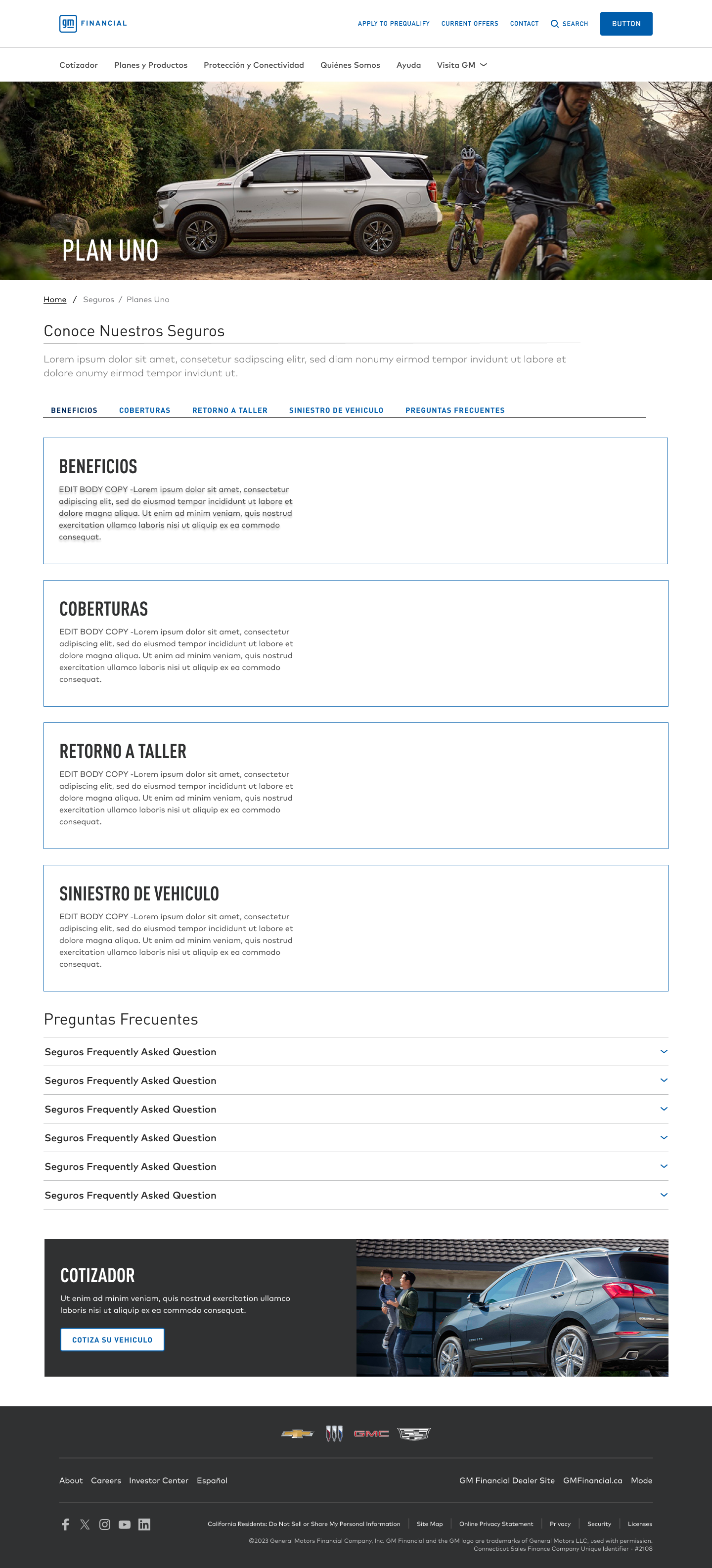
With the help of our design system and analytics teams, we were able to design and implement a new layout to show the lengthy insurance information in chunks and give our users (and dealership sales team) a more efficient way to show and explain all its products and features. See screencap slideshow below.
GMF MyAccount app clip
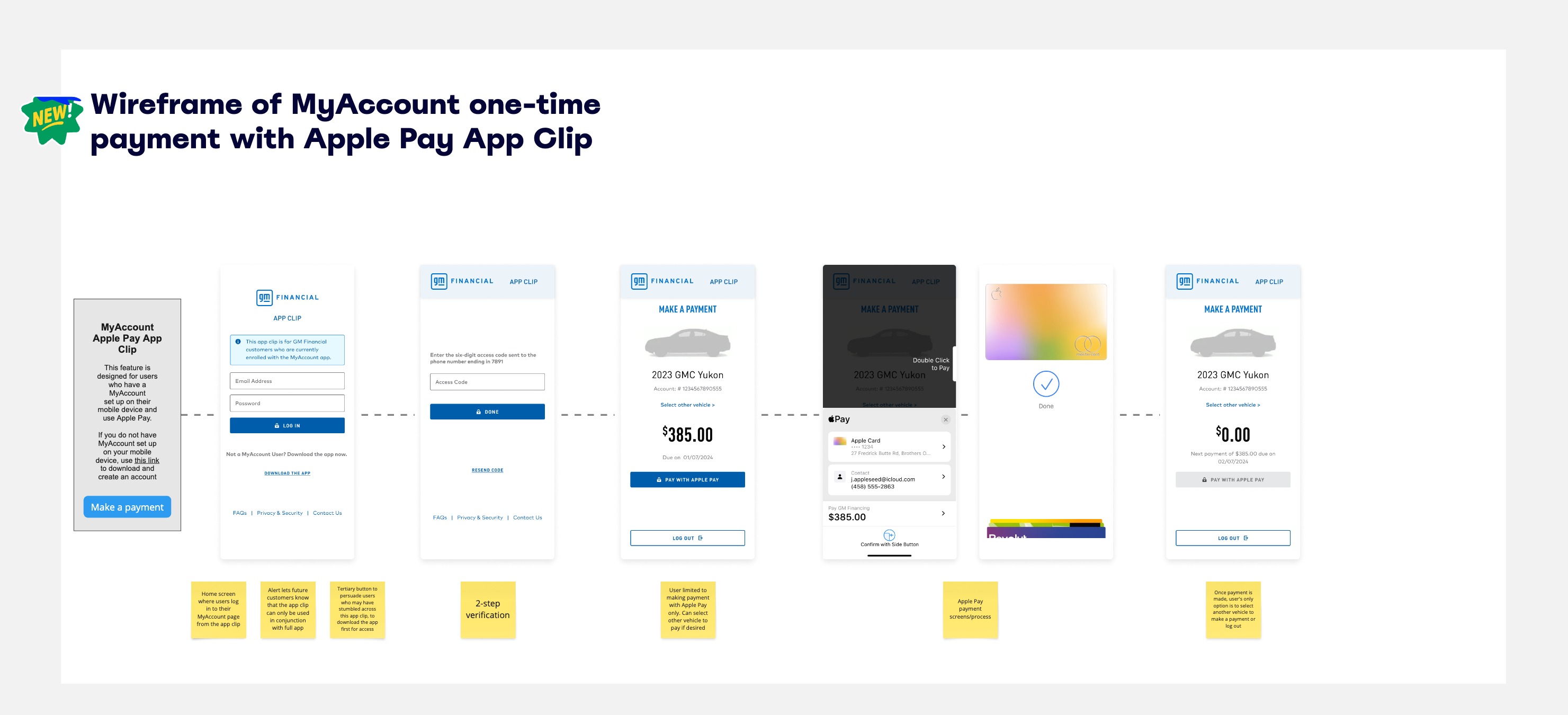
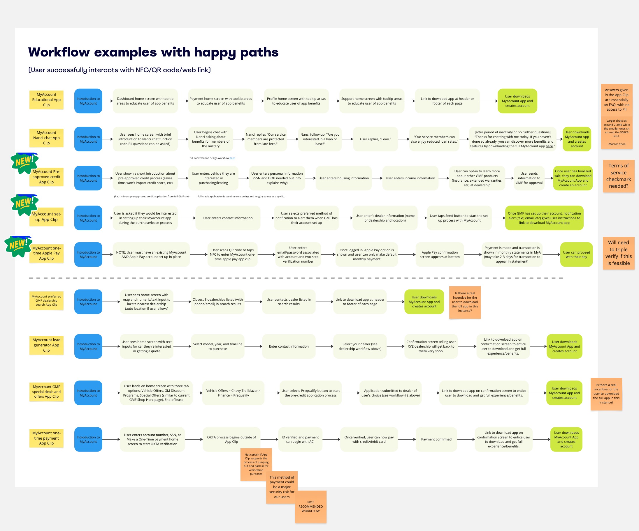
The digital product management team was looking for an opportunity to raise awareness and get more users to download our MyAccount app to help users easily manage their vehicle financing. They explored different options and eventually landed on app clip proposal. I took ownership as both researcher and designer to look into this fairly unknown digital app solution. Working in Miro, I created a huge board to identify project goals and educate the team (and myself) what an app clip can and cannot do. See screencap slideshow below.


I poured over different concepts, via workflows, to see which option could generate the most interest and have the least technical debt. Ultimately, the Apple Pay option was the clear winner. See screencap slideshow. Final implementation is still TBD.
Designing Good Forms presentation
Once a month, our internal user experience team hosts a learning session where employees share a new topic or new research on a topic ux centric or adjacent. The goal is to learn for all of us to learn new concepts, knowledge, or broaden our perspectives on usability findings. I volunteered to help everyone understand the importance of good form design for our users. Whether a user fills out a credit application or a inquiry on a vehicle, we should only be asking for what is required and give context where its necessary. The full document can be found here.
The presentation was well received from the UX leadership team and our content design team loved that I brought a closer look into what GM’s brand’s voice represents.
myDealership app project
Coming soon...
Mode by GM Financial
Coming soon...
Previously, I was at Sabre as a Senior UX Designer. My job involved collaborating with different UX and product design teams in the travel and hospitality commerce sector to develop user-friendly solutions on complex applications. We design and produce scalable B2B solutions for airlines and hotels worldwide so they can be more efficient and monitor their revenue streams. Our software touches everything from mobile apps to housekeeping to airline scheduling to dynamic retailing. Together, we make travel happen.
Click the links below to see a few of the projects I worked on.
︎︎︎Load Manager
︎︎︎Air Price IQ
︎︎︎Intelligence Exchange
︎︎︎Sabre Central
︎︎︎DW Air
----
Load Manager
Load Manager is a database of configurations for proper weight distribution of passengers and cargo on an airline. This is a critical piece of software for all airlines to prevent overloaded planes from taking off which could have catastrophic results. As of 2021, almost all the data was entered manually by load controller or specialists with deep knowledge of airport operations. We were tasked with updating the data entry system from an early Windows 95-era interface, to our new design language and improve the overall user experience.
Note: This was my first project as a Sabre employee. It was a bit overwhelming at first, but thankfully the UX team I worked with quickly brought me up to speed.
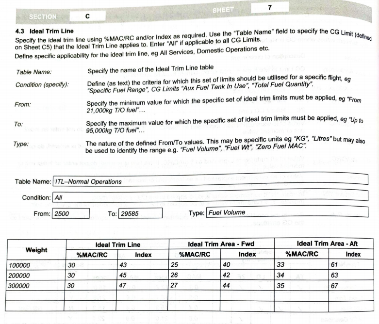
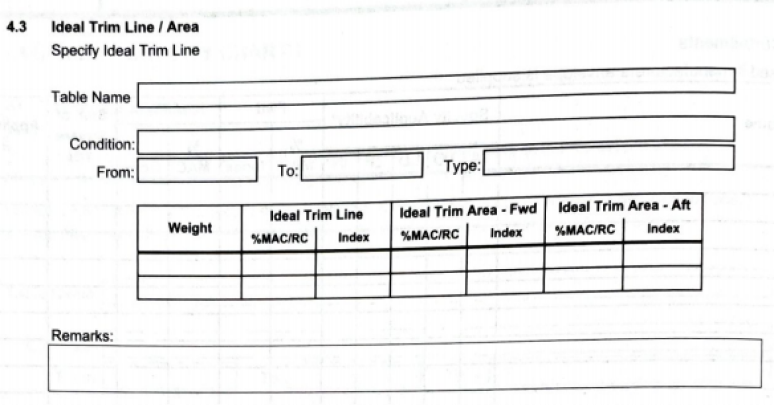
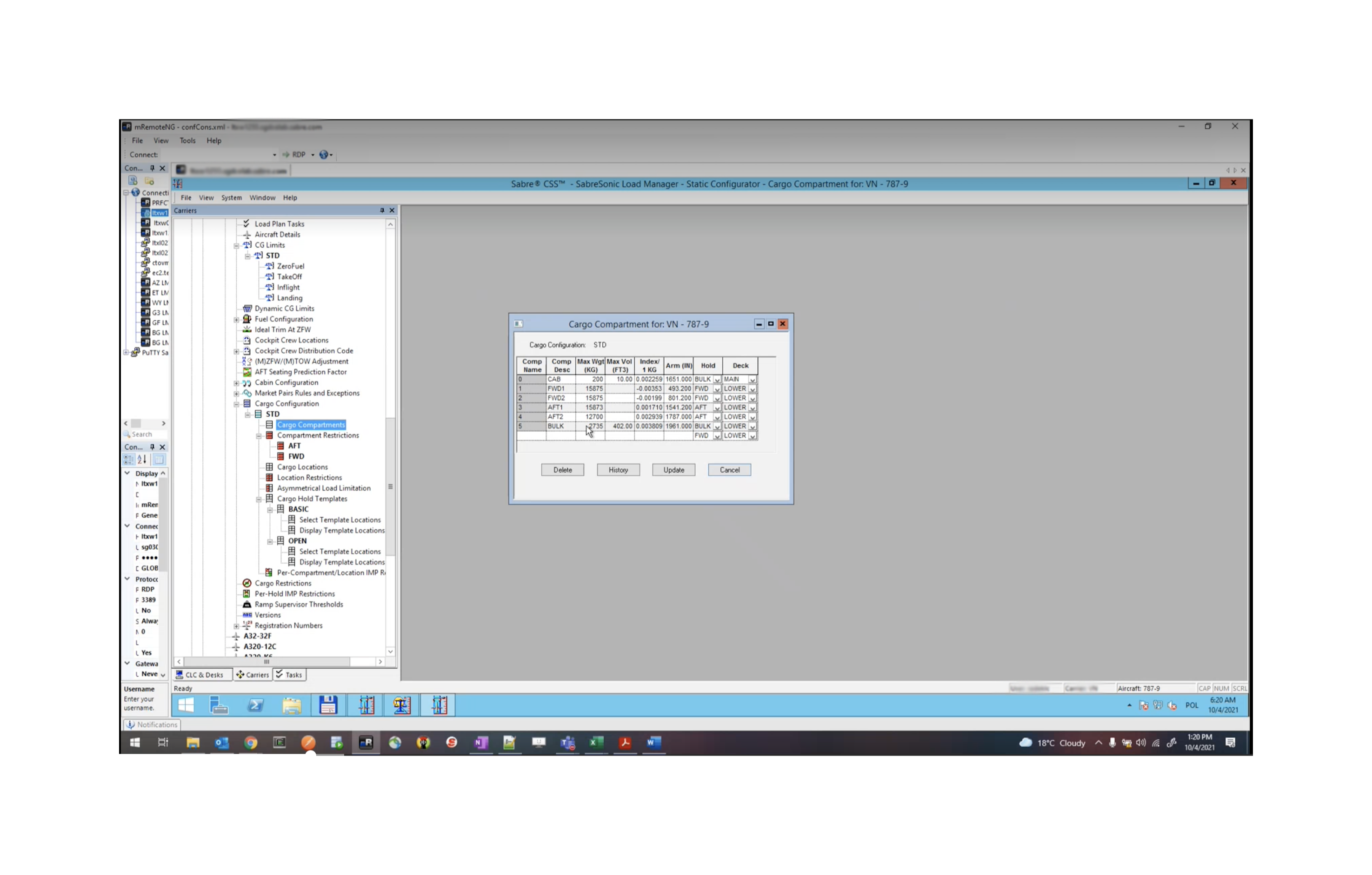
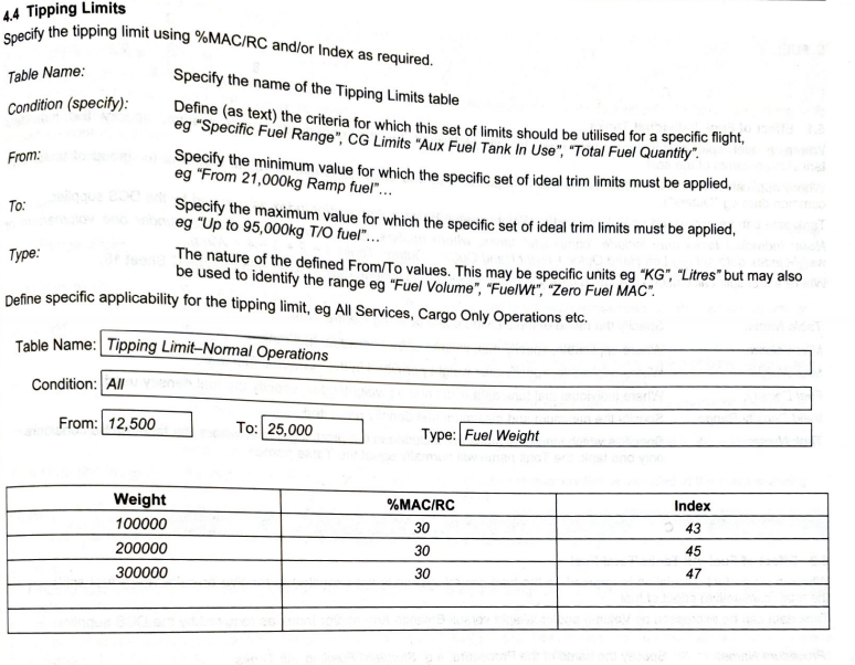

Figjam board research and workflow (click for larger view)
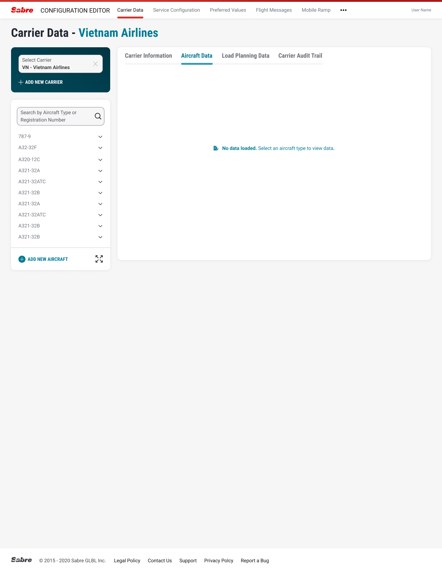


Usability testing found a number of problem areas (sorted by severity levels) we quickly rectified:
The original design had a long horizontal dropdown input for carriers that users ignored due to “banner blindness”. The problem was resolved by adding contrast color to primary drop-down menu. See above.
Save/Enter were used interchangably in the app causing confusion. We added an Undo button to give users peace of mind so they would not have to start from beginning of form.
Users liked the updated sidebar navigation but did not like how much scrolling needed to be done to find their specific airline. We added an Expand icon so users could use the full screen to search and/or sort information. See above.
----
Air Price IQ
Air Price IQ is a tool used by carriers to adjust airfare pricing in real-time based on market conditions, pricing strategy, customer segment, and booking velocity. It helps airlines adjust to pricing changes more quickly to maximize revenue. Our UX team was tasked with merging the new software with an existing Ancillary Manager and updating the AM’s user interface to seamlessly work with the current software package. Usability tests were also conducted. Here is a small sampling of the work done.
Note: This was the first full Sabre project that I worked on.
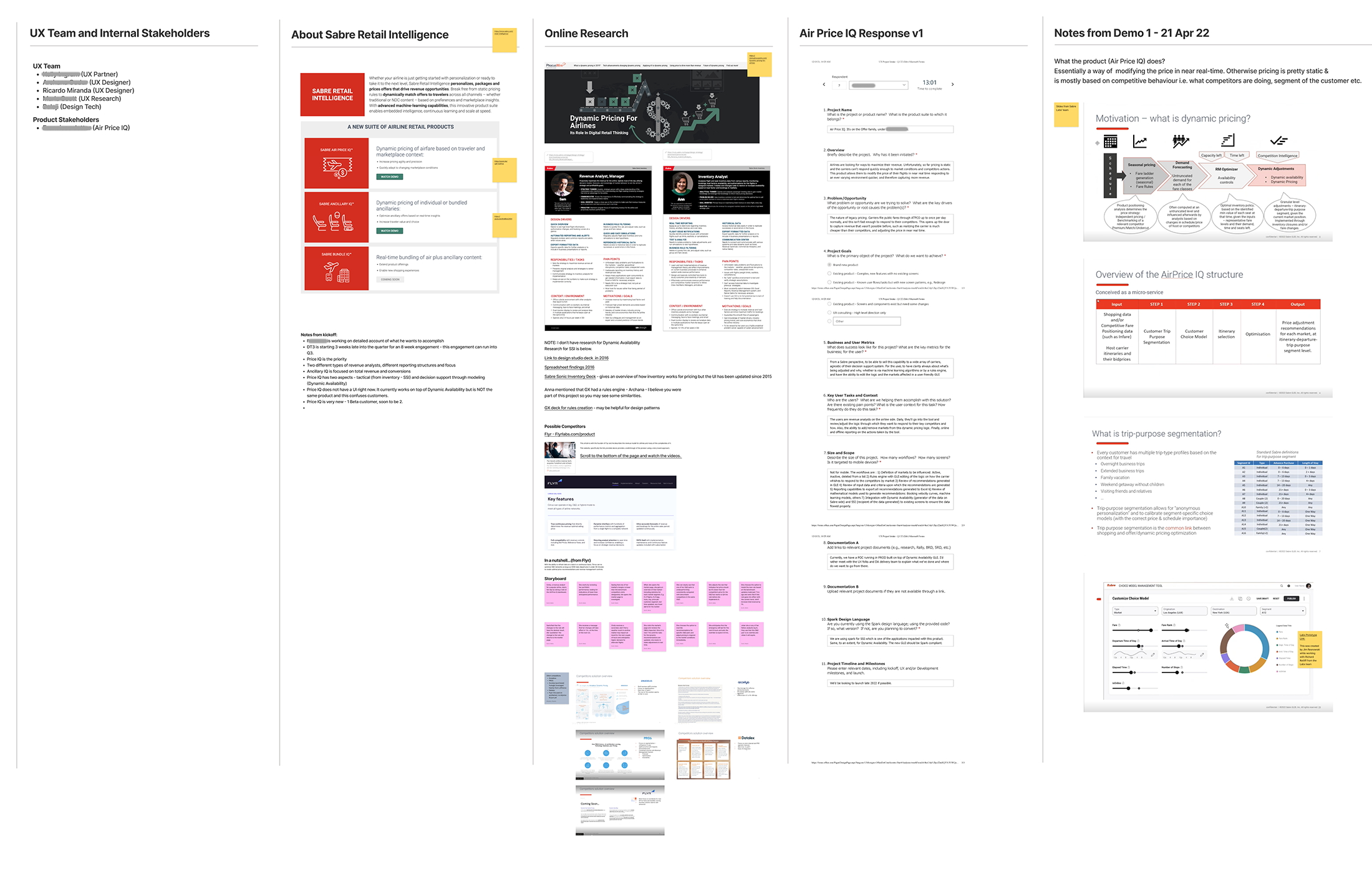
Figjam board research and workflow (click for larger view)

Our team’s first attempt to understand the user workflow
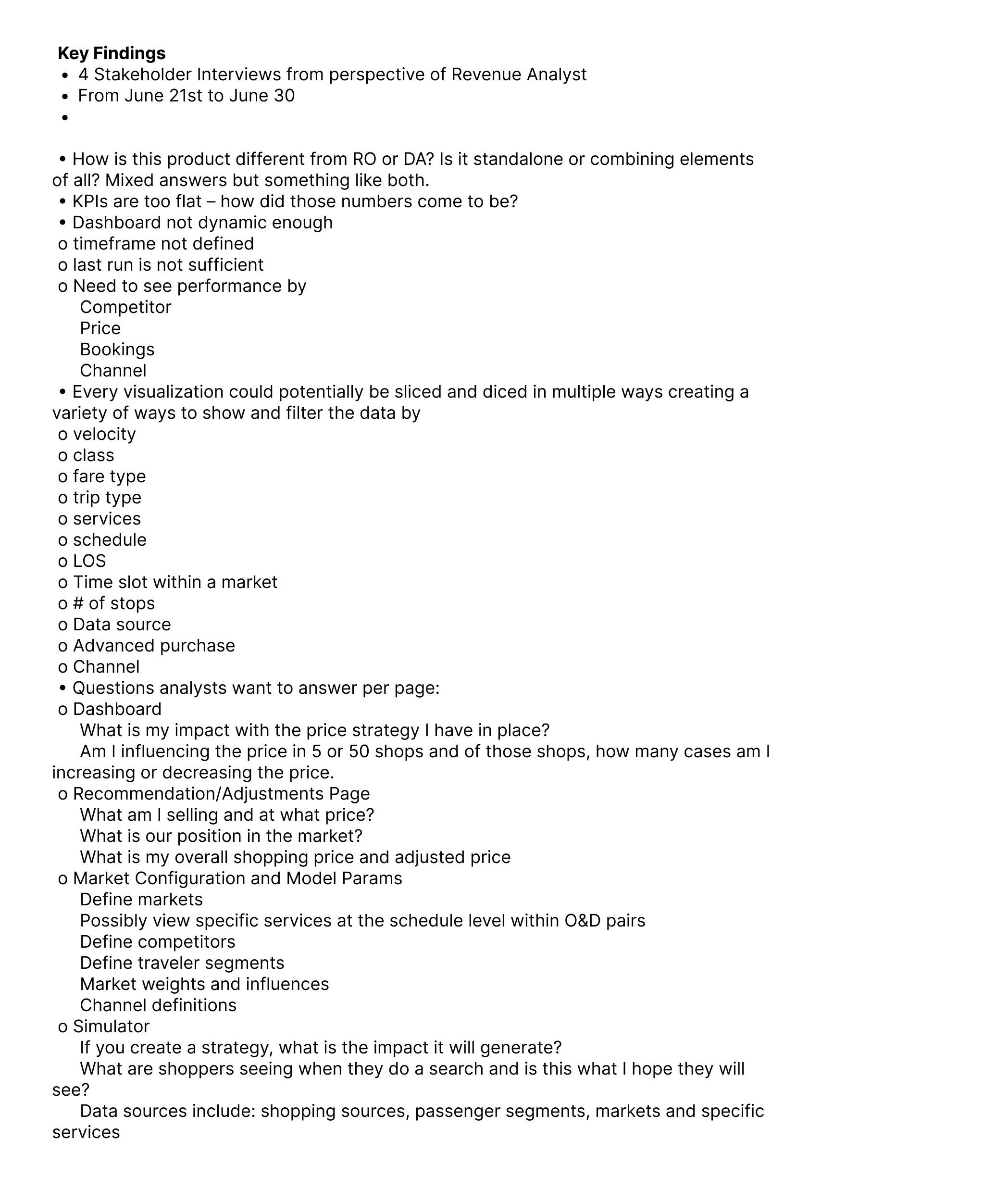 Key findings from four separate stakeholder interviews
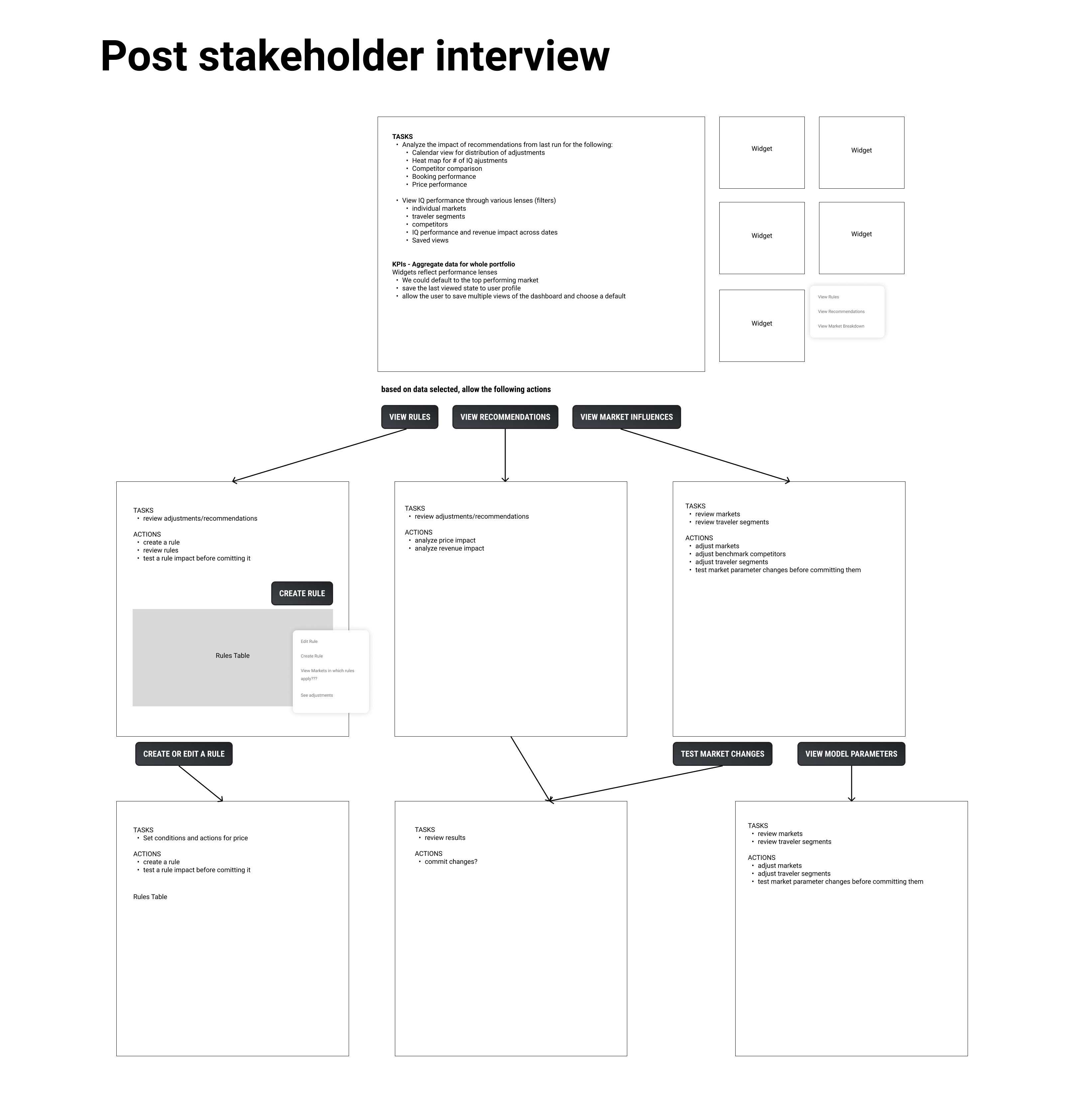
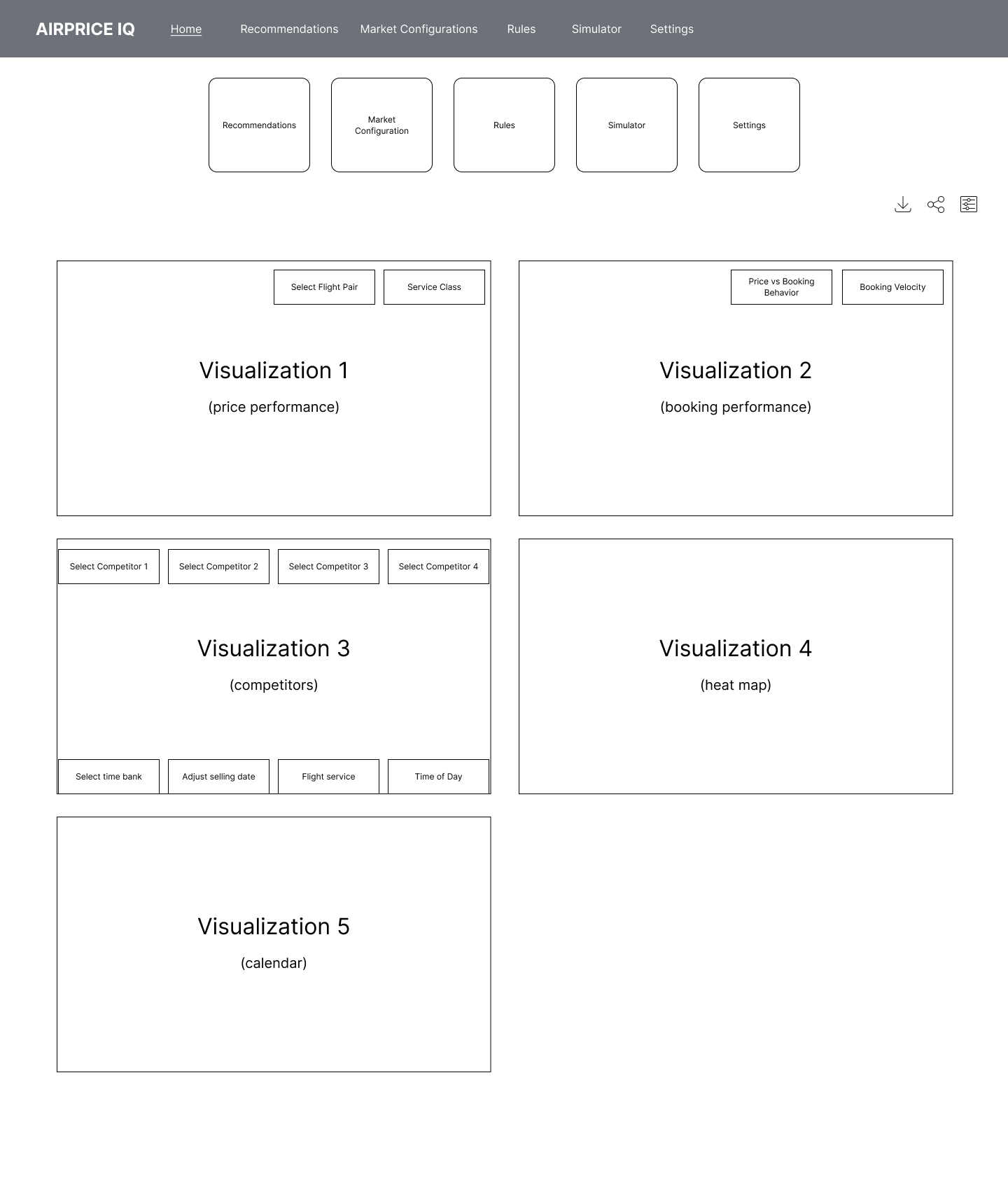
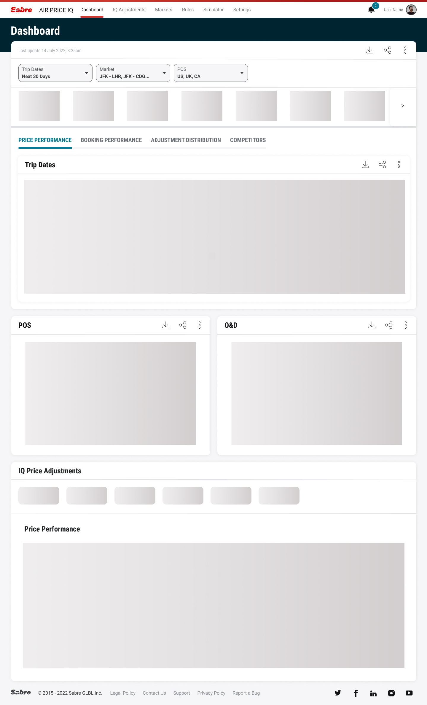
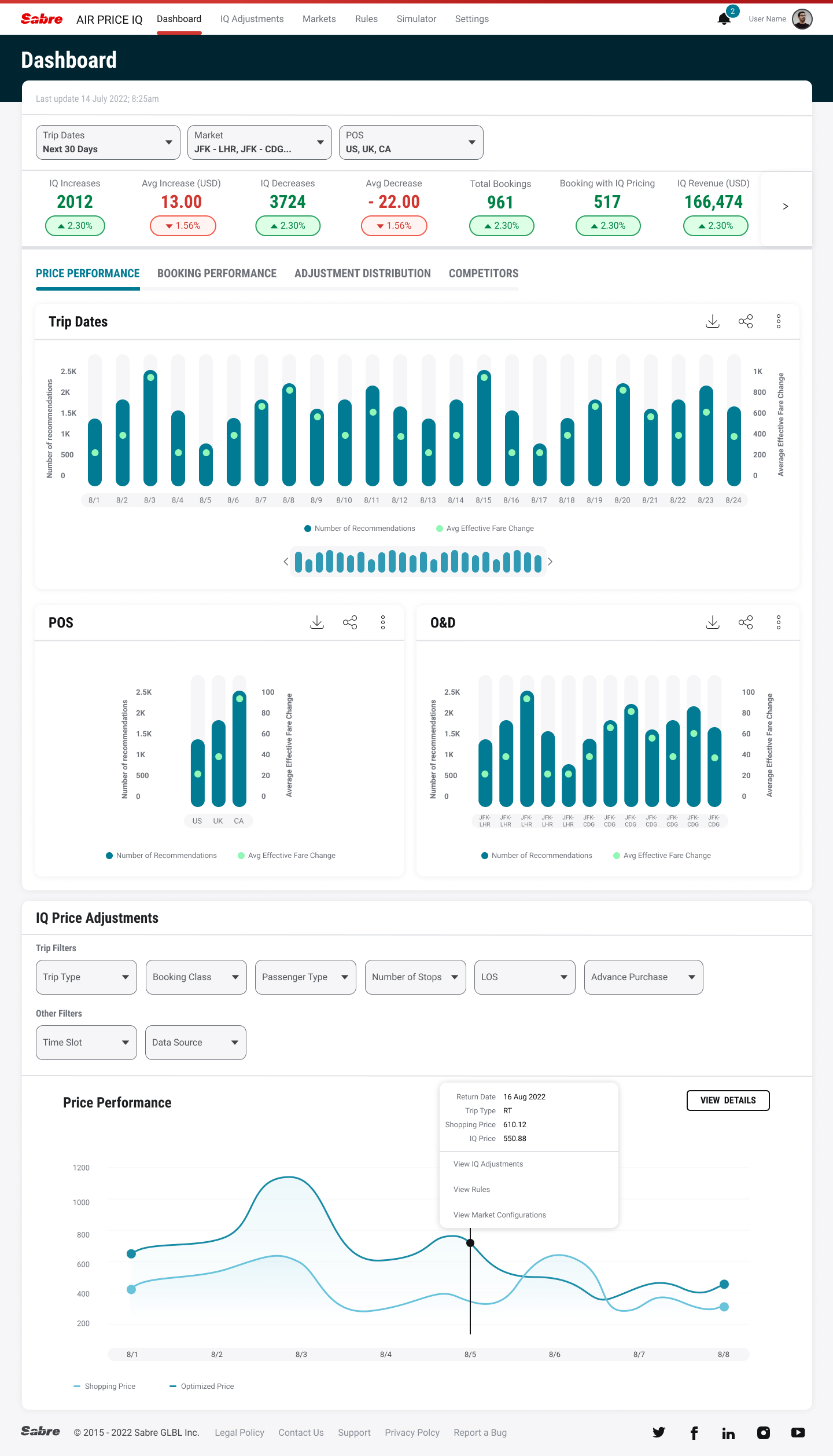
Usability testing found a number of key takeaways we revised for future testing:
Some of the market configuration widgets or snapshots should be better suited for the main dashboard.
Consider a global way to create a rule that can be accessed in the same way from all areas of the application – “If I right click on a value, I can create a rule”.
The dashboard should show portfolio level aggregation “with high level views for markets” - – include the market drilldown from the dashboard – to allow users to change the market pairs (origin and destination) here.
----
Intelligence Exchange
Intelligence Exchange is an airline back-end booking rules engine for airline shopping and ticketing. It allows carriers to monitor search requests and allow for mark-ups (or mark-downs), content mapping, or payment options in certain markets. We were asked to improve the functionality of the software and update the existing UI to our own design language, Spark. Our research team also conducted usability tests on our prototypes.
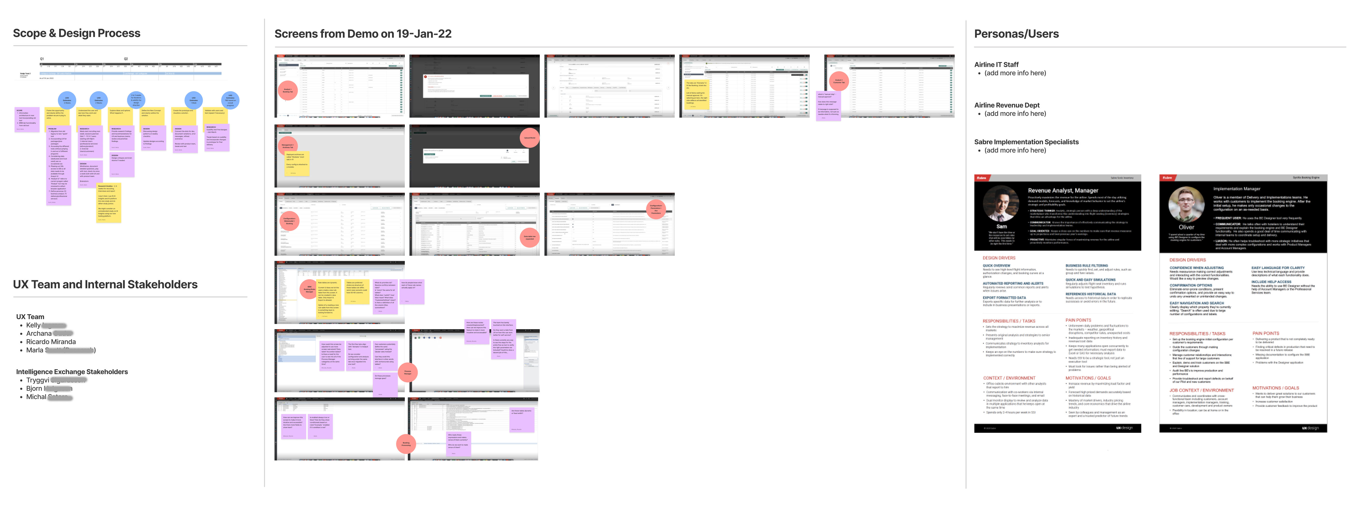
Figjam board project brief (click for larger)

Information Architecture discussions (click for larger)
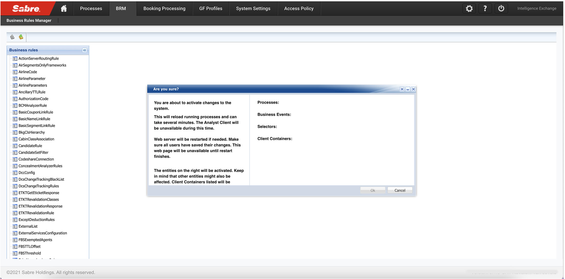
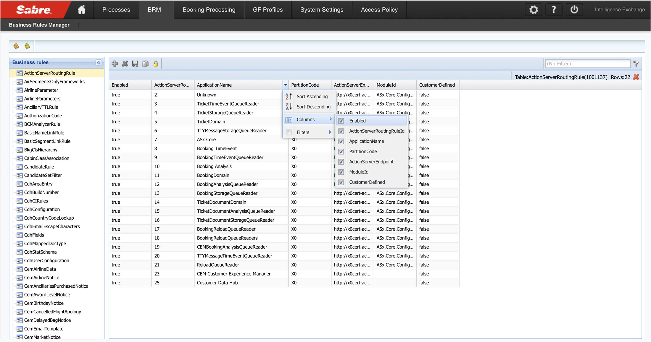
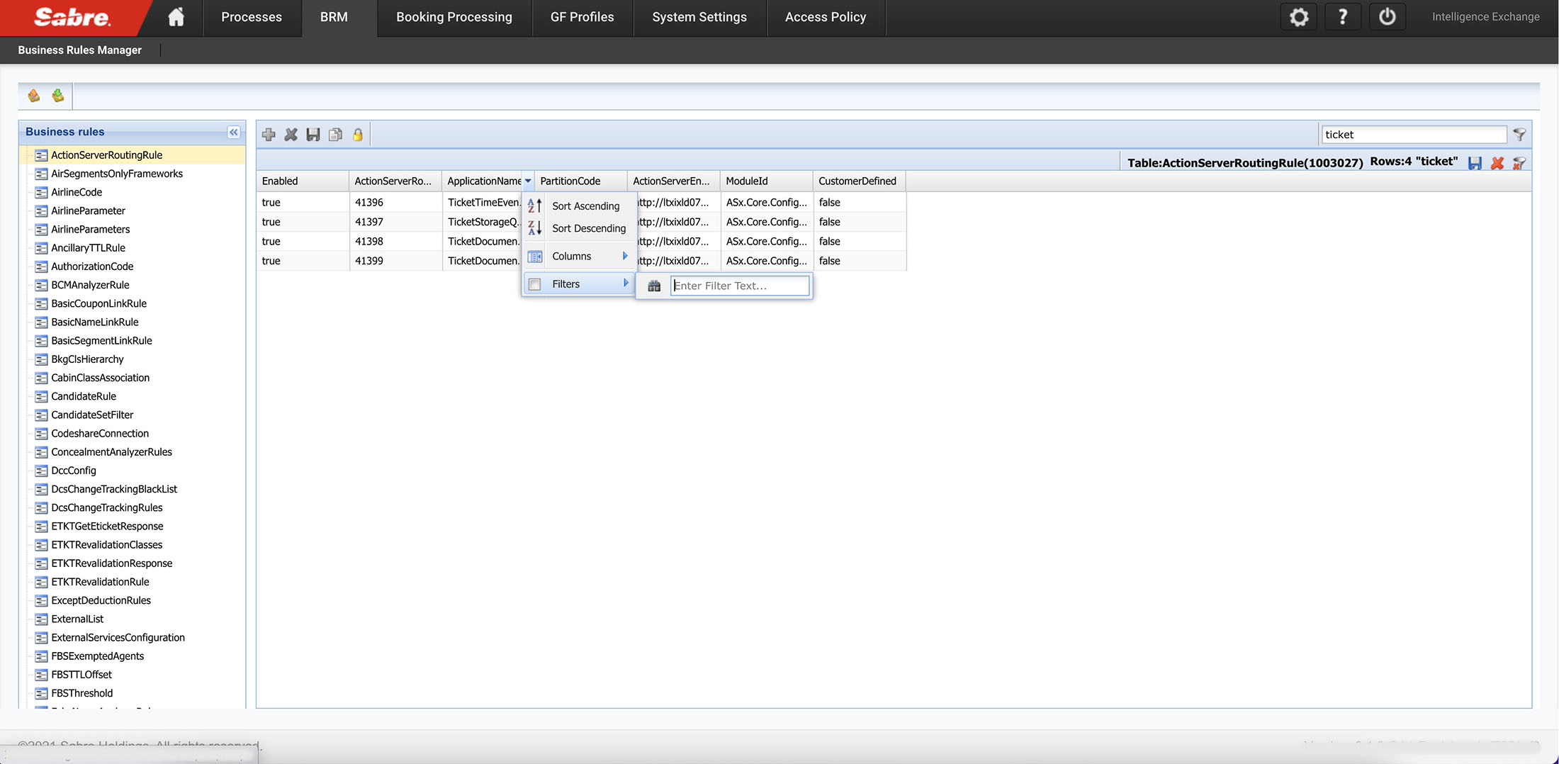
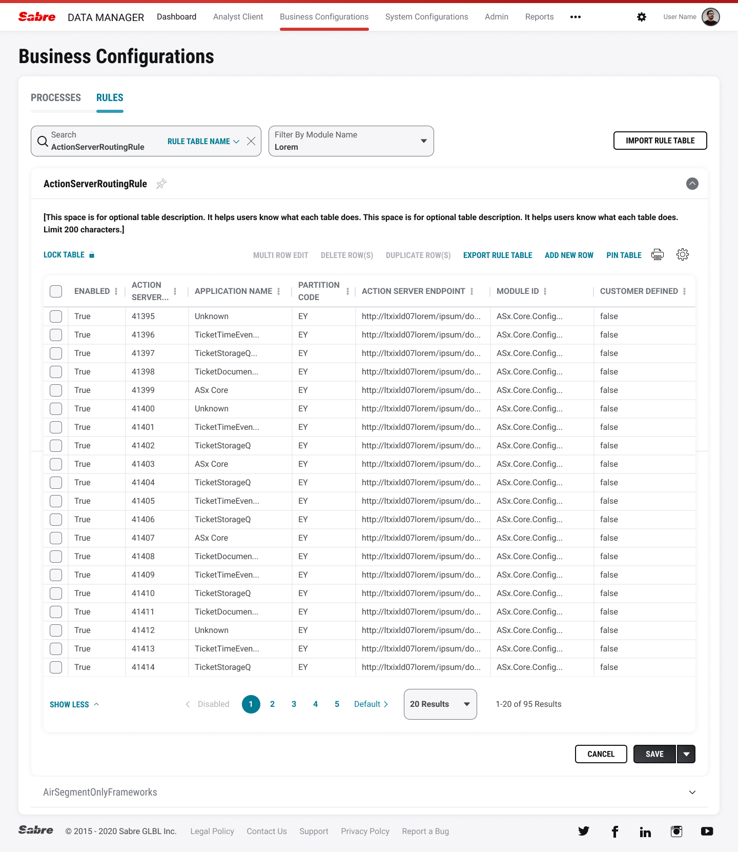
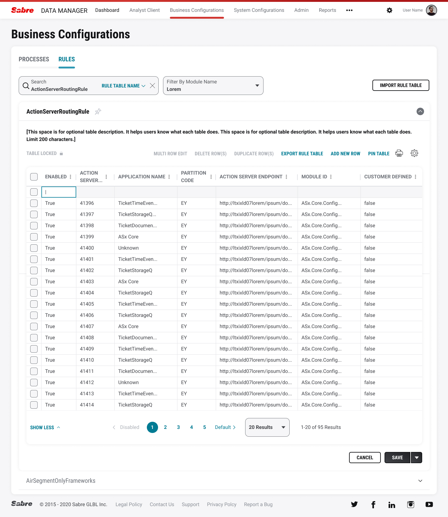

Usability testing found a number of key takeaways we revised for future testing:
When a rule is duplicated, the row is highlighted and bold. Users told us that some of their other apps indicate a duplicate field which makes it easy to locate when coming back to the rules area. See above.
Combination button for Save and Check in were implemented due to users wanting to Save but not Check-in just yet. See above.
----
Sabre Central
Sabre Central is a web-based help tool for online travel agencies (OTA’s) using Sabre’s native travel agent software. OTA’s can be notified of system updates, learn about the newest training videos, and get help on certain tasks if they hit roadblocks. Our main goal was to redesign the home page to make it easier for users to scan across the page and find their answers. We also needed to expose relevant content to five different personas using the software. Additionally, the new designs would be placed on the Salesforce platform to make it easier for admins to monitor the site, add/remove content, and reduce response time on urgent calls.

Figjam board project brief (click for larger)

UX Research journey map (click for larger)
The UX team worked in tandem with our UX Researcher who set up times to meet with stakeholders and power users. After the initial rounds of interviews, we began to prioritize and report on their biggest painpoints. That led us into the design/exploration phase where lo-def screens were first shared with our clients then their users to gain more insights. A dossier was created to share those results and catergorize our findings by severity level. We also created a list of recommended items that the product team should implement such as, improving search functionality, re-designing the secondary pages, and revising the outdated security question as an authentication solution in Sabre Central.

Homepage layouts (click for larger)
The project is still ongoing and we’re working with our product team (and development team) to keep the project on time and on-scope.
----
DW Air
Digital Workspace Airport (DW Air) is a collection of programs used by flight crews to perform various passenger/crew tasks. These tasks vary ranging from adding passenger remarks outside of the normal check-in screen, to adding a crew member’s luggage into the plane’s cargo hold. All of the projects seen below were part of a larger initiative to improve functionality for gate agents and staff. As much as we wanted to reimagine the entire software package, resources and budgets required small additions to the software. However, some of the recommened changes would be brought online in the next few quarters.
Passenger Remarks
This feature is for DW AIR to have the ability to retrieve PNR outside the check-in window. It would create a much faster workflow for gate agents to add their remarks about a passenger (payment forms, itineraries, special needs, etc). The program also has to be responsive to allow for tablet usage away from the gate agent’s computer station.
![]()
![]()
![]()
![]() PNR screens (carousel)
PNR screens (carousel)
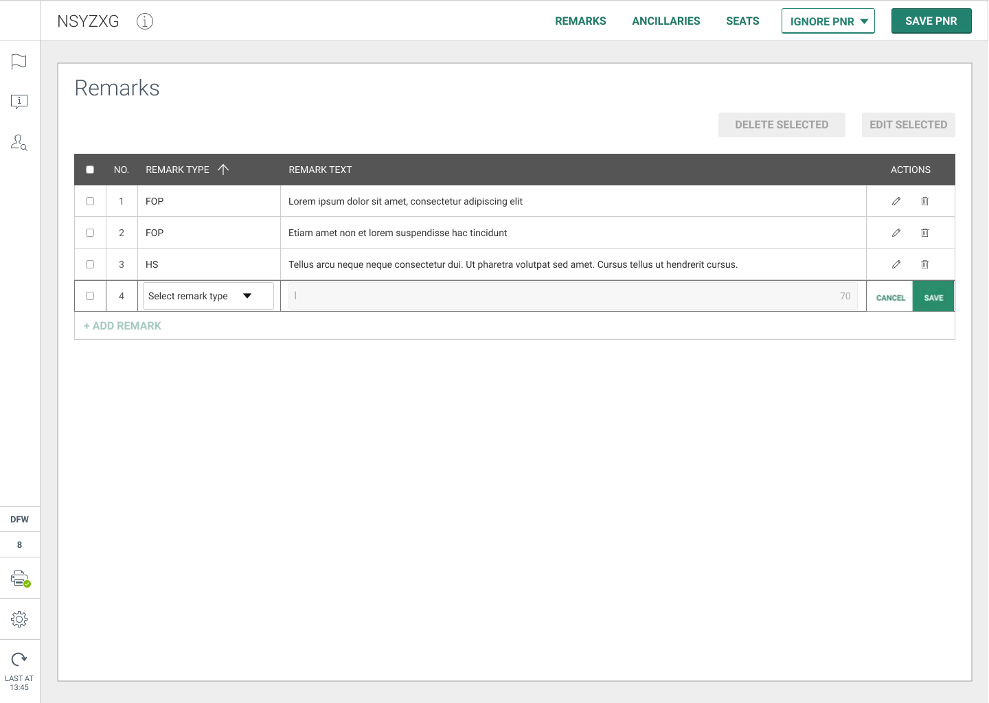
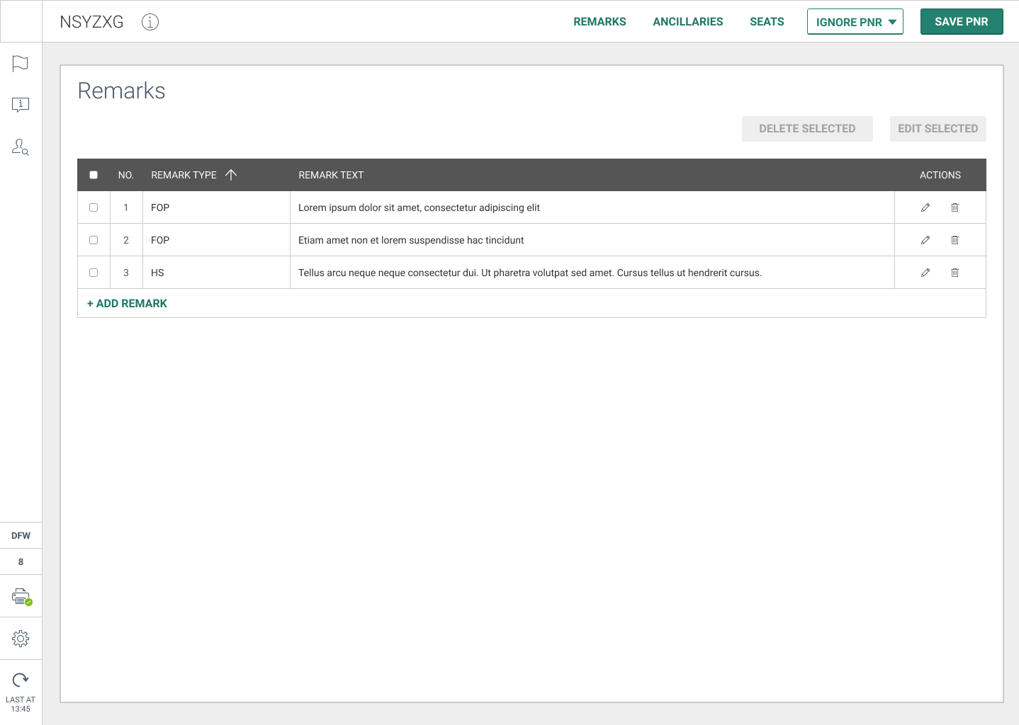

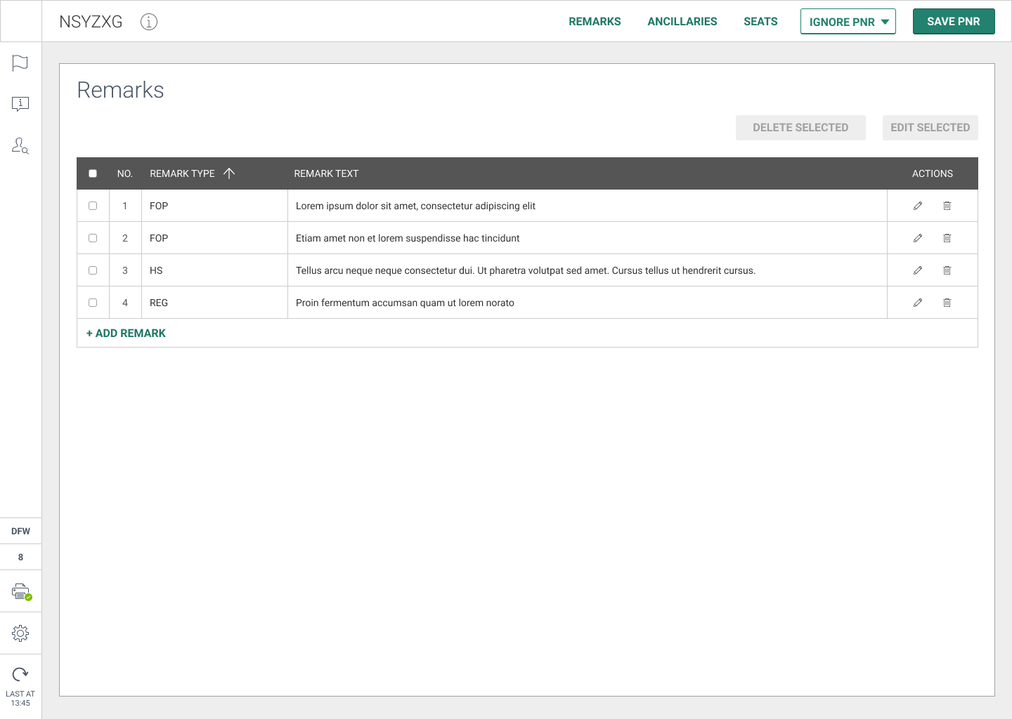
Adding/Removing Crew Bags
This feature is for DW AIR to have the ability for an airport agent to add or remove a crew bag from a plane’s cargo hold. For example, if there is no space in the main cabin storage for a crew member’s bag. The current version of the software was terribly outdated and the product team needed a more reliable method of completing this task. Our timing/scope was short and limited for this project so I worked with the product team extensively on several variations.

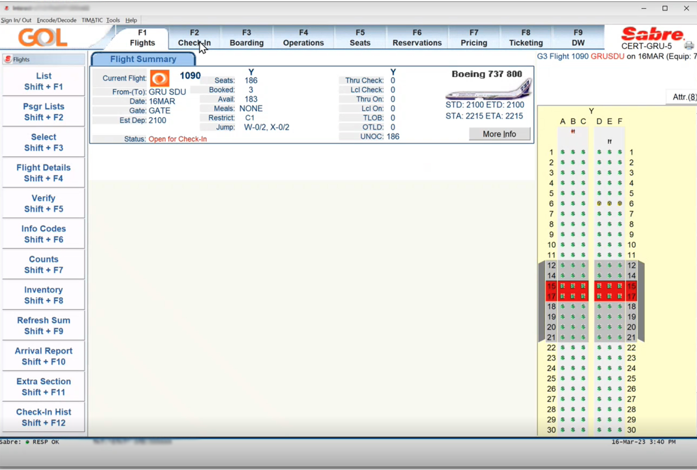
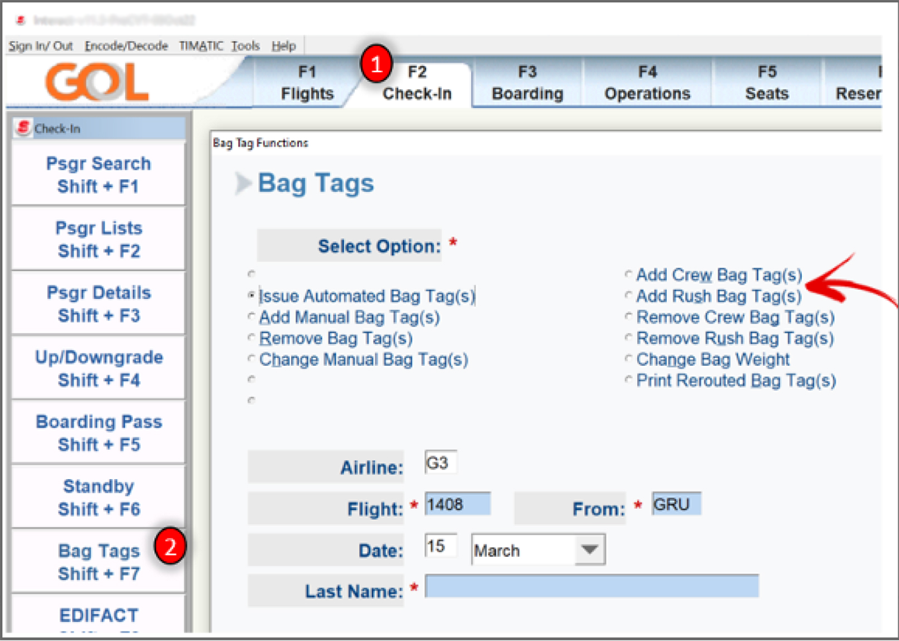
Current Add Crew Bag screens (carousel)
As you can see, the current version had an outdated UI and needed to be incorporated with our classic Spark Design language. The screen had a bad workflow for selecting a primary task and gave the user extra inputs that were not necessary for amount of bags and weight. Connections were given low priority on the screen as well.
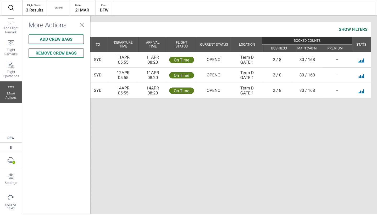
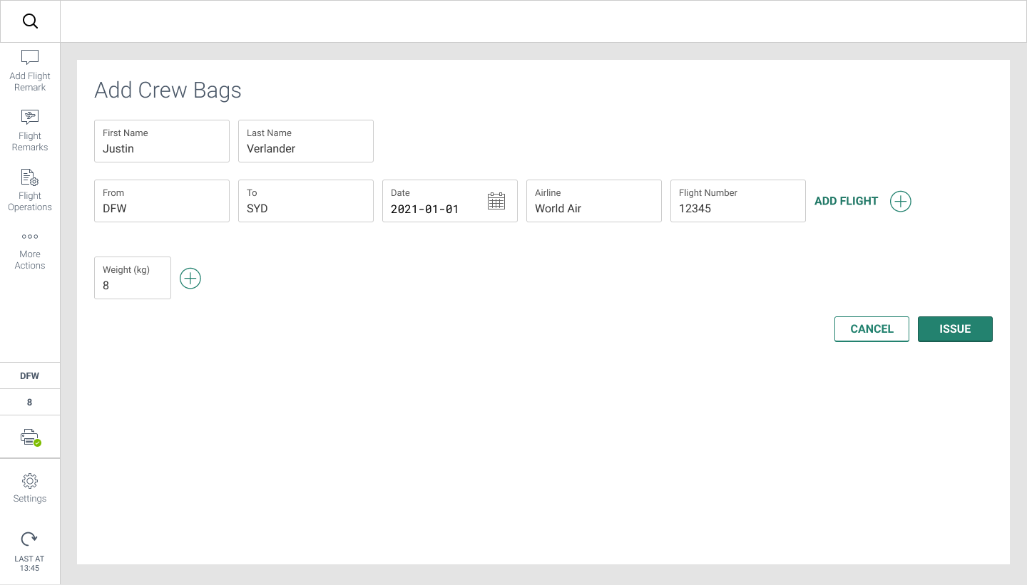

Updated Add Crew Bag screens (carousel)
The new screens have a much more easily visible UI and better workflow to complete the tasks. With a bit more research, we learned that the user wanted a tiny shortcut on the completion modal if more than one crew member needed to check a bag.
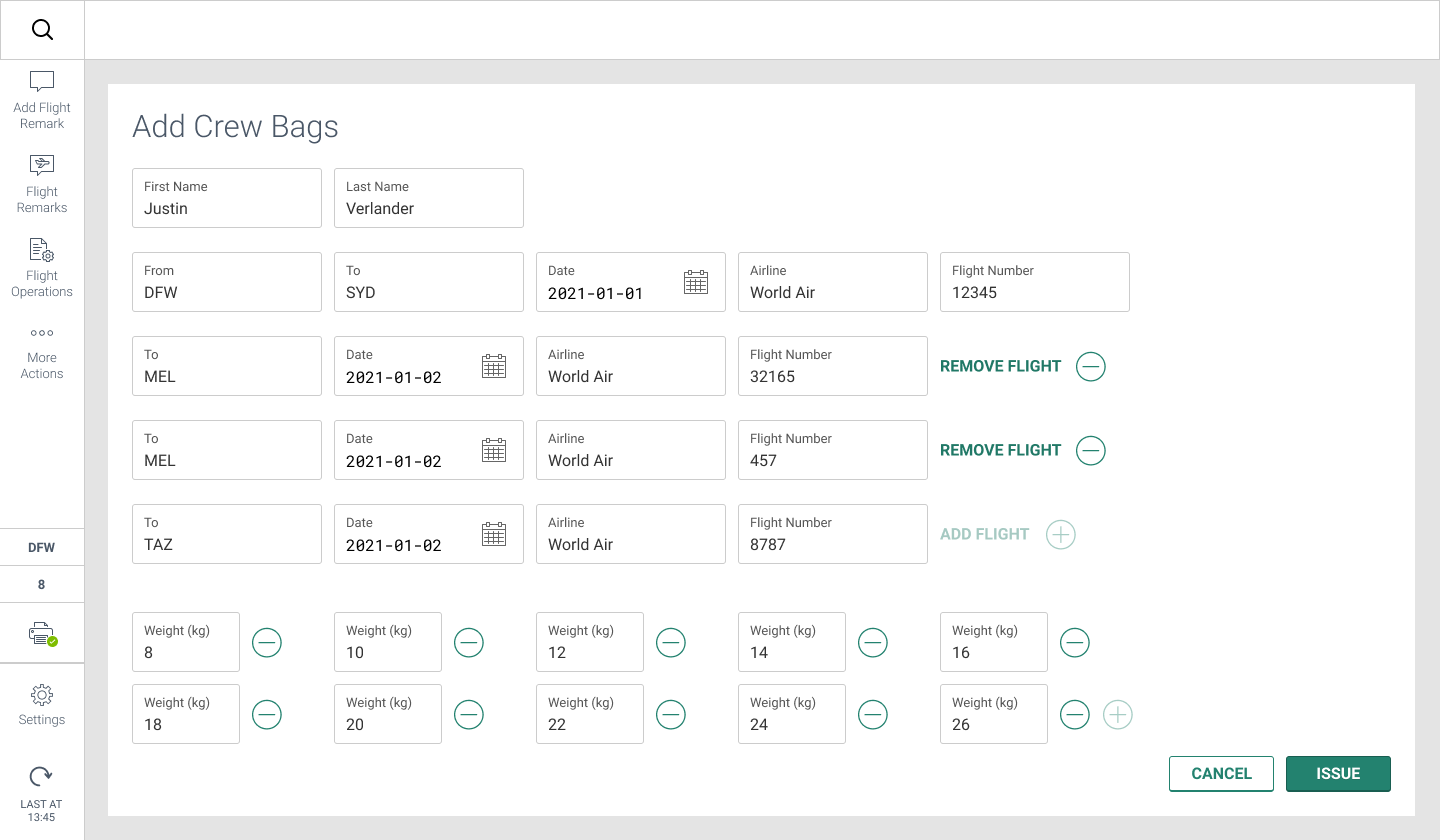

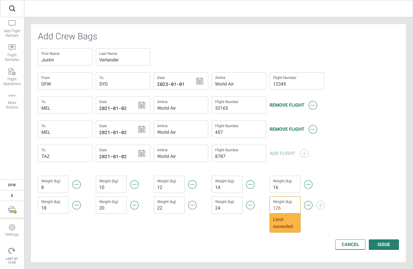
Ancillary Add Crew Bag screens (carousel)
Carefull consideration was also given to the amount of flights and bags that could be added per crew member. The edge case limit of flights and bags, as well as input-level error messages had to be considered.
In late February 2022, Russian forces invaded neighboring Ukraine, setting off the largest and fastest-growing humaniatarian crisis since World War II. Millions of Ukranians, mostly women and children, fled their homes seeking safety in the countries of Poland, Romania, Slovakia, and Hungary. These countries faced an unprecidented strain on their database systems to find accommodations within their borders.
Sabre employees in Poland (all volunteers), reached out to the global UX team for help. They required three key features:
- Make the software easy for new volunteers to jump right in and enter family information quickly and easily. They want to take care of people, not papers.
- Work with the existing validation software to validate hosts accommodations.
- Make the long data table of guests, hosts, and accommodations searchable and filterable.
Research/Discovery
As the project lead, I partnered with another Sabre UX designer, UX researcher, as well as a Developer based in Poland, to work with a European NGO on how best to help them manage the data from huge amounts of people seeking shelter.
First, we interviewed the lead volunteer staffer and looked at their exisiting input form to see what is being entered. We discovered there were large amount of open-ended text inputs on the guest forms that could not be organized or sorted. This made the volunteer’s job much more difficult to find a place for a family.
Second, we put together a workflow to show the amount of information entered, or not entered, that is critical for the volunteers. During this time, we also began the exploration of family member inputs to help speed up the process of entering names of persons traveling together.
Unfortunately, just as we were getting into the research and processes of the project, the entire effort was cancelled due to internal discussions within the NGO on ownership and development resources. Not the way we wanted to end the partnership, but we respected their decision and still admire their resolve to help the people of Ukraine find safe accommodations while the conflict rages on.
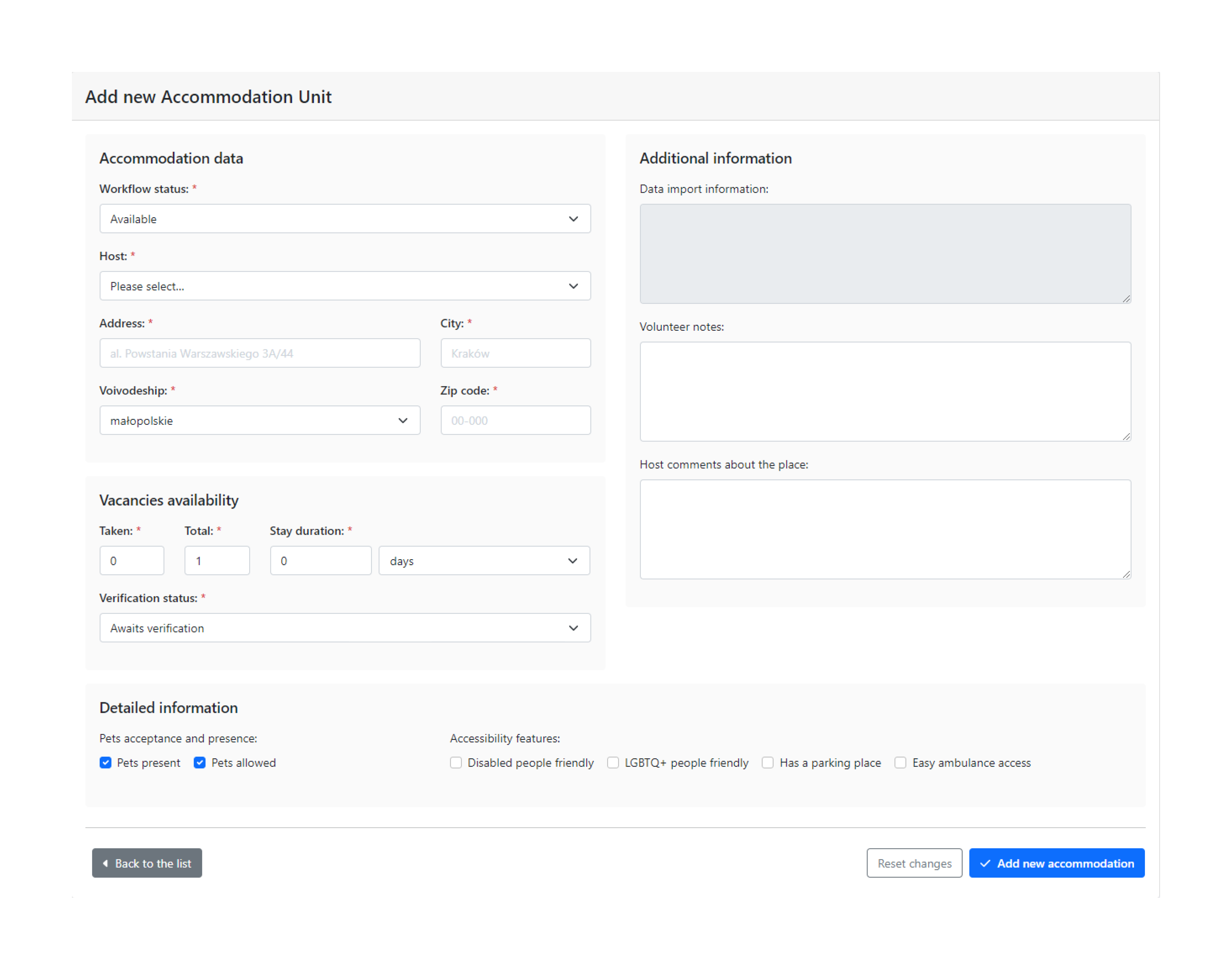


Exising accommodation input form, data table, and host search results (slideshow)

Stickies of missing items/info
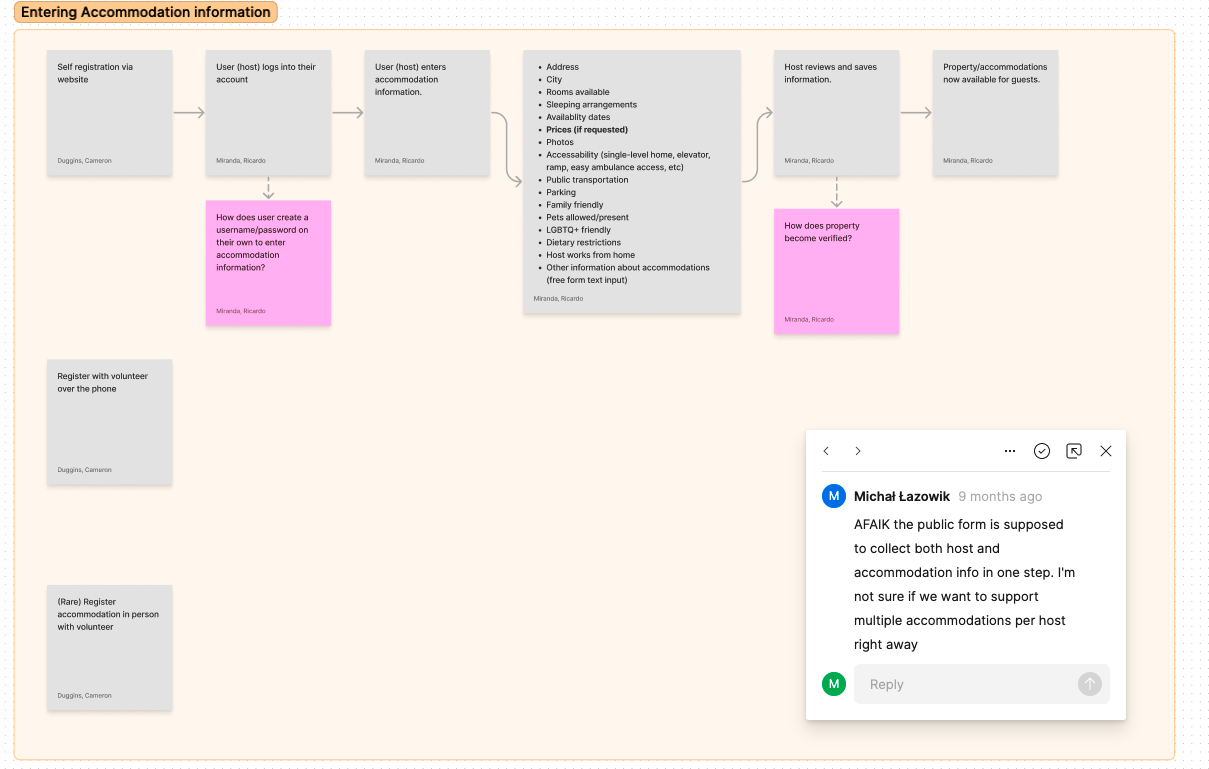
Task/user flow
As the sole UX designer at HBS Systems, I was brought on board to clean up their B2B software designs by reviewing their existing software for usability issues, establishing a solid design system, working with development team on taking a more critical approach design, and help bring a much needed browser independence to some of their older screens. Additionally, HBS Systems tasked me with the creation of a B2C app for their client’s customers in the agriculture/construction/heavy equipment rental industries.
Click the links below to see a few of the projects I worked on.
︎︎︎OEM telematics
︎︎︎Report Screens
︎︎︎Ecom API/portal
︎︎︎Design System
︎︎︎Dealer Now app
----
OEM Telematics
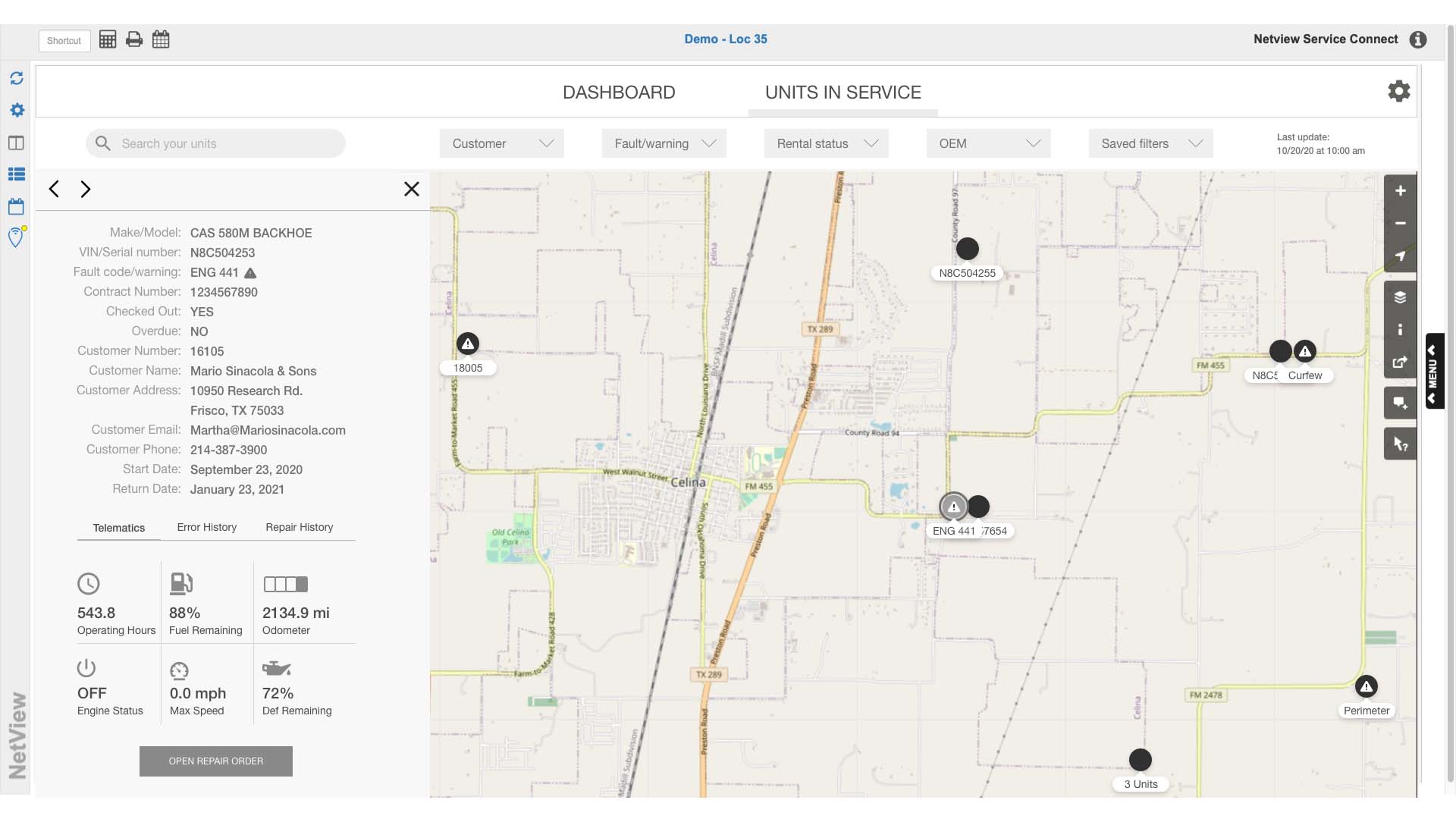
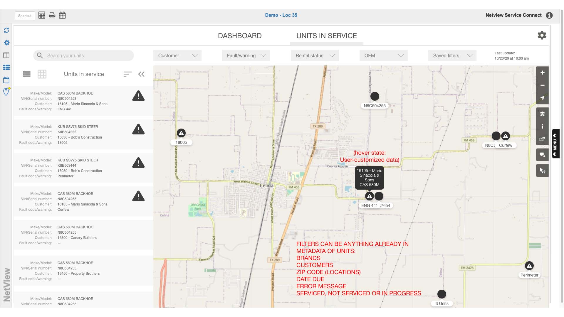
Telematics is a method of monitoring heavy equipment (tractors, telehandlers, skid loaders, etc) by using a GPS and onboard diagnostics for keeping tabs of anything from fuel consumption to power readings and geofencing. It is extremely useful for dealerships that have equipment rental so they can for locate unit and diagnose problems remotely. When a piece of equipment is not doing its job, it’s time/money wasted for customer and dealer.
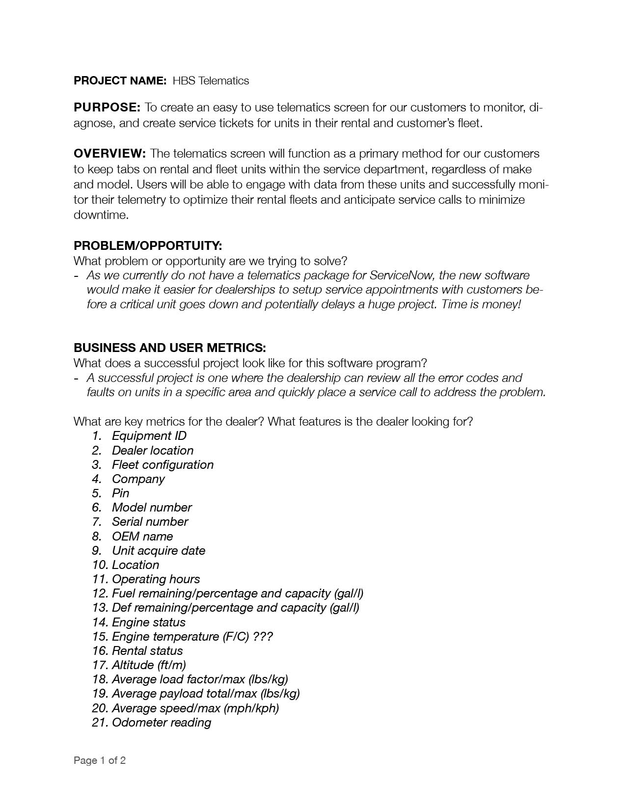
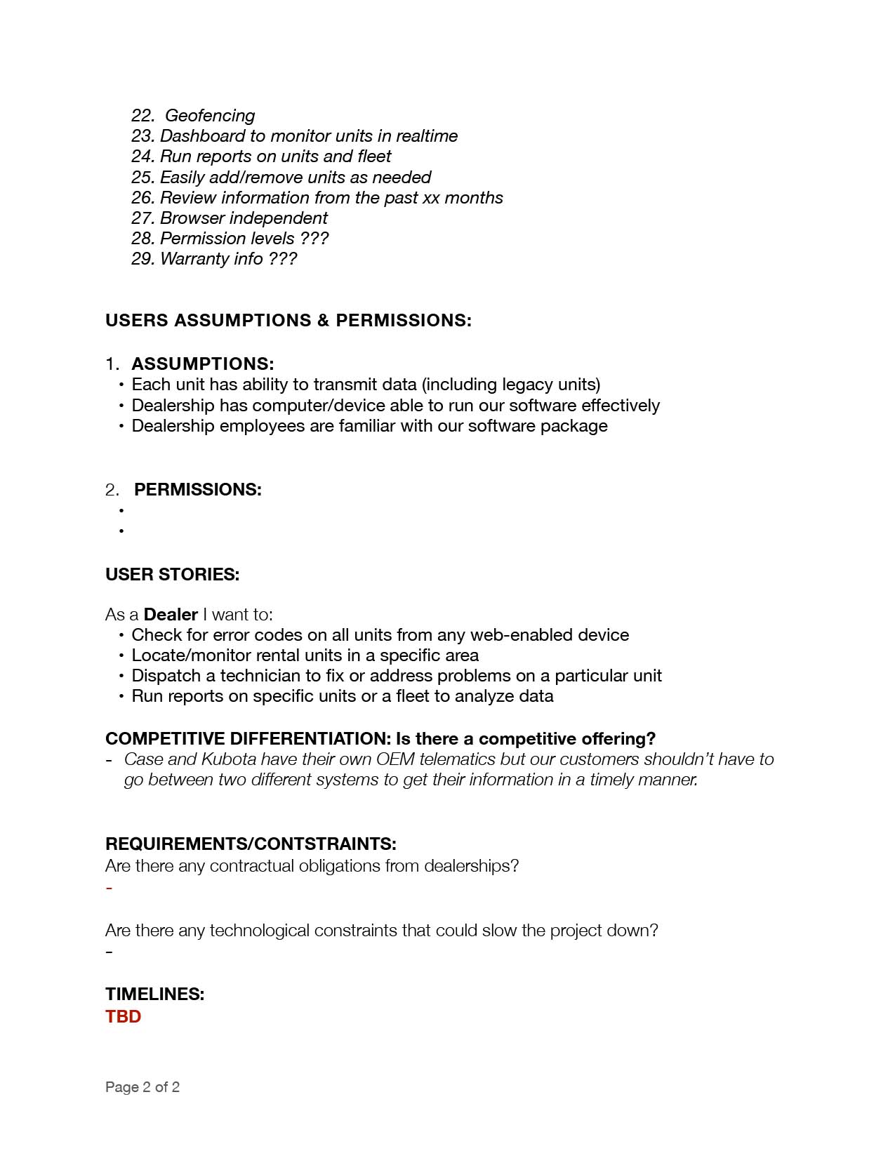


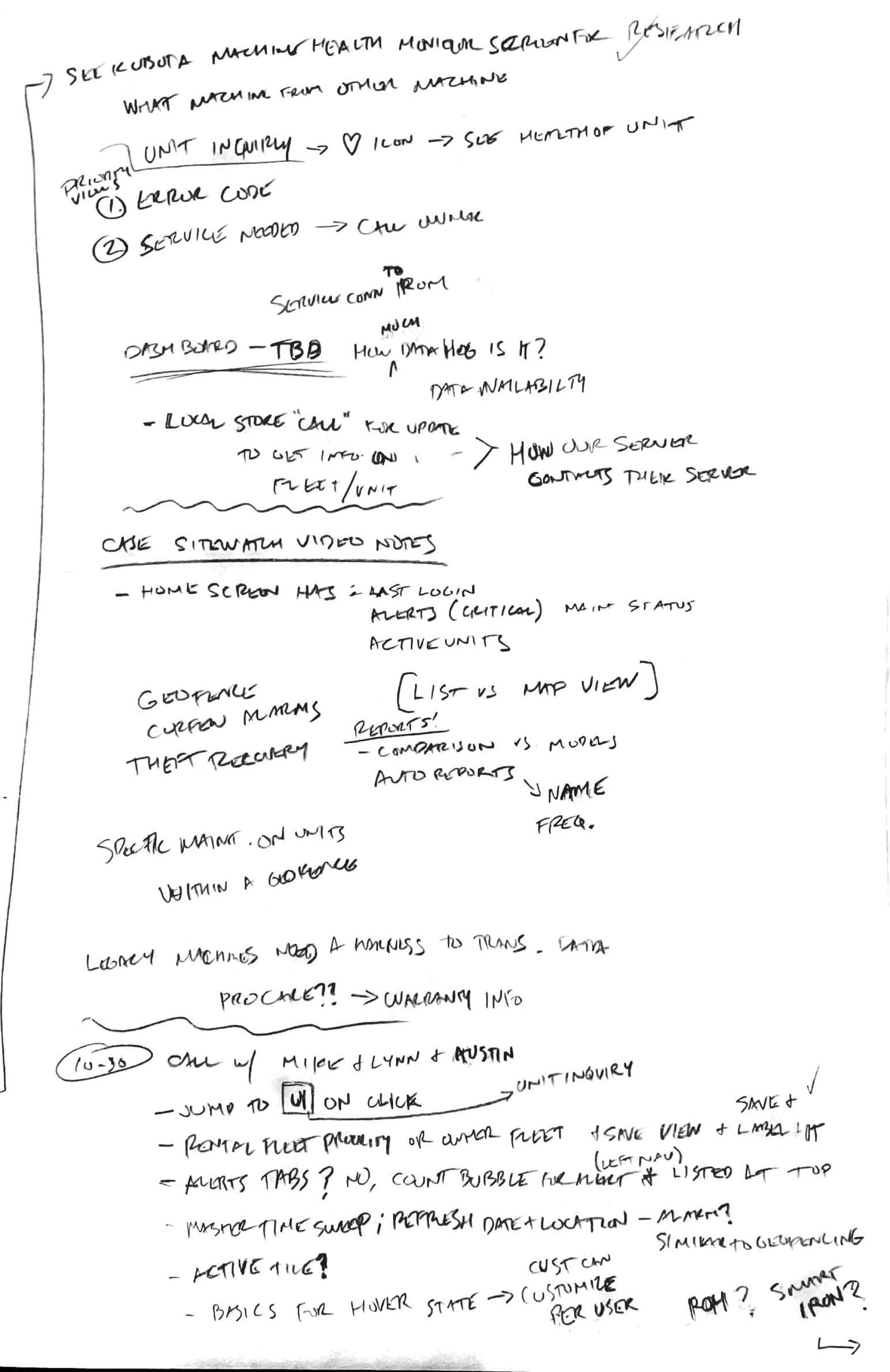
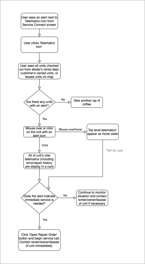
Task/user flow



----
Report Screens
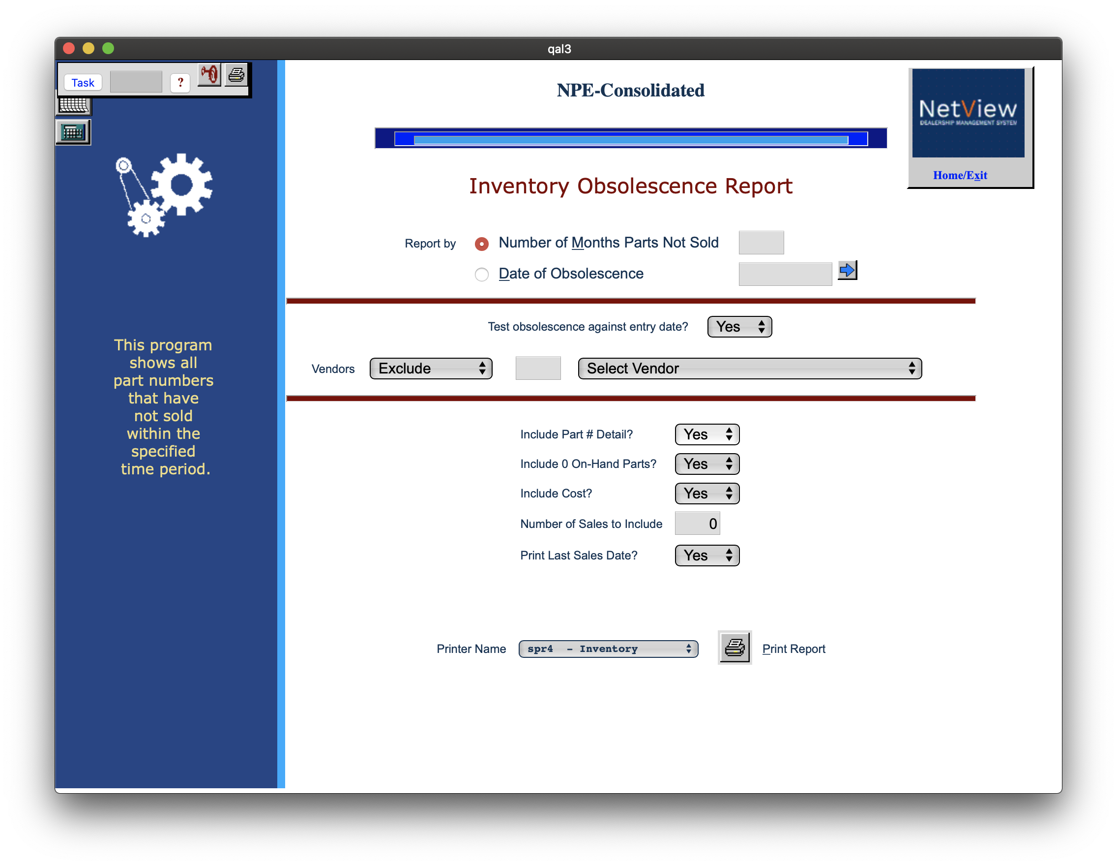
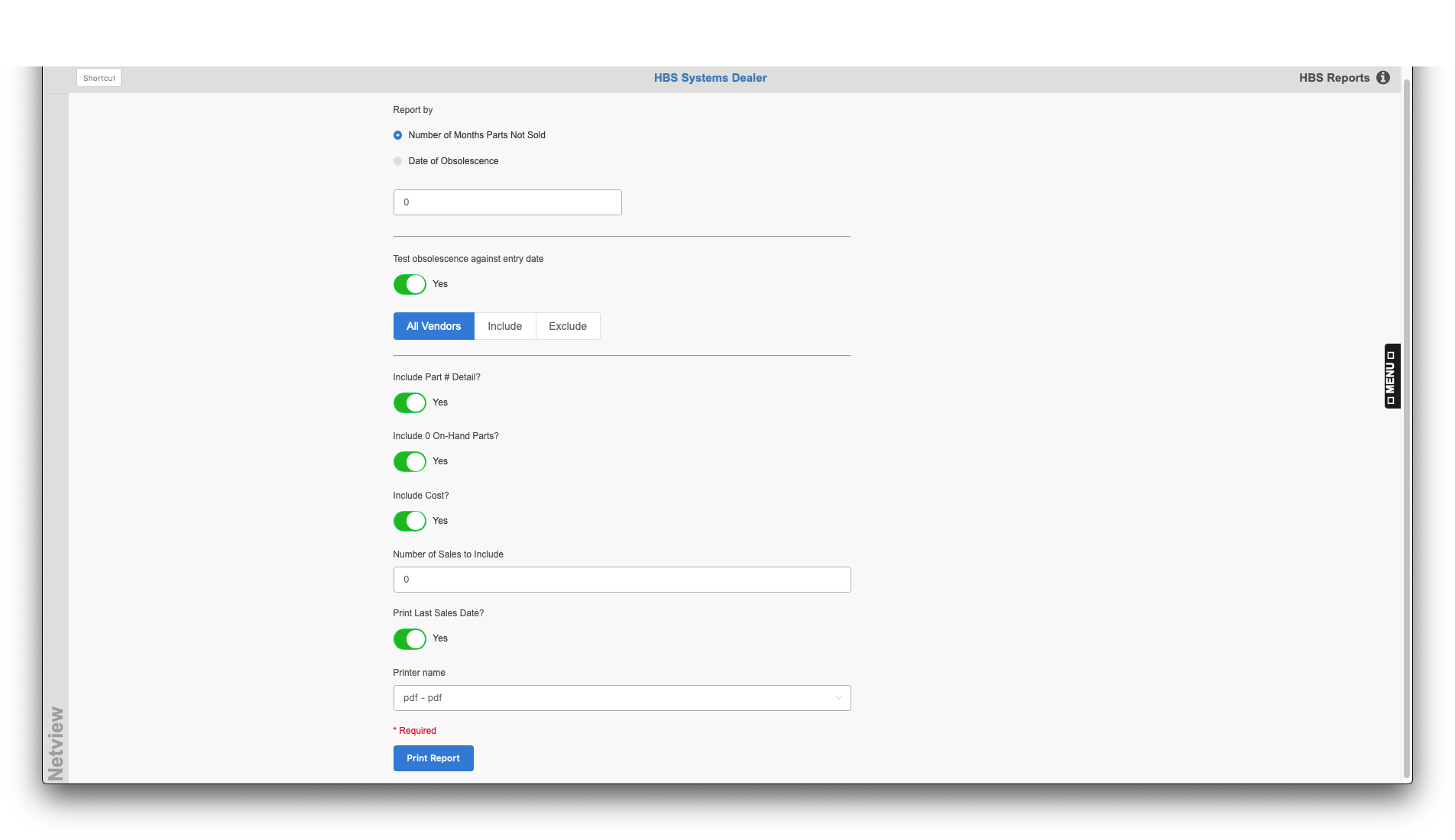
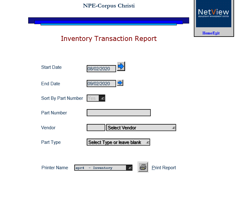
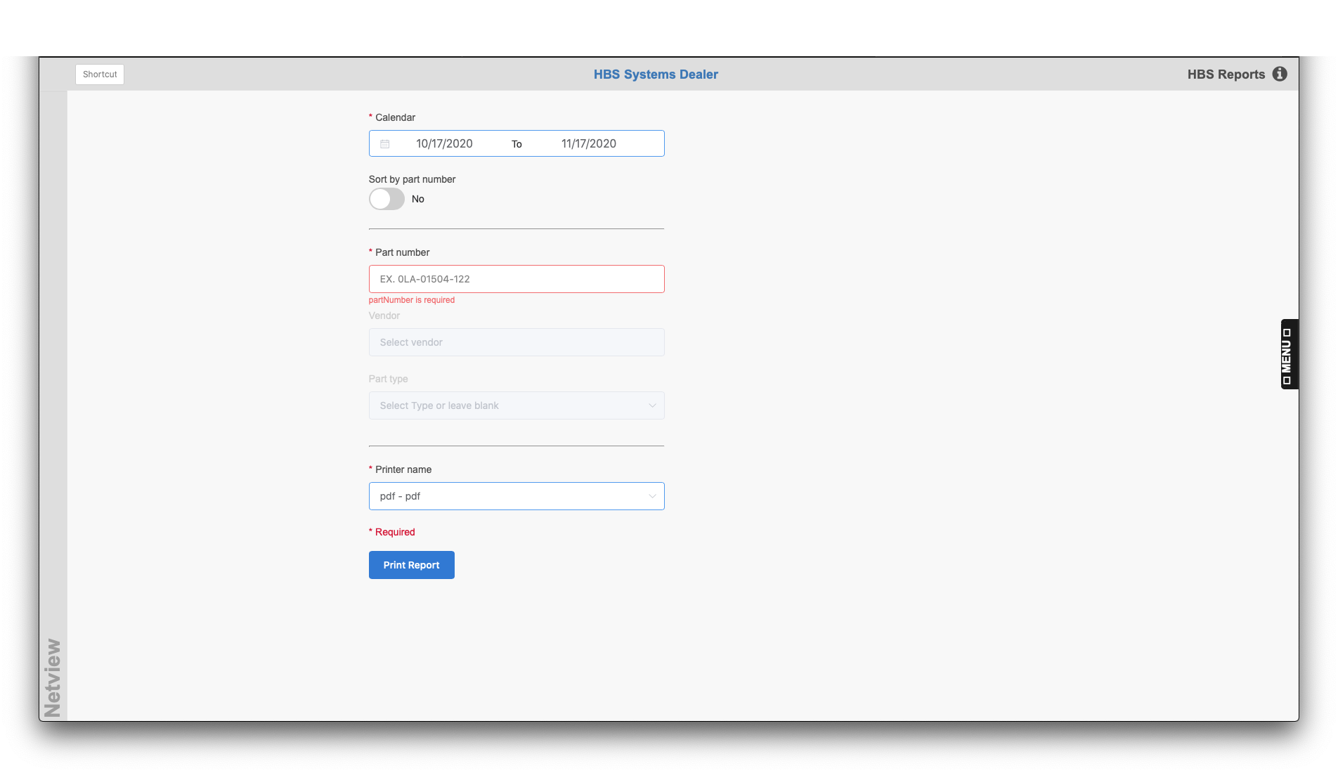
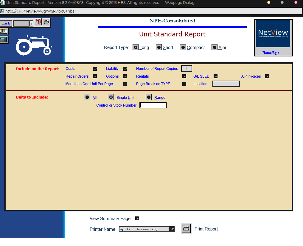
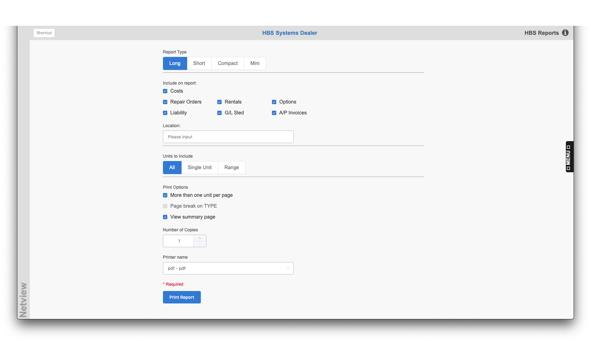
Some of the legacy programs for our software will be endangered by Microsoft’s decision to stop all support for Internet Explorer in the coming months. As the sole UX designer, I’ve been tasked to reimagine the 20+ year old applications into a more contemporary look and feel, but not alter the functionality unless a critical usability issue was detected.
----
Ecom API/portal
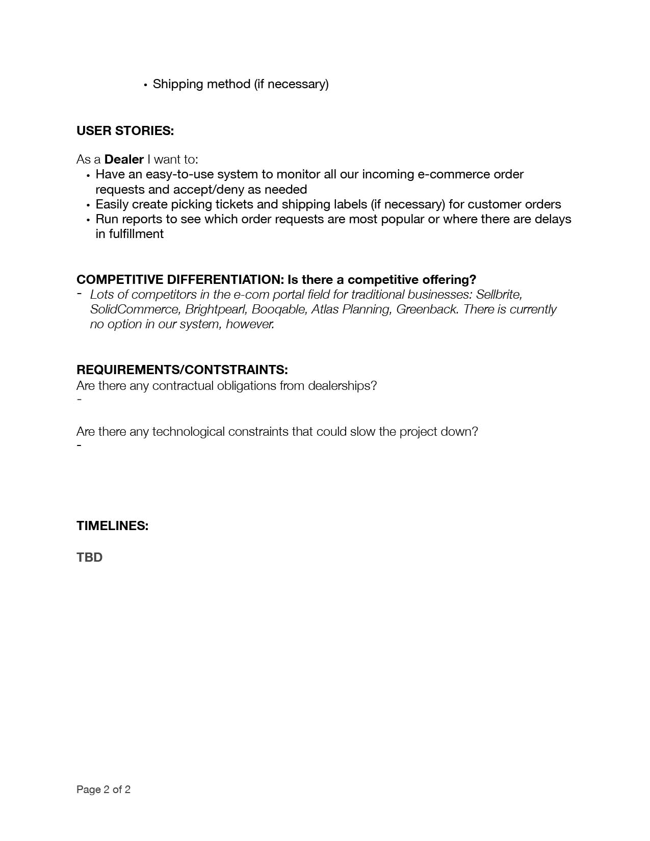
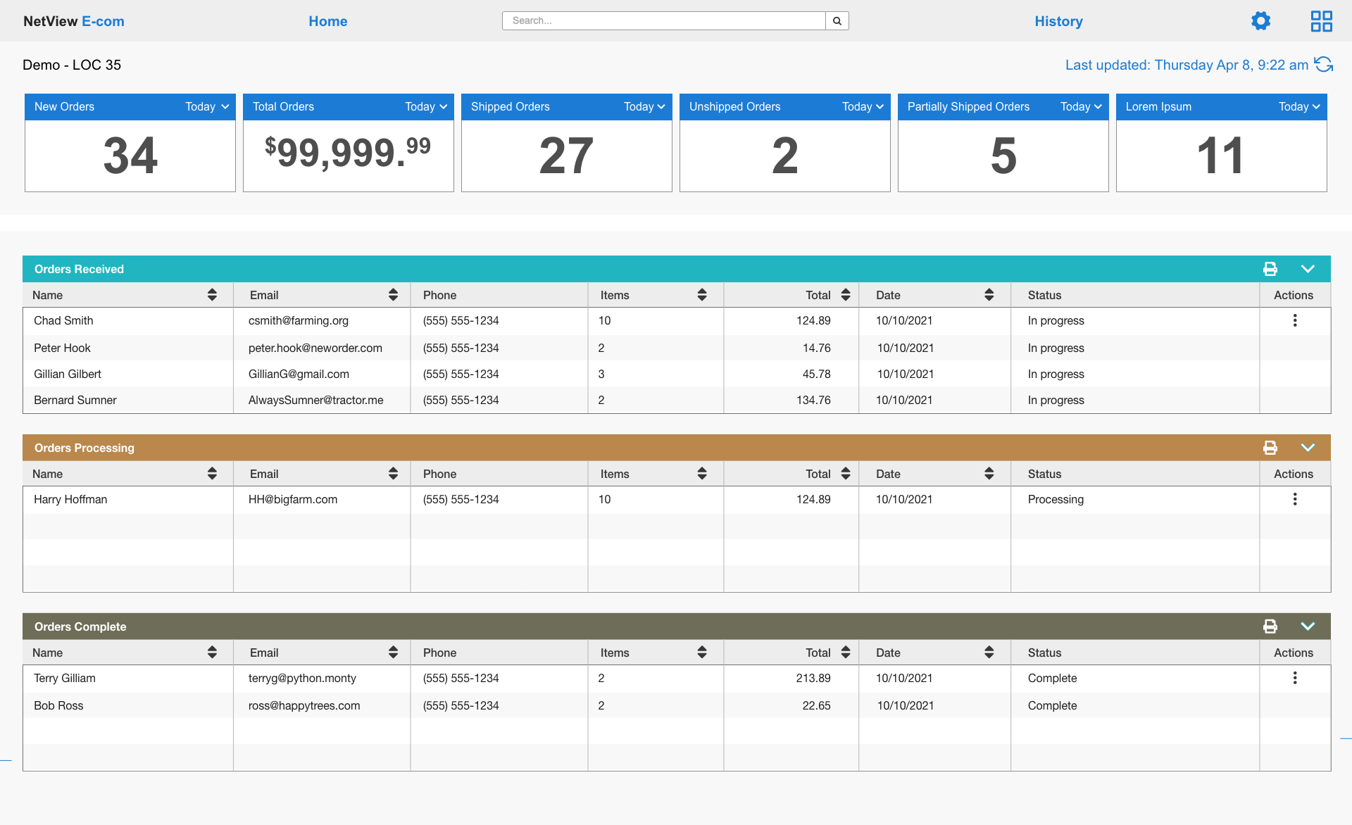
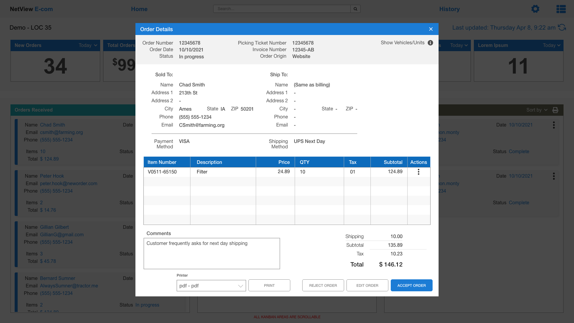
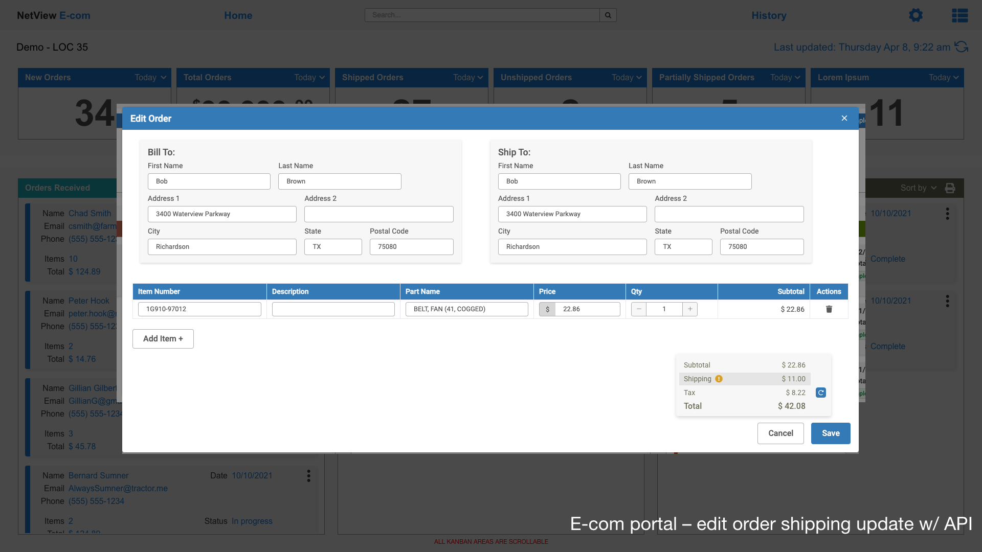
One of our strongest relationships is with a large OEM with a loyal customer base. They tasked us to help create an ecom API/portal to help ease the burden of the dealer’s parts department having to manually sort and enter all the customer orders entered from the OEM website. Definately a challenge, but our team was ready for it!
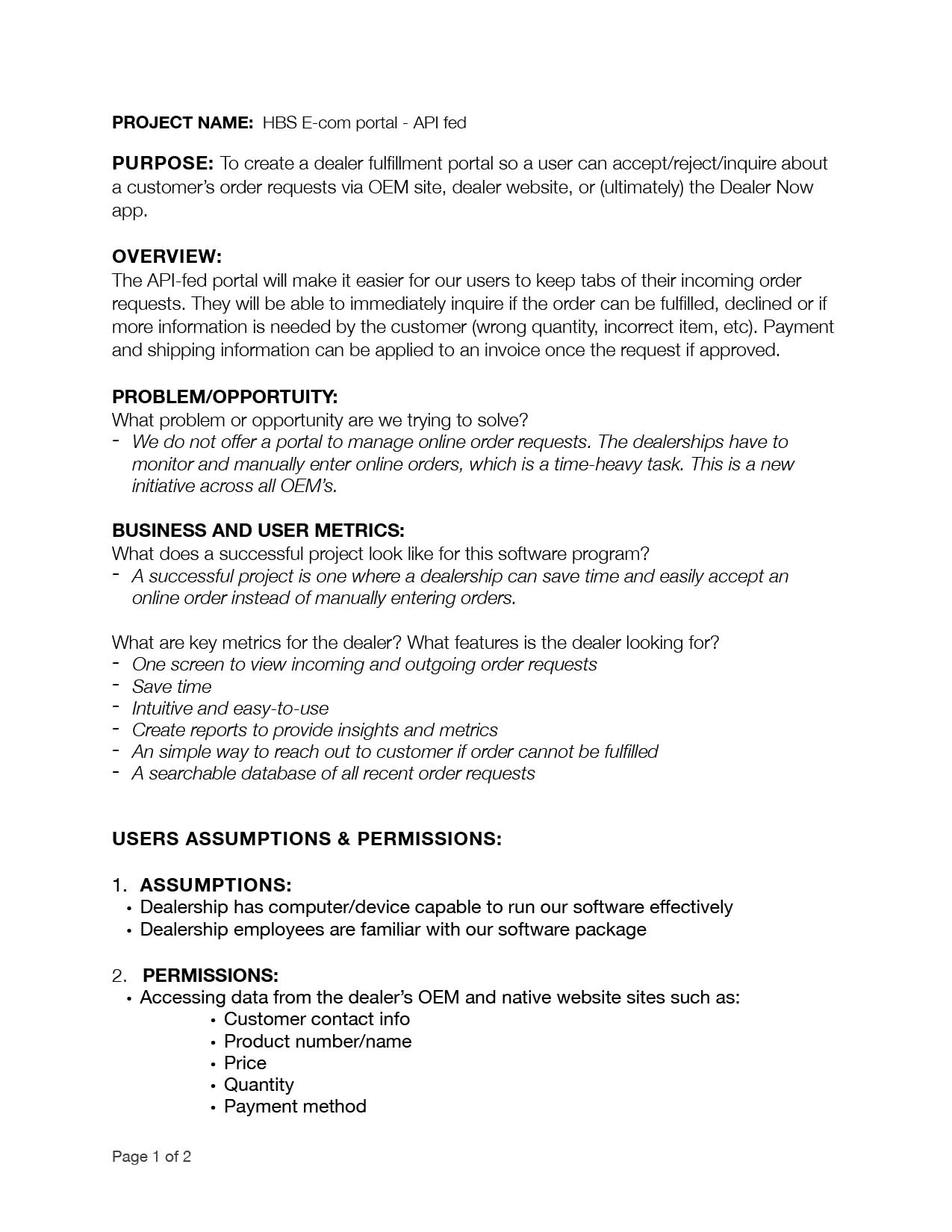
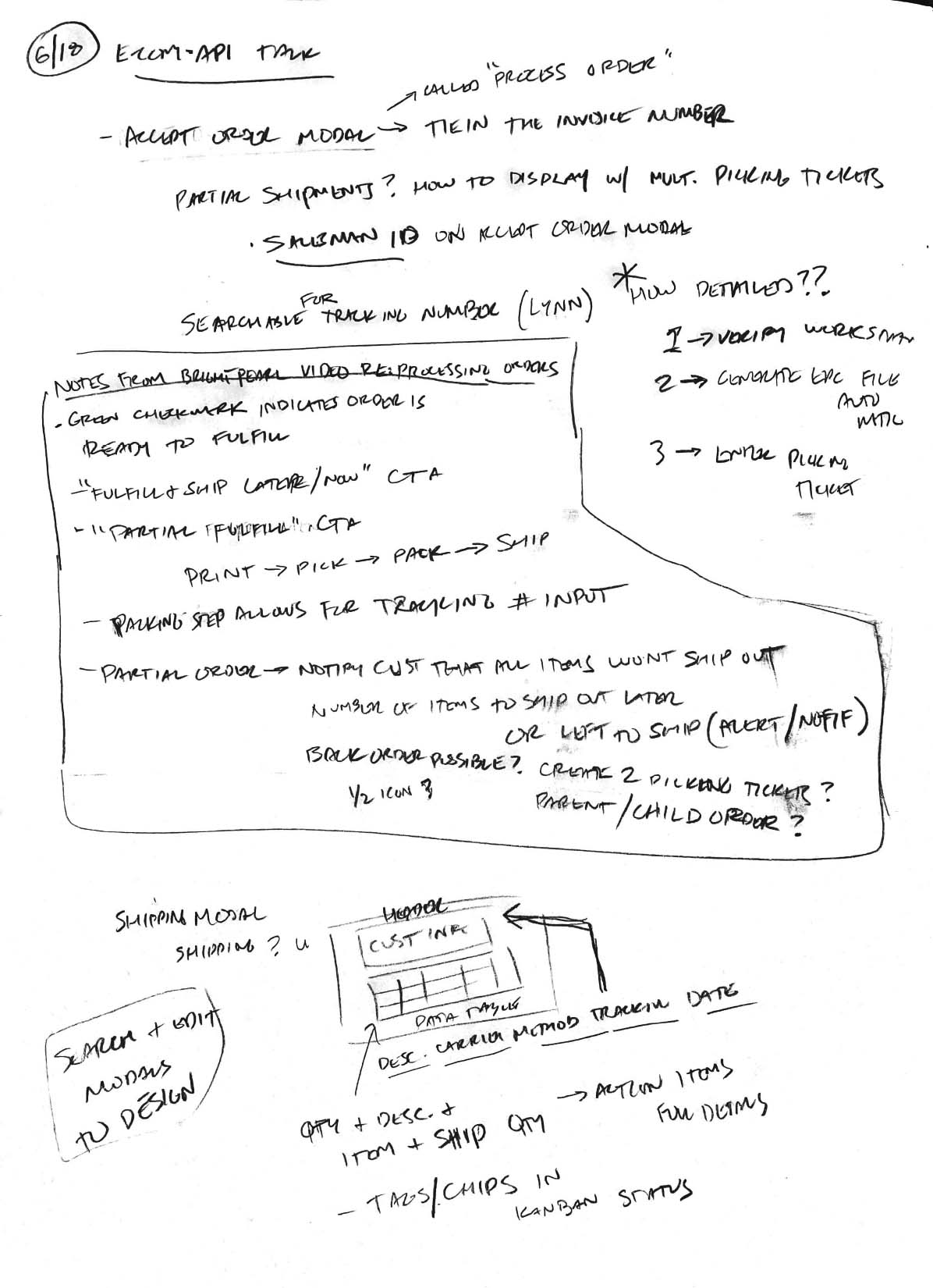

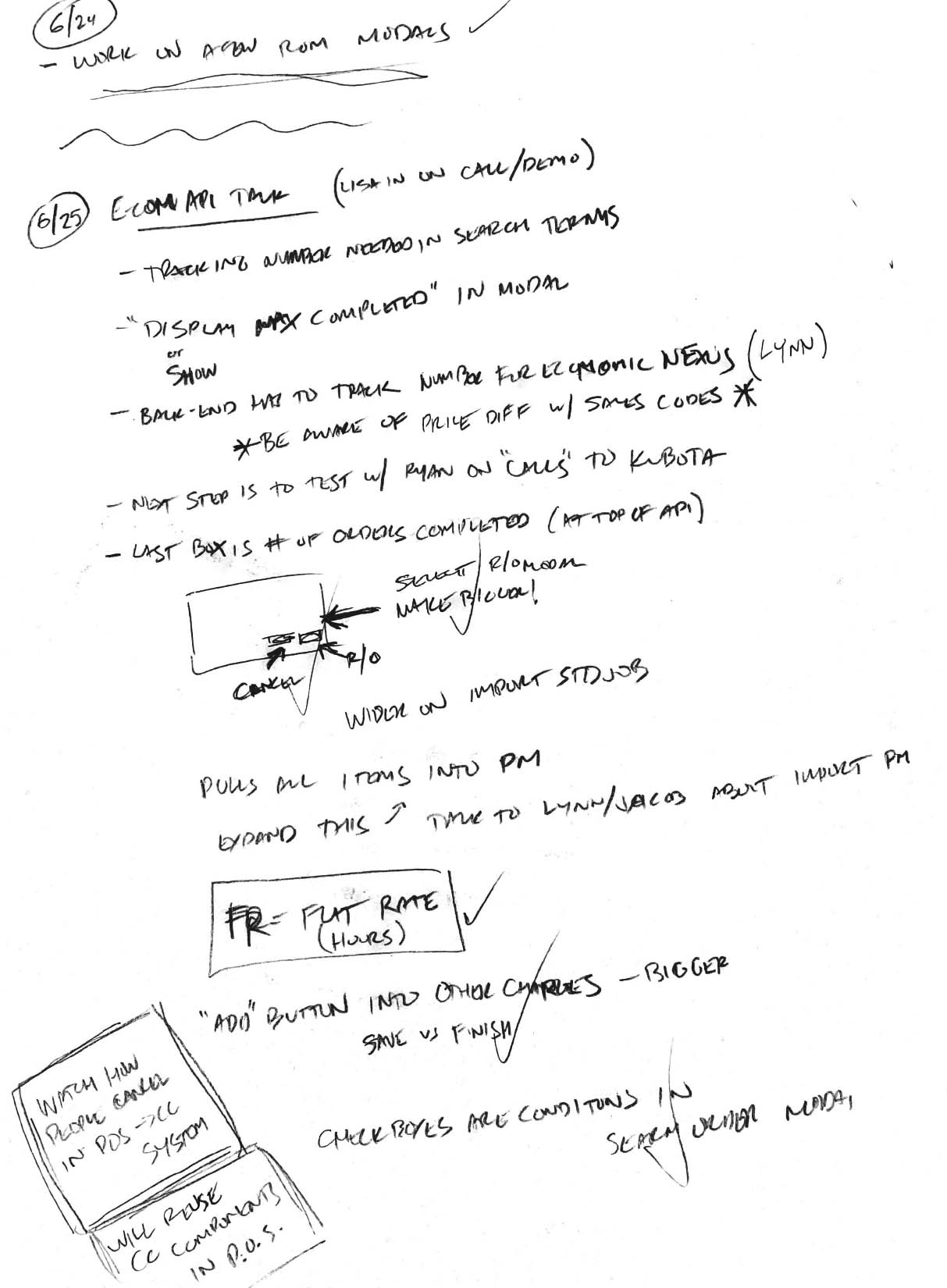
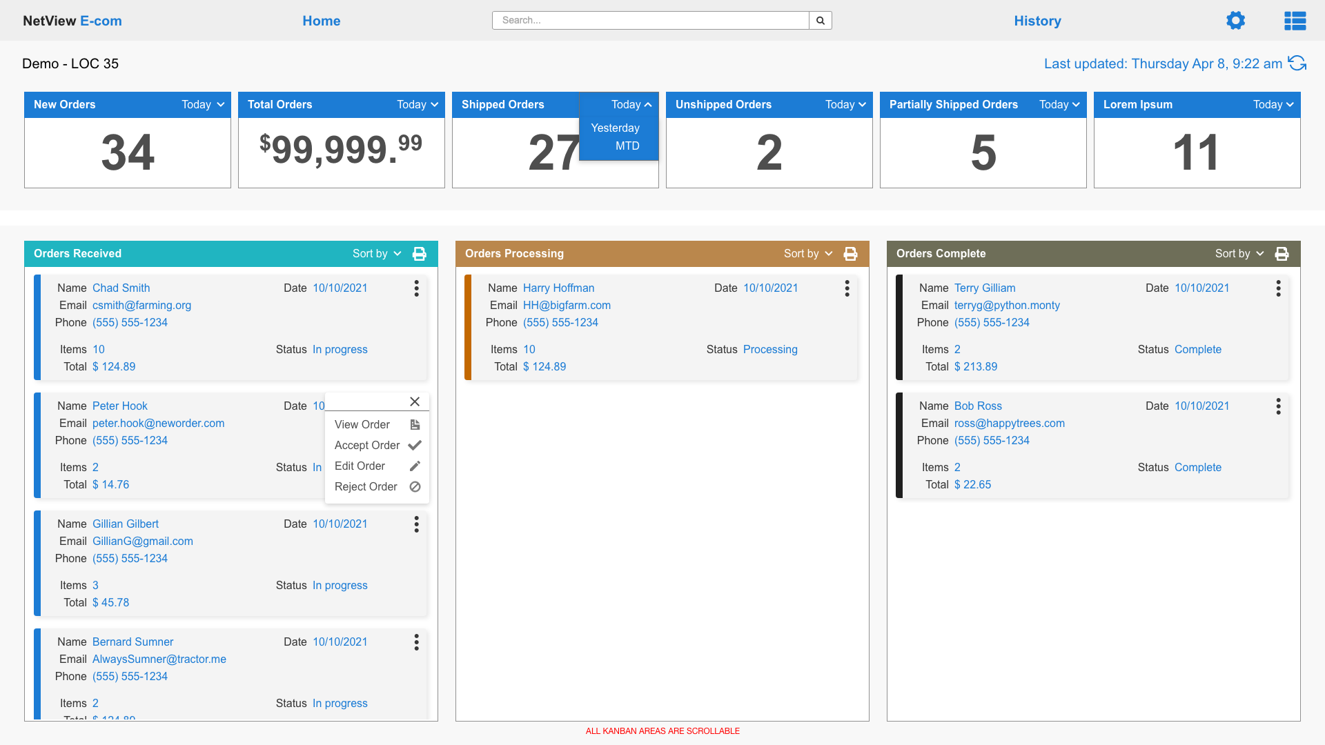
----
Design System
During the revising report screens project (seen above), I simultaneously created the company’s first EVER design system. With some of parts of the software not having been touched in a very long time, this task was long overdue. Sorting through 20 years of CTAs, text inputs, and random UI elements was challenging, but brought out my inner archeologist.
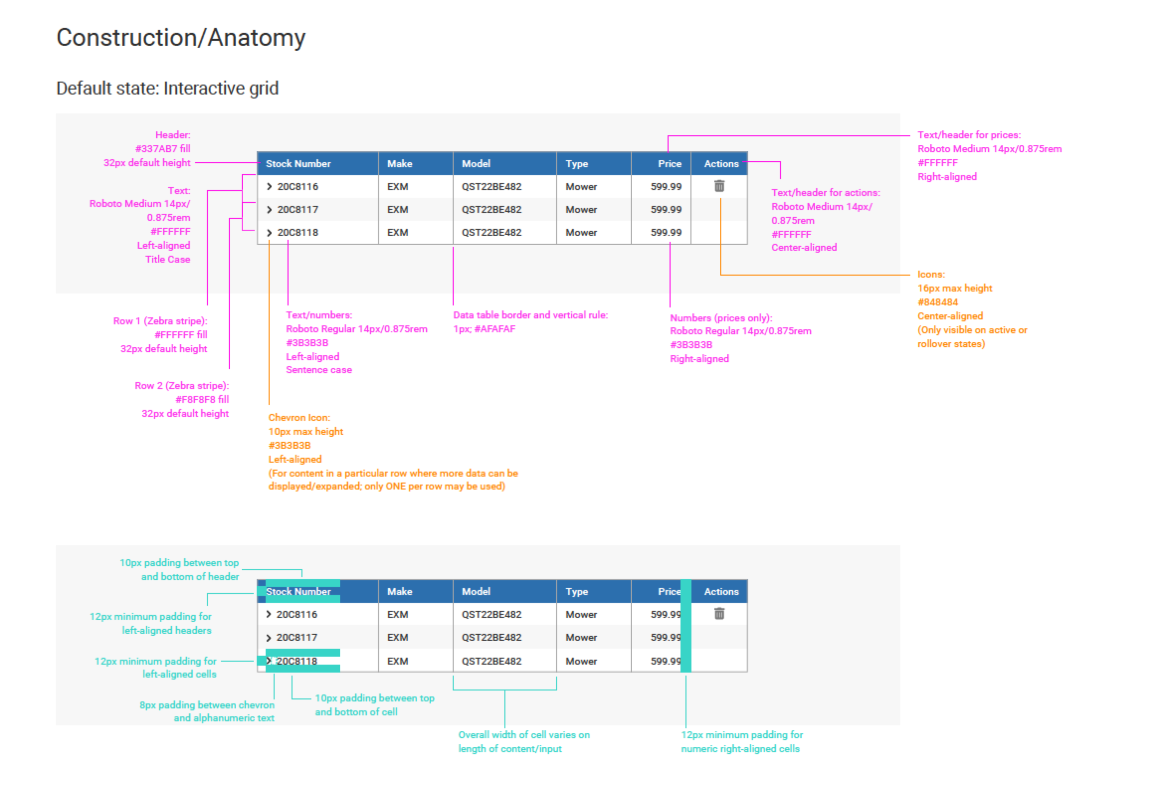

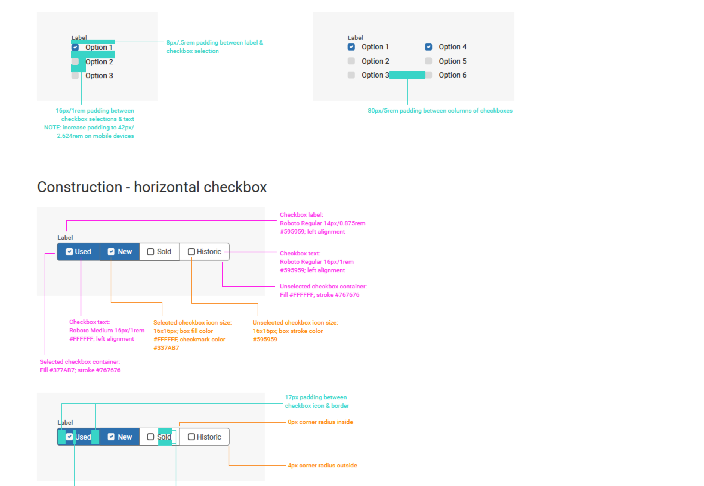
Click here to see the latest version of the system
-----
Dealer Now app
As one of the largest and best known B2B software companies in the equipment dealership business, HBS Systems has a large and loyal network across the US and Canada. We felt we could improve the client/dealer relationship by developing an app that could give more control to the client with paying invoices, monitoring their credit limit, shopping for parts, and reserving construction/ag heavy equipment.
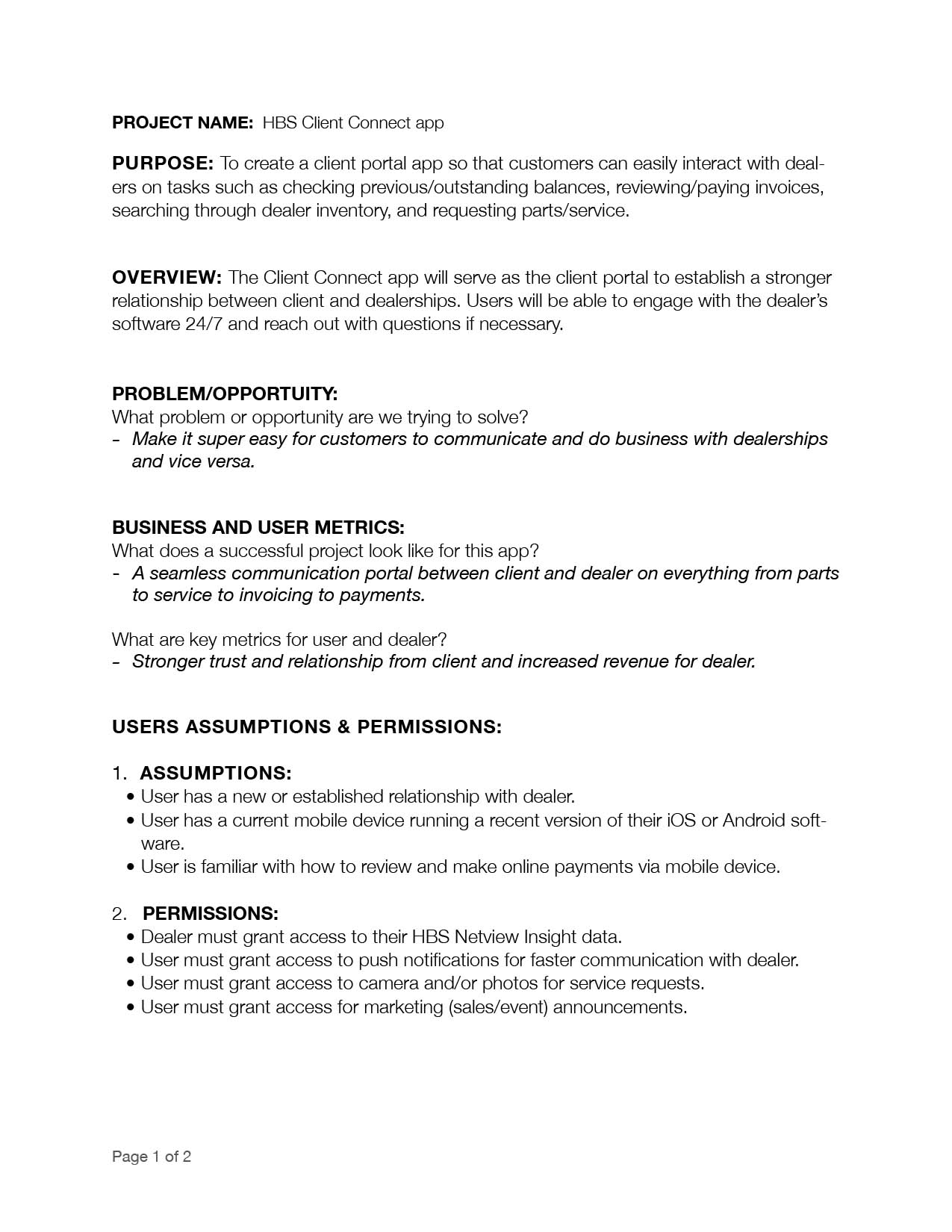
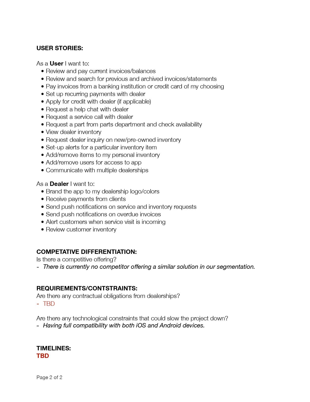
Project brief (slideshow)
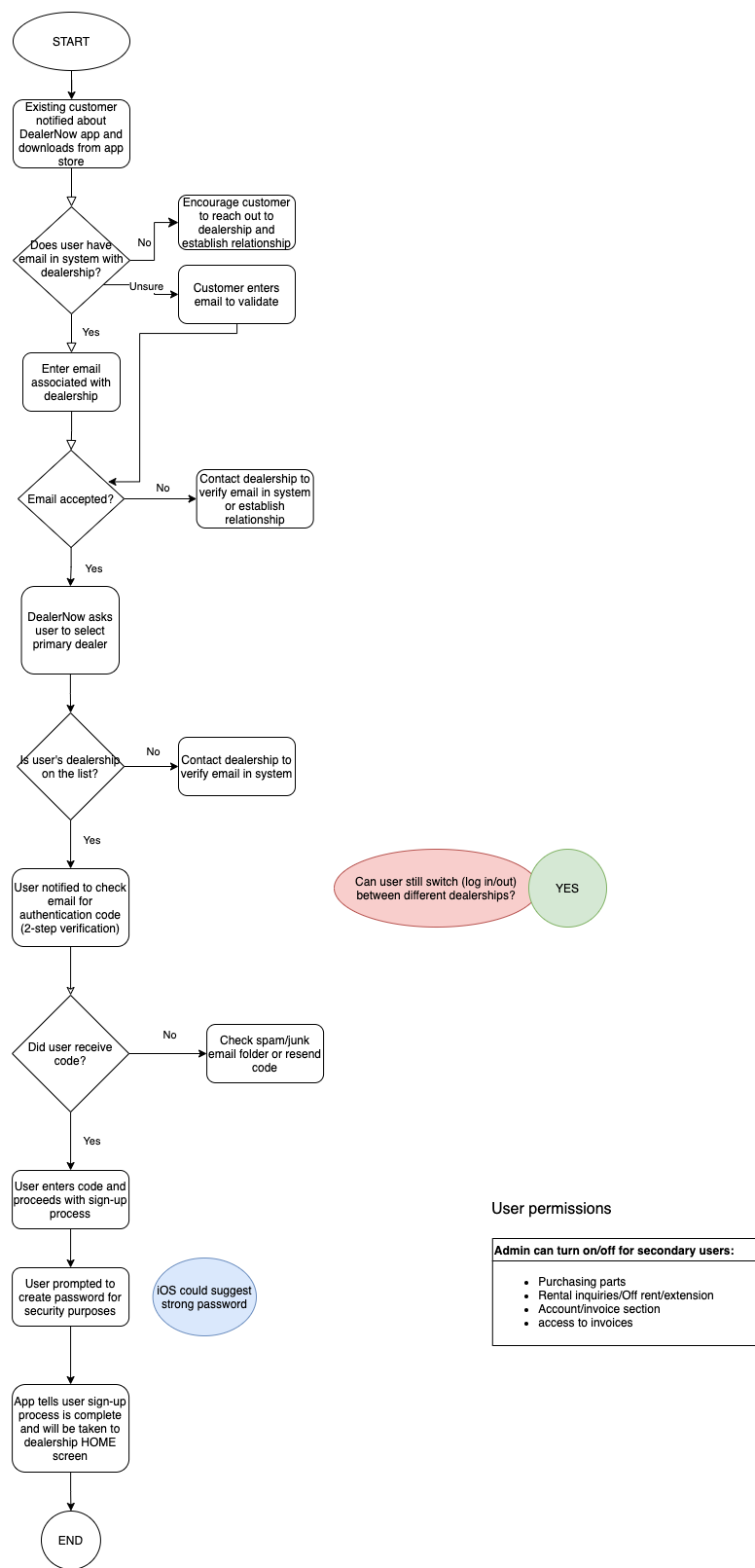
Task/user flow


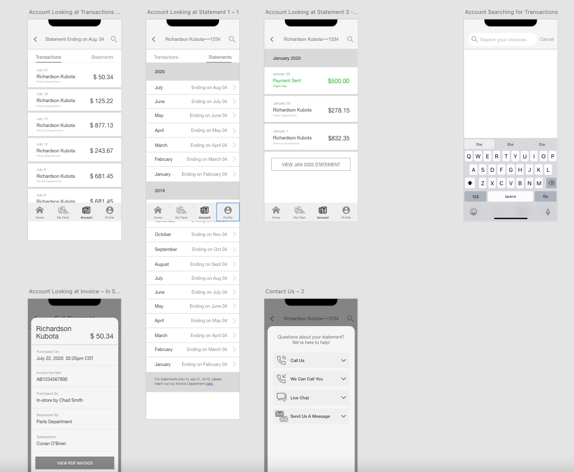
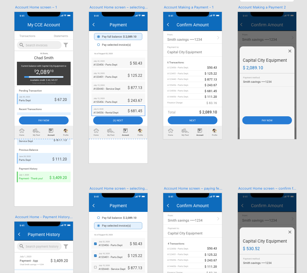

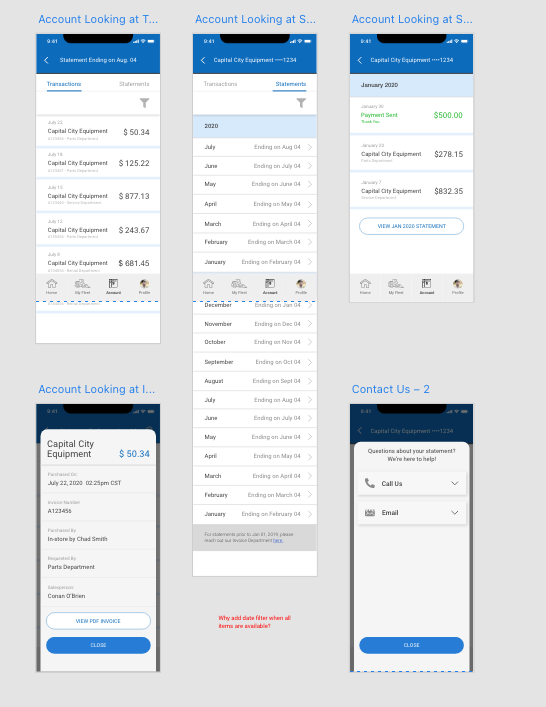
Click here to see the high-def version of the prototype in action.
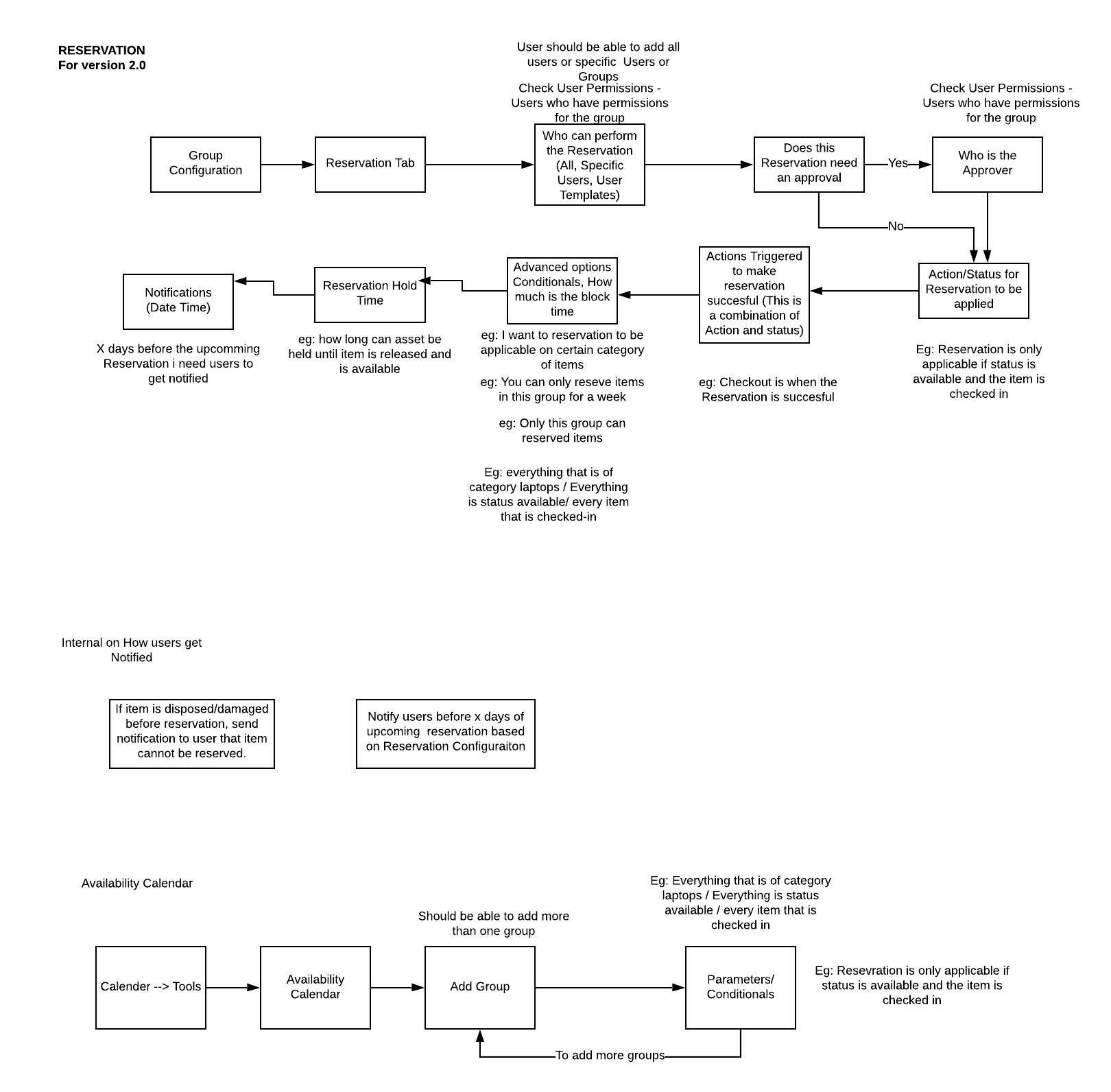
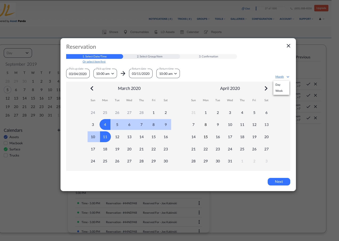
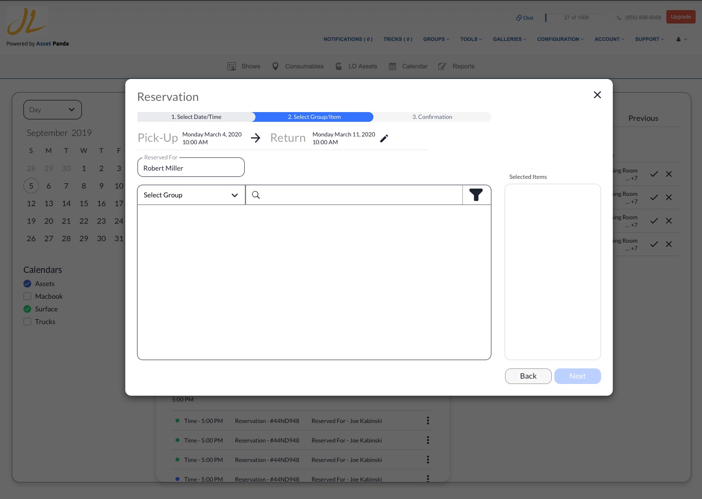
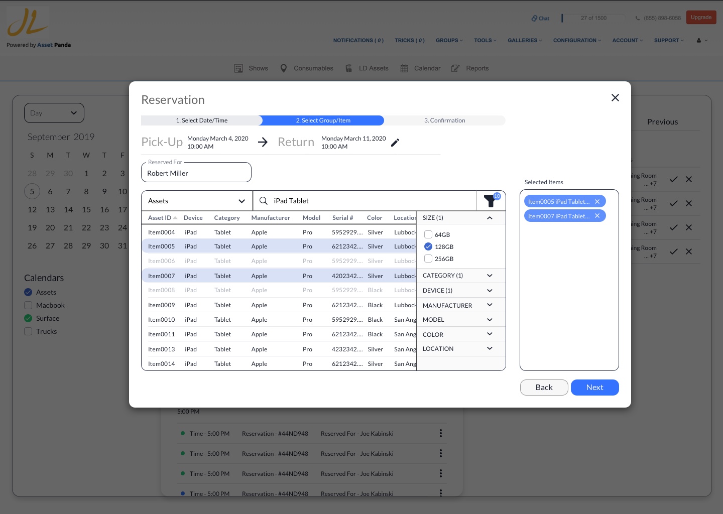
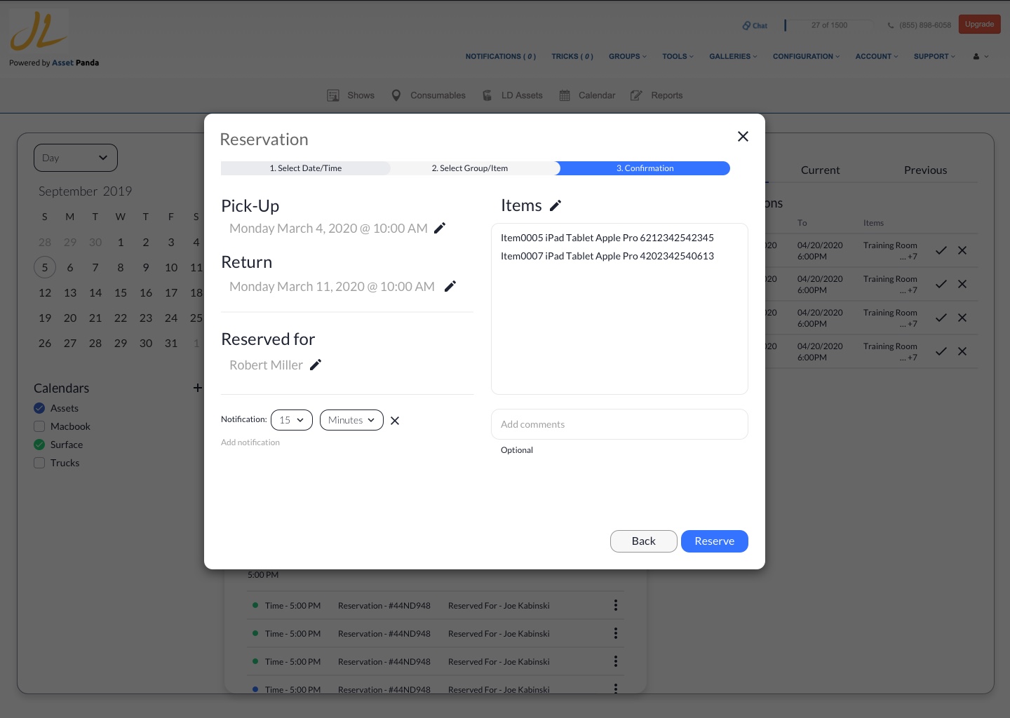
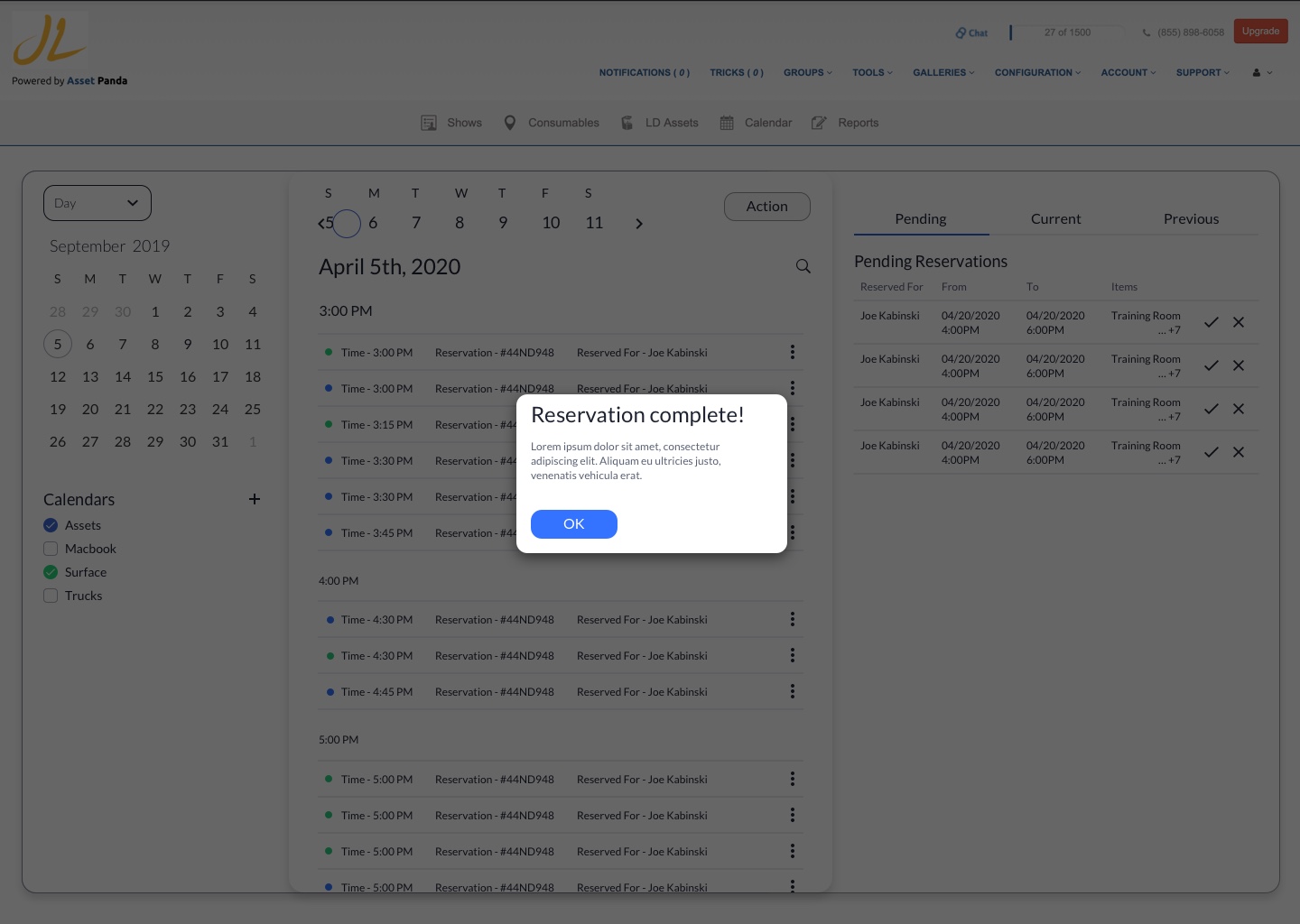
As my first real-world experience as a full-time UX/UI designer, I was tasked with two projects: create a calendar/reservation system for our clients who don’t have to rely on a spreadsheet to loan out their assets; and start working on the design system for the eventual migration to 3.0
Calendar/Reservation System (workflow)
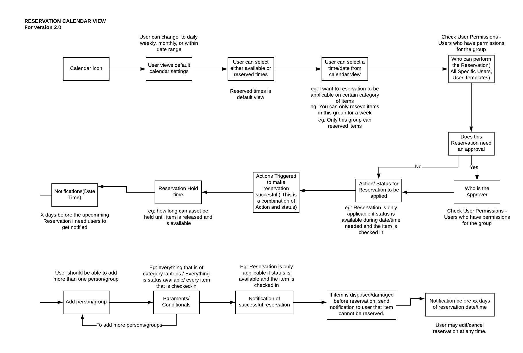
Calendar/Reservation System (med-def wireframes)
Design Systems
