Previously, I was at Sabre as a Senior UX Designer. My job involved collaborating with different UX and product design teams in the travel and hospitality commerce sector to develop user-friendly solutions on complex applications. We design and produce scalable B2B solutions for airlines and hotels worldwide so they can be more efficient and monitor their revenue streams. Our software touches everything from mobile apps to housekeeping to airline scheduling to dynamic retailing. Together, we make travel happen.
Click the links below to see a few of the projects I worked on.
︎︎︎Load Manager
︎︎︎Air Price IQ
︎︎︎Intelligence Exchange
︎︎︎Sabre Central
︎︎︎DW Air
----
Load Manager
Load Manager is a database of configurations for proper weight distribution of passengers and cargo on an airline. This is a critical piece of software for all airlines to prevent overloaded planes from taking off which could have catastrophic results. As of 2021, almost all the data was entered manually by load controller or specialists with deep knowledge of airport operations. We were tasked with updating the data entry system from an early Windows 95-era interface, to our new design language and improve the overall user experience.
Note: This was my first project as a Sabre employee. It was a bit overwhelming at first, but thankfully the UX team I worked with quickly brought me up to speed.
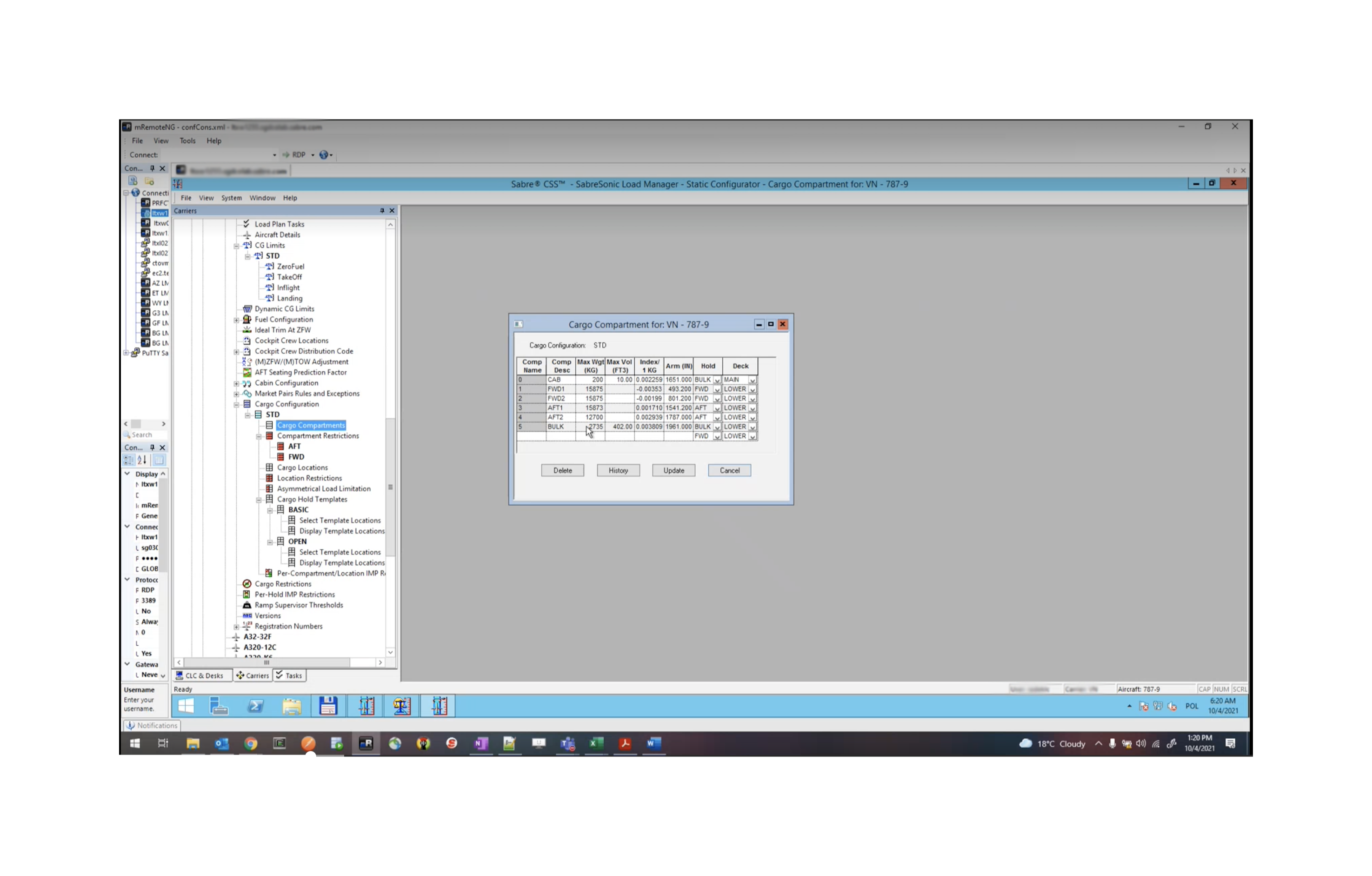
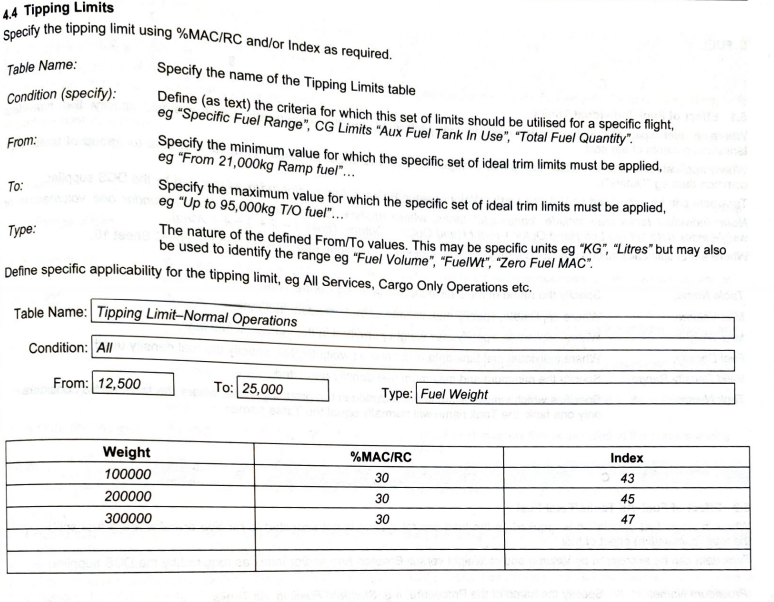

Figjam board research and workflow (click for larger view)
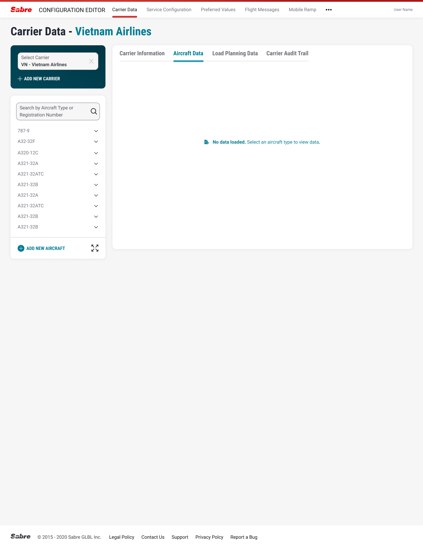


Usability testing found a number of problem areas (sorted by severity levels) we quickly rectified:
The original design had a long horizontal dropdown input for carriers that users ignored due to “banner blindness”. The problem was resolved by adding contrast color to primary drop-down menu. See above.
Save/Enter were used interchangably in the app causing confusion. We added an Undo button to give users peace of mind so they would not have to start from beginning of form.
Users liked the updated sidebar navigation but did not like how much scrolling needed to be done to find their specific airline. We added an Expand icon so users could use the full screen to search and/or sort information. See above.
----
Air Price IQ
Air Price IQ is a tool used by carriers to adjust airfare pricing in real-time based on market conditions, pricing strategy, customer segment, and booking velocity. It helps airlines adjust to pricing changes more quickly to maximize revenue. Our UX team was tasked with merging the new software with an existing Ancillary Manager and updating the AM’s user interface to seamlessly work with the current software package. Usability tests were also conducted. Here is a small sampling of the work done.
Note: This was the first full Sabre project that I worked on.
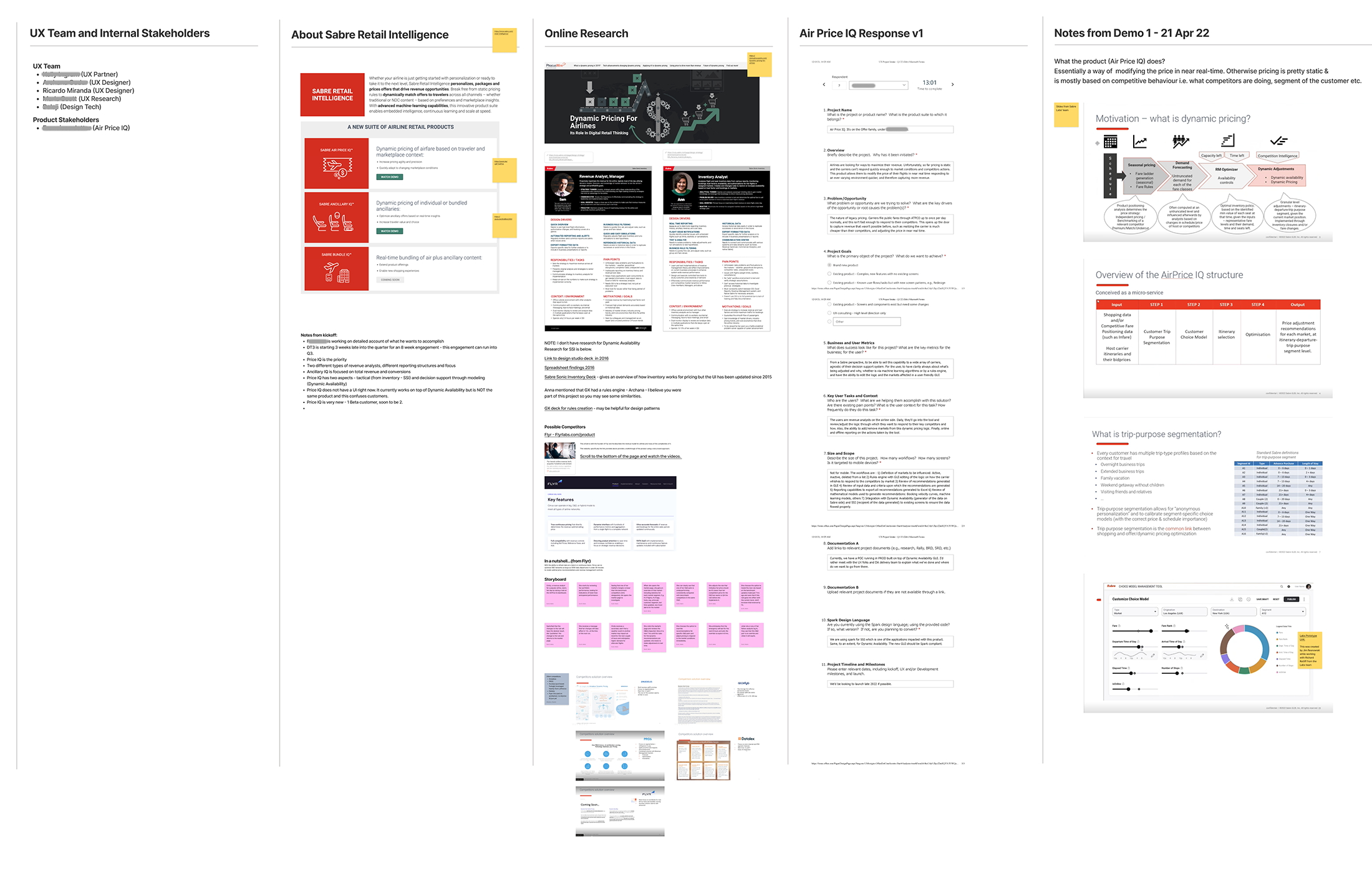
Figjam board research and workflow (click for larger view)

Our team’s first attempt to understand the user workflow
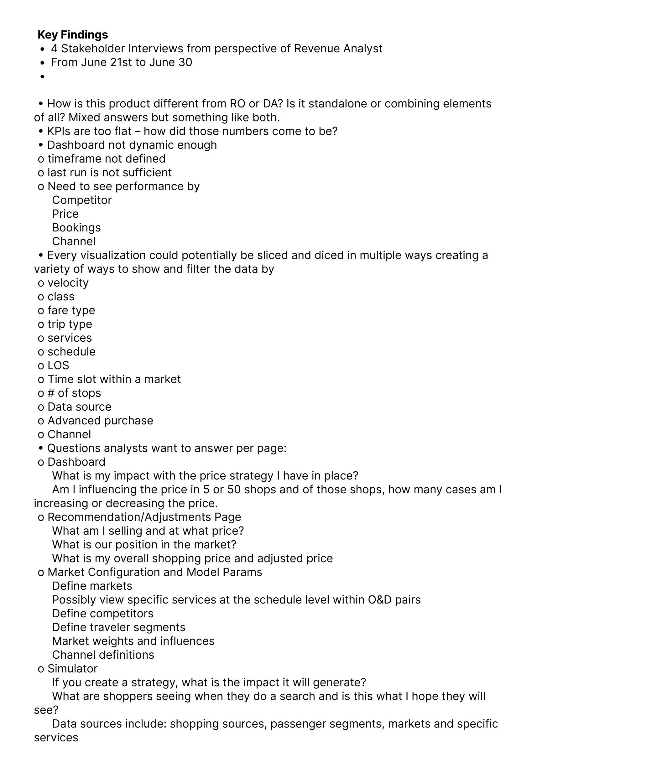 Key findings from four separate stakeholder interviews
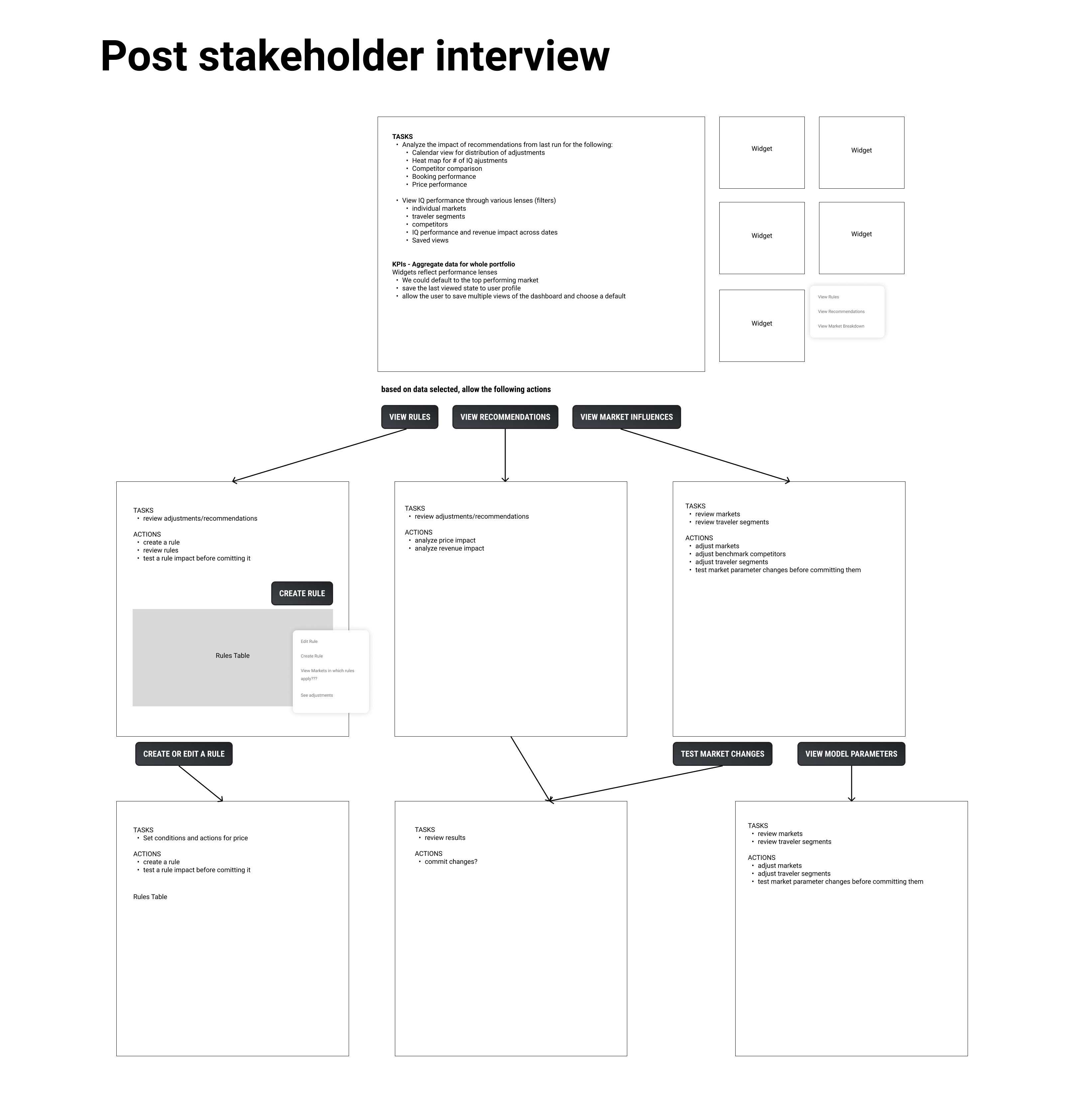
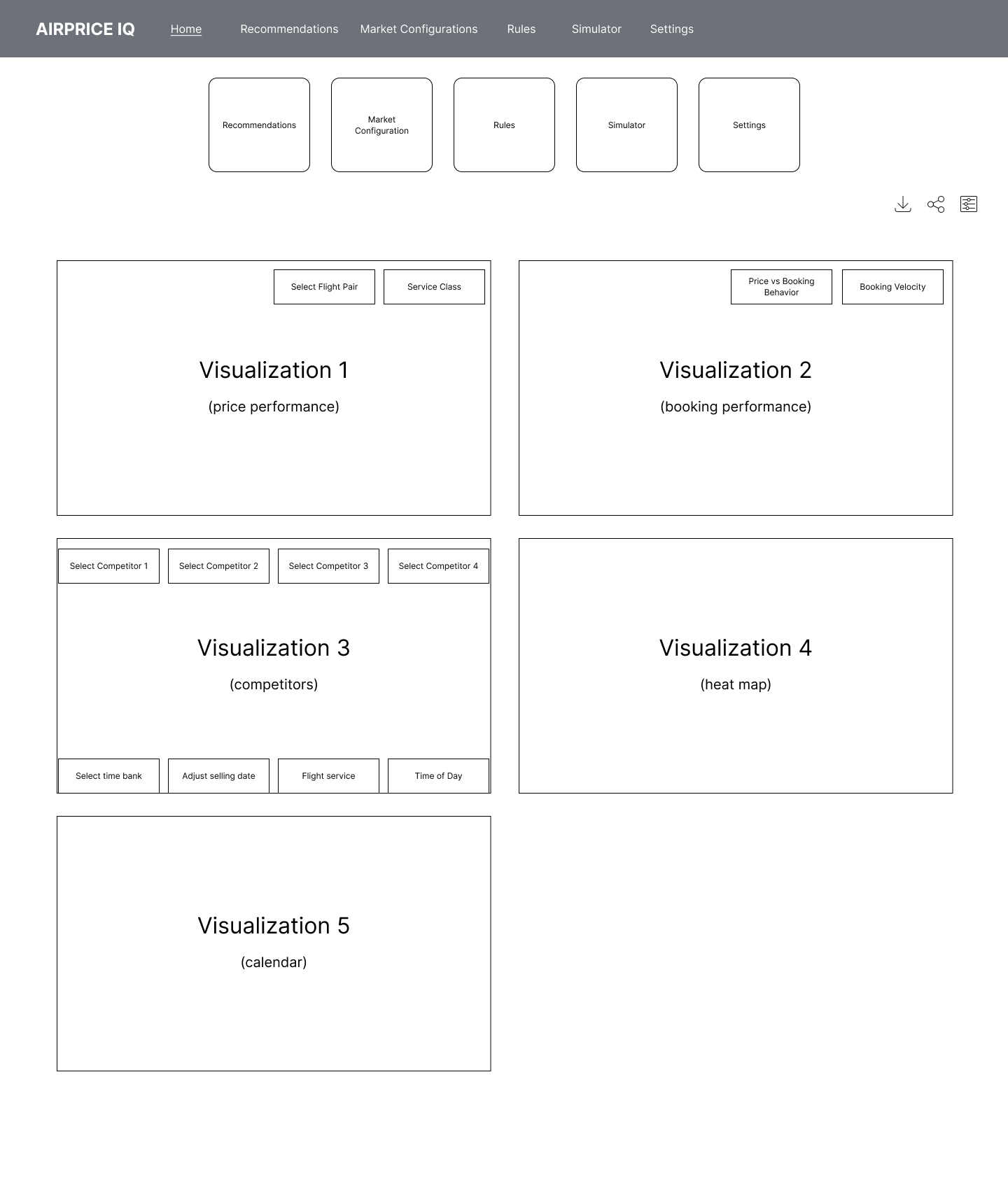
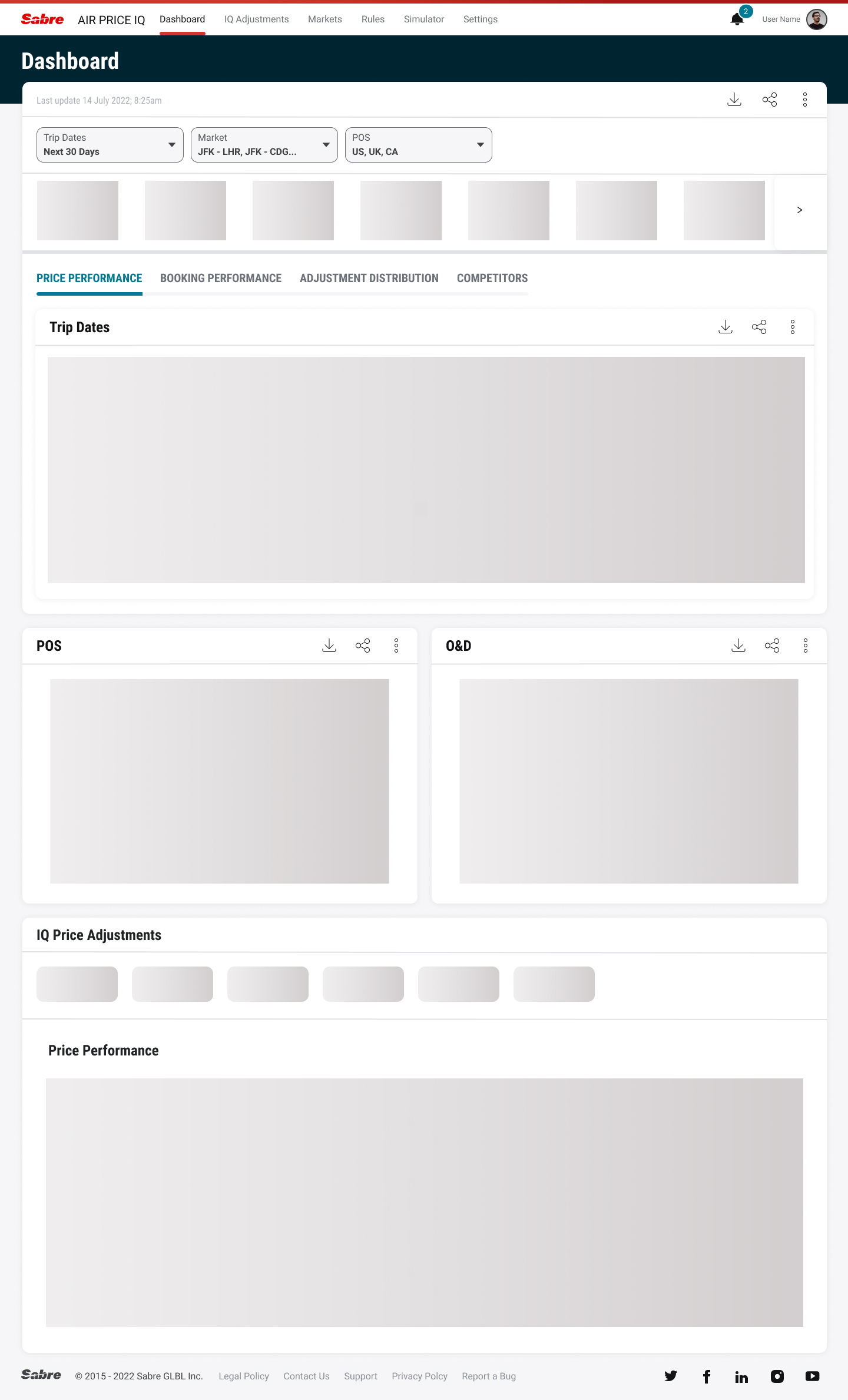
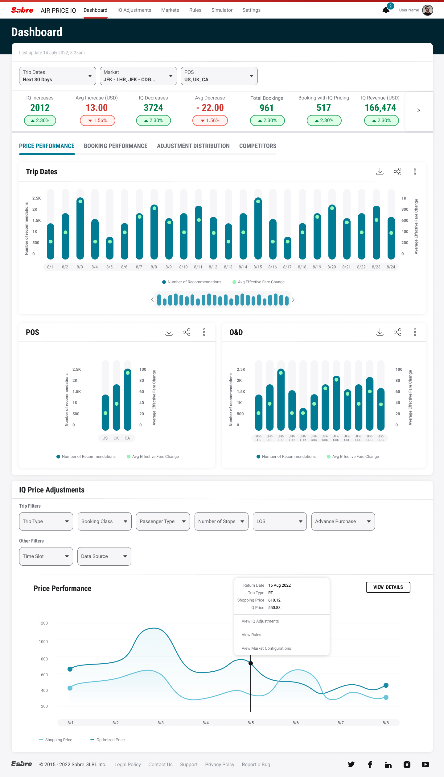
Usability testing found a number of key takeaways we revised for future testing:
Some of the market configuration widgets or snapshots should be better suited for the main dashboard.
Consider a global way to create a rule that can be accessed in the same way from all areas of the application – “If I right click on a value, I can create a rule”.
The dashboard should show portfolio level aggregation “with high level views for markets” - – include the market drilldown from the dashboard – to allow users to change the market pairs (origin and destination) here.
----
Intelligence Exchange
Intelligence Exchange is an airline back-end booking rules engine for airline shopping and ticketing. It allows carriers to monitor search requests and allow for mark-ups (or mark-downs), content mapping, or payment options in certain markets. We were asked to improve the functionality of the software and update the existing UI to our own design language, Spark. Our research team also conducted usability tests on our prototypes.
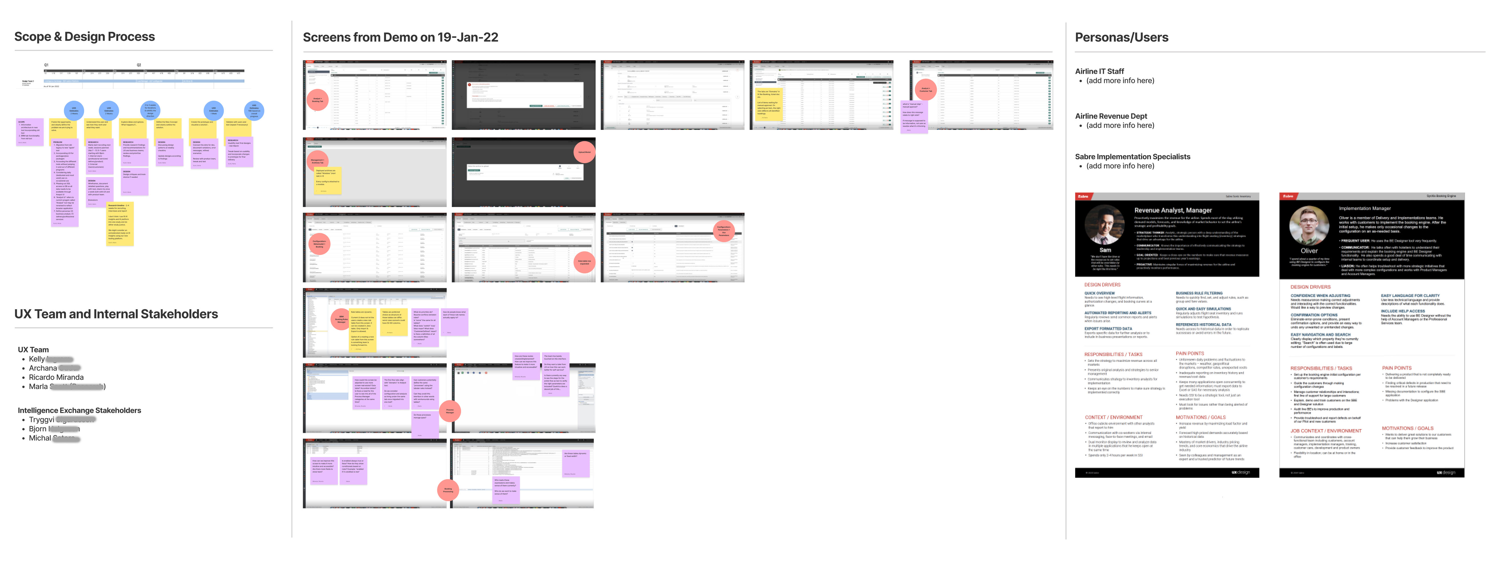
Figjam board project brief (click for larger)

Information Architecture discussions (click for larger)
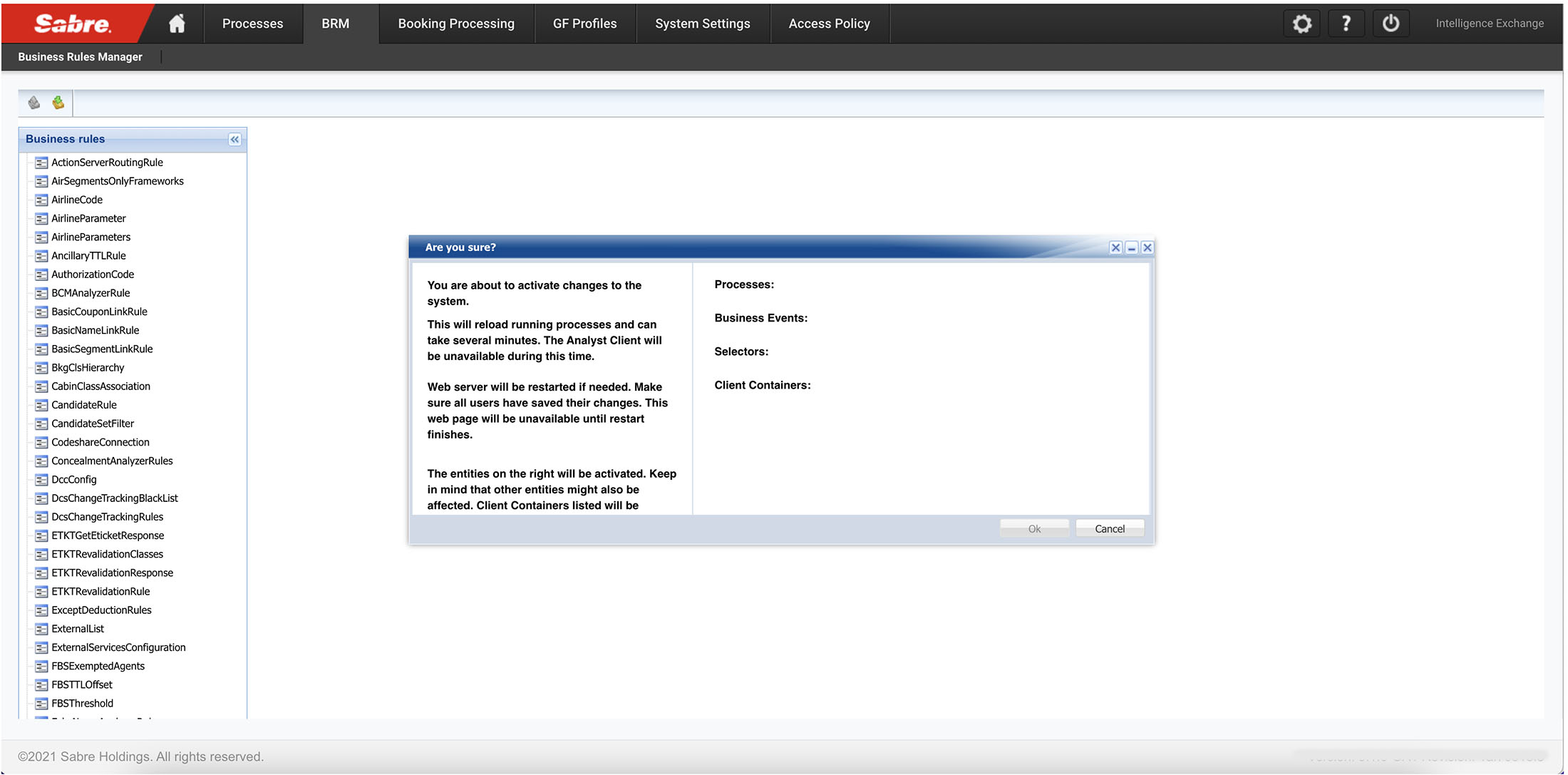
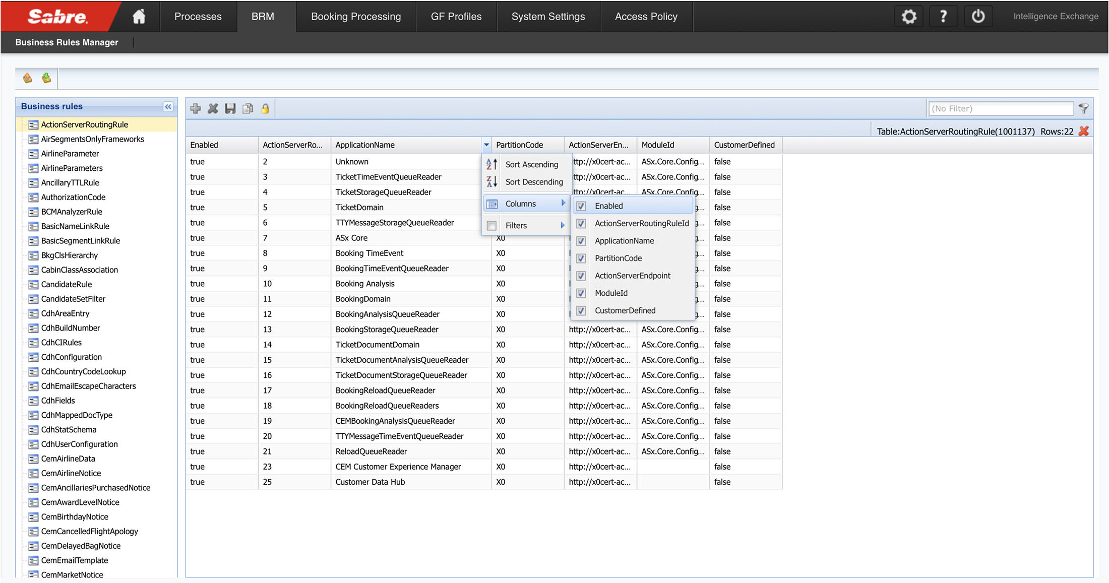
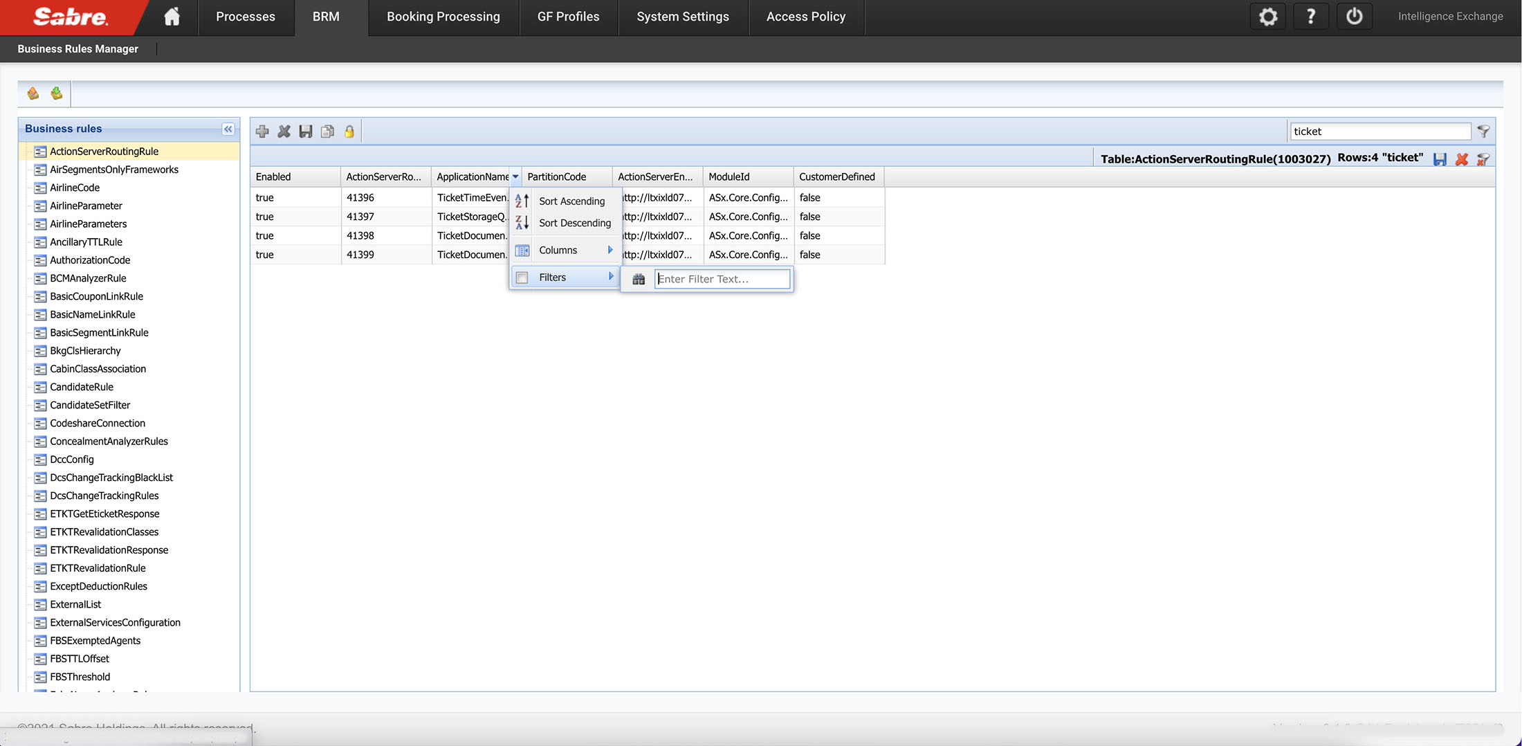
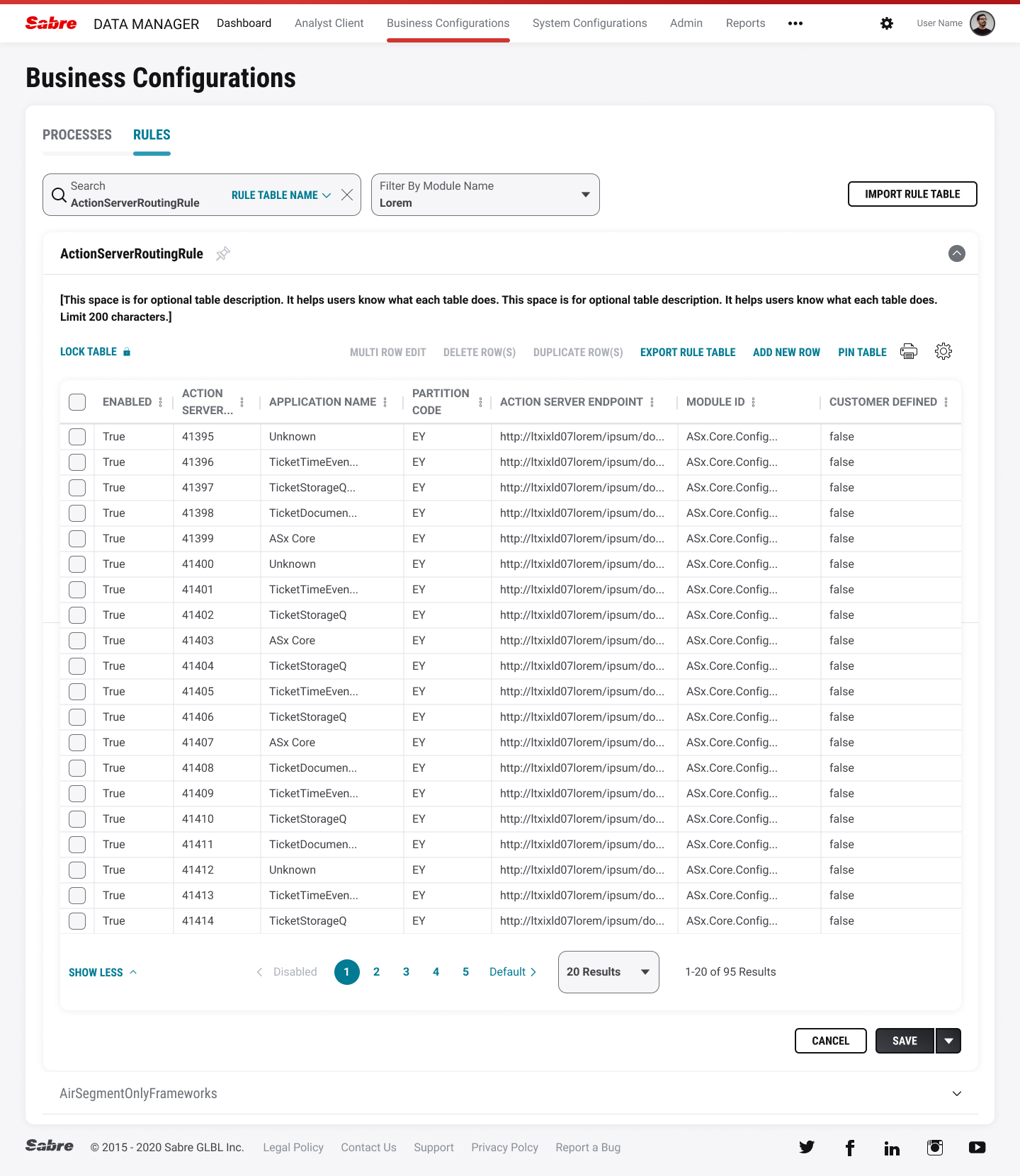
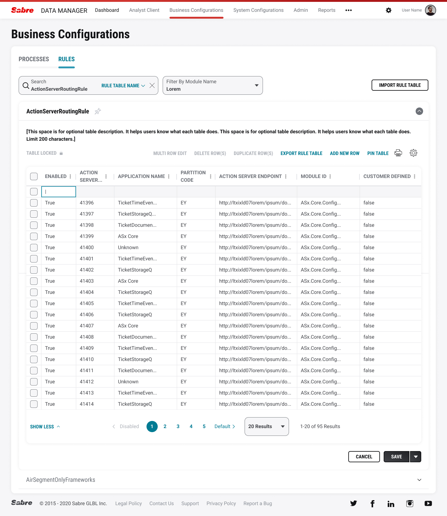

Usability testing found a number of key takeaways we revised for future testing:
When a rule is duplicated, the row is highlighted and bold. Users told us that some of their other apps indicate a duplicate field which makes it easy to locate when coming back to the rules area. See above.
Combination button for Save and Check in were implemented due to users wanting to Save but not Check-in just yet. See above.
----
Sabre Central
Sabre Central is a web-based help tool for online travel agencies (OTA’s) using Sabre’s native travel agent software. OTA’s can be notified of system updates, learn about the newest training videos, and get help on certain tasks if they hit roadblocks. Our main goal was to redesign the home page to make it easier for users to scan across the page and find their answers. We also needed to expose relevant content to five different personas using the software. Additionally, the new designs would be placed on the Salesforce platform to make it easier for admins to monitor the site, add/remove content, and reduce response time on urgent calls.

Figjam board project brief (click for larger)

UX Research journey map (click for larger)
The UX team worked in tandem with our UX Researcher who set up times to meet with stakeholders and power users. After the initial rounds of interviews, we began to prioritize and report on their biggest painpoints. That led us into the design/exploration phase where lo-def screens were first shared with our clients then their users to gain more insights. A dossier was created to share those results and catergorize our findings by severity level. We also created a list of recommended items that the product team should implement such as, improving search functionality, re-designing the secondary pages, and revising the outdated security question as an authentication solution in Sabre Central.

Homepage layouts (click for larger)
The project is still ongoing and we’re working with our product team (and development team) to keep the project on time and on-scope.
----
DW Air
Digital Workspace Airport (DW Air) is a collection of programs used by flight crews to perform various passenger/crew tasks. These tasks vary ranging from adding passenger remarks outside of the normal check-in screen, to adding a crew member’s luggage into the plane’s cargo hold. All of the projects seen below were part of a larger initiative to improve functionality for gate agents and staff. As much as we wanted to reimagine the entire software package, resources and budgets required small additions to the software. However, some of the recommened changes would be brought online in the next few quarters.
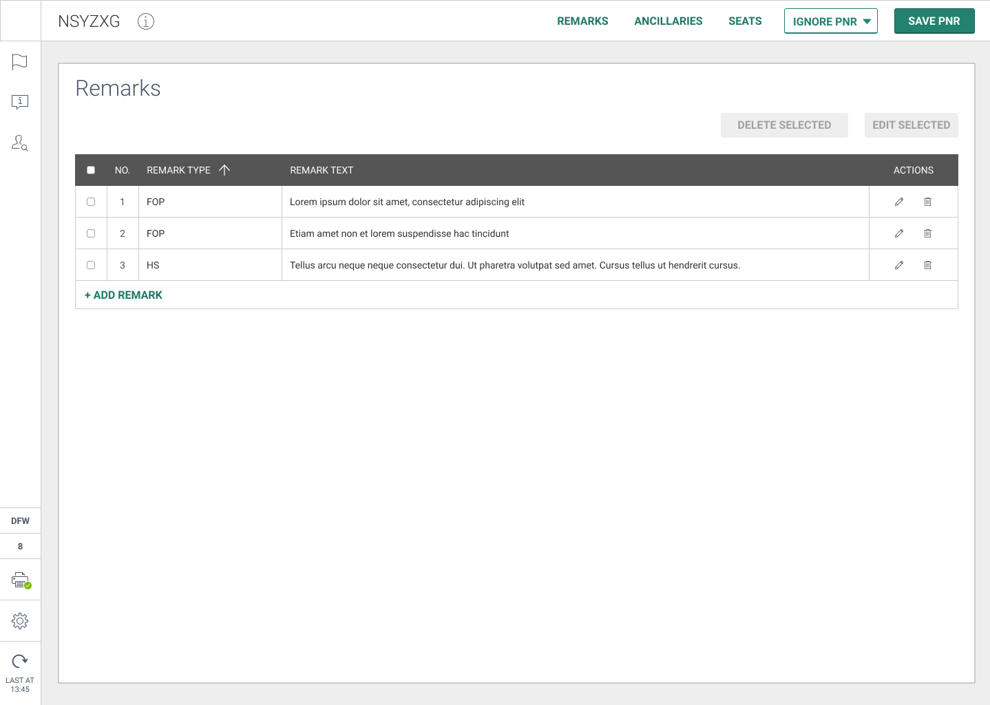
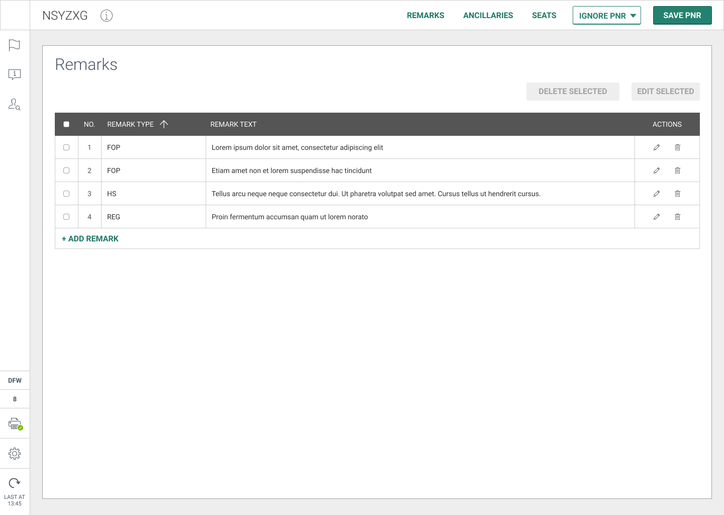
Passenger Remarks
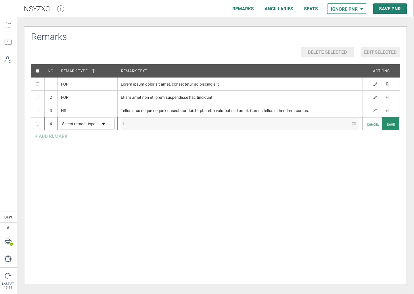
This feature is for DW AIR to have the ability to retrieve PNR outside the check-in window. It would create a much faster workflow for gate agents to add their remarks about a passenger (payment forms, itineraries, special needs, etc). The program also has to be responsive to allow for tablet usage away from the gate agent’s computer station.
![]()
![]()
![]()
![]() PNR screens (carousel)
PNR screens (carousel)

Adding/Removing Crew Bags
This feature is for DW AIR to have the ability for an airport agent to add or remove a crew bag from a plane’s cargo hold. For example, if there is no space in the main cabin storage for a crew member’s bag. The current version of the software was terribly outdated and the product team needed a more reliable method of completing this task. Our timing/scope was short and limited for this project so I worked with the product team extensively on several variations.

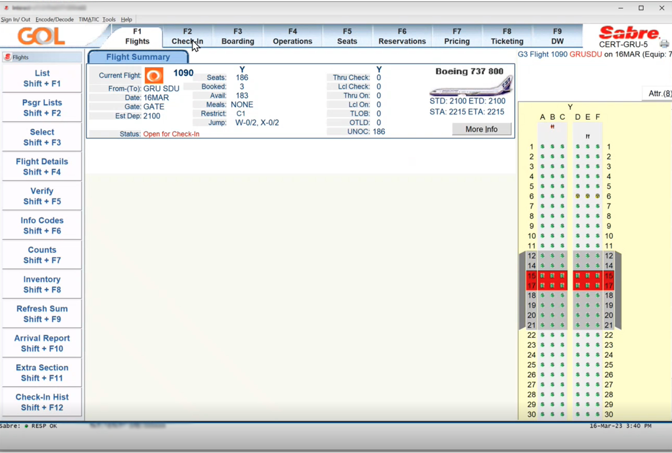
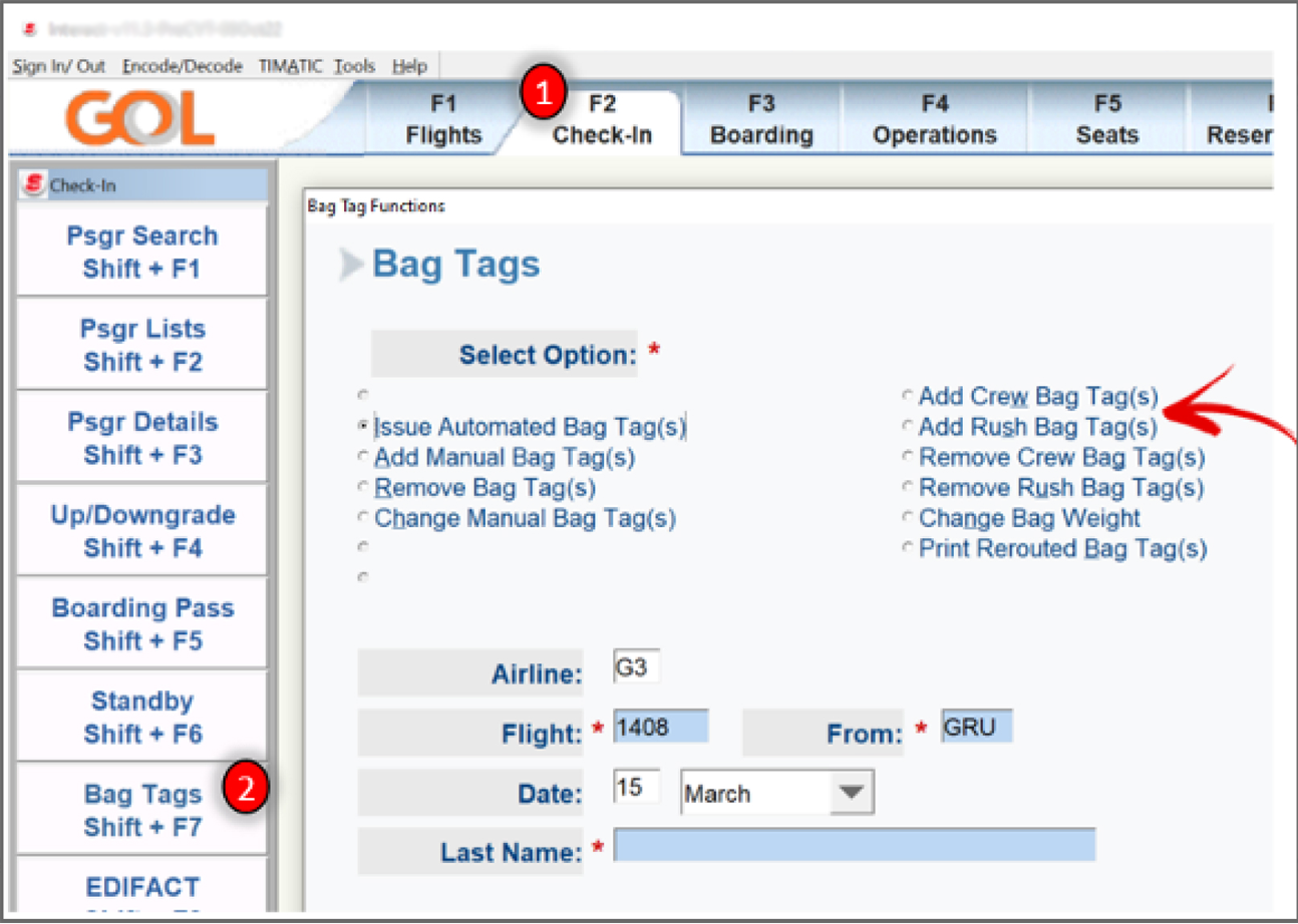
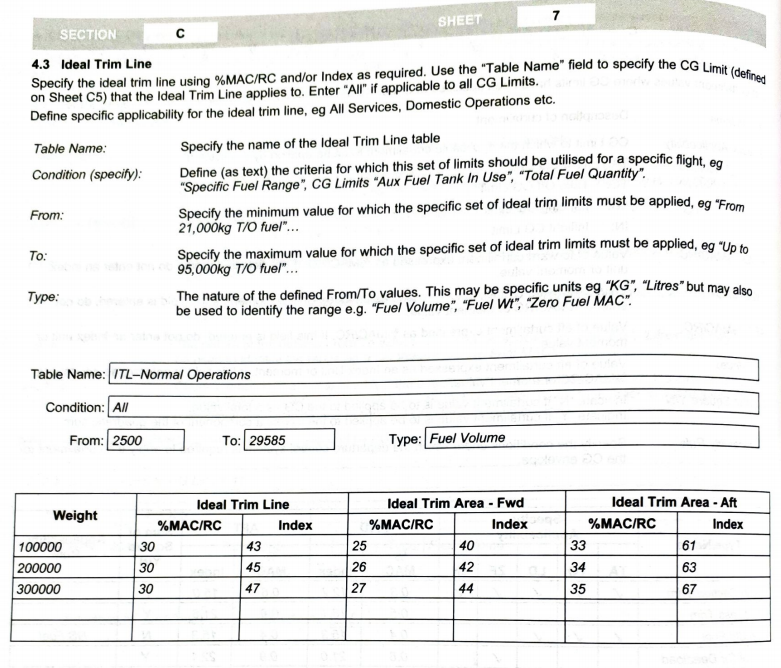
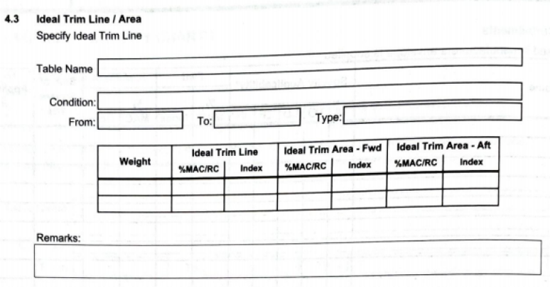
Current Add Crew Bag screens (carousel)
As you can see, the current version had an outdated UI and needed to be incorporated with our classic Spark Design language. The screen had a bad workflow for selecting a primary task and gave the user extra inputs that were not necessary for amount of bags and weight. Connections were given low priority on the screen as well.
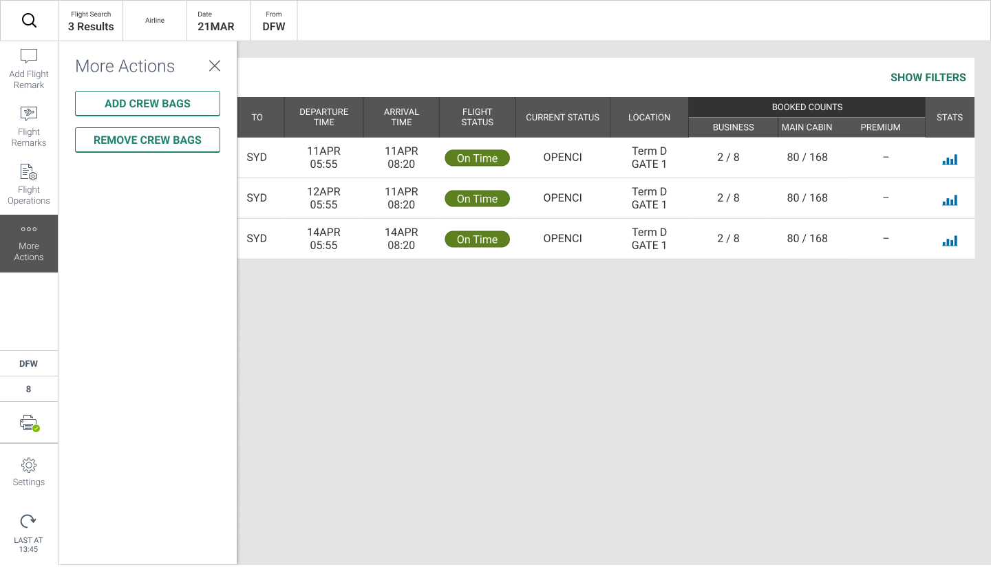
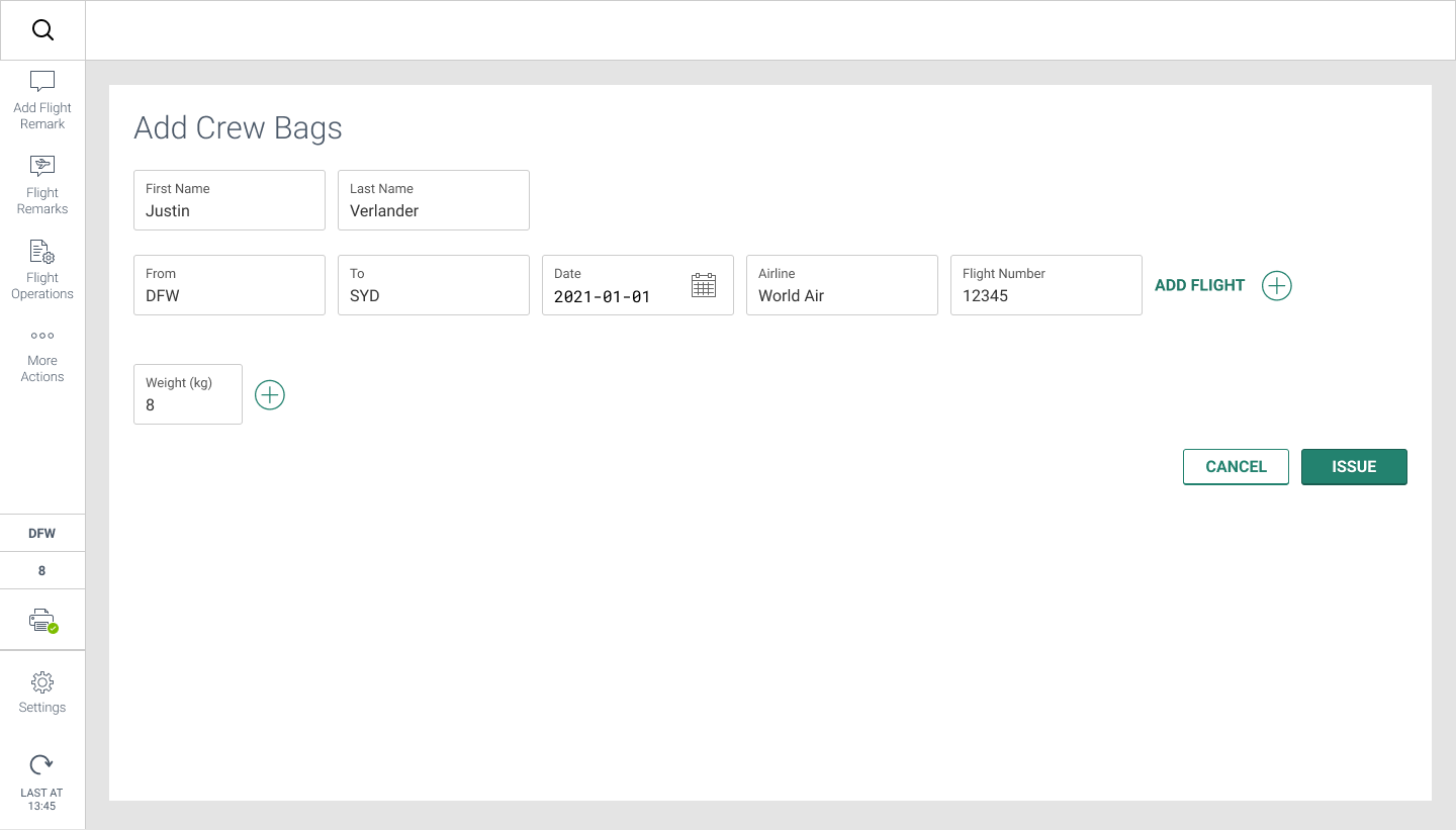

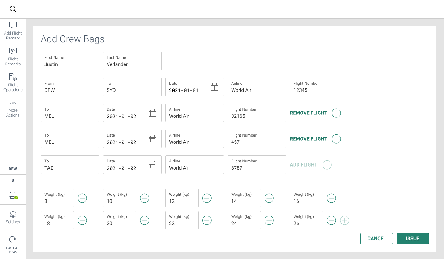
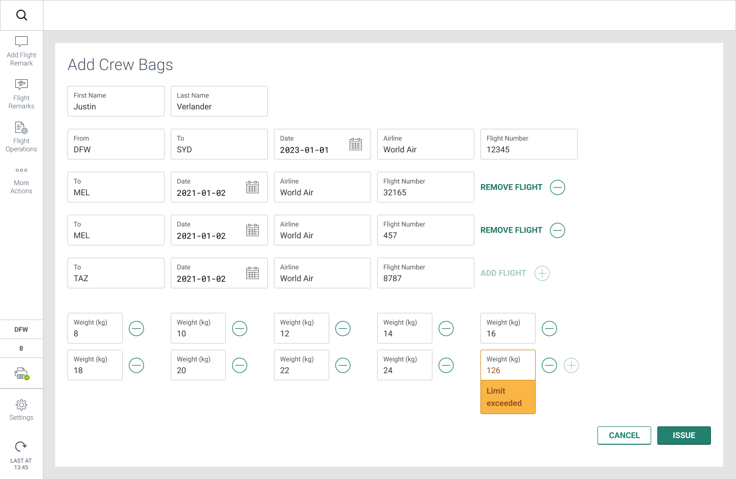
Updated Add Crew Bag screens (carousel)
The new screens have a much more easily visible UI and better workflow to complete the tasks. With a bit more research, we learned that the user wanted a tiny shortcut on the completion modal if more than one crew member needed to check a bag.
