With all due respect to the hard working people at Aquent | Vitamin T, the native app for their job search is terribly outdated and quite frustrating. As someone who went through the process of looking for full-time/contract employment during the COVID-19 Pandemic, I wondered if I could quickly research and mock-up a better engaging app.
During my initial research/breakdown of the app, I found four major usability issues with the login page, the onboarding flow, check in process and searching for jobs. Let’s take a look.
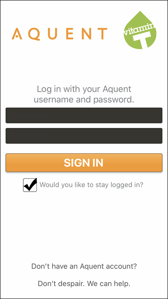
Login page - Minor Usability Problem
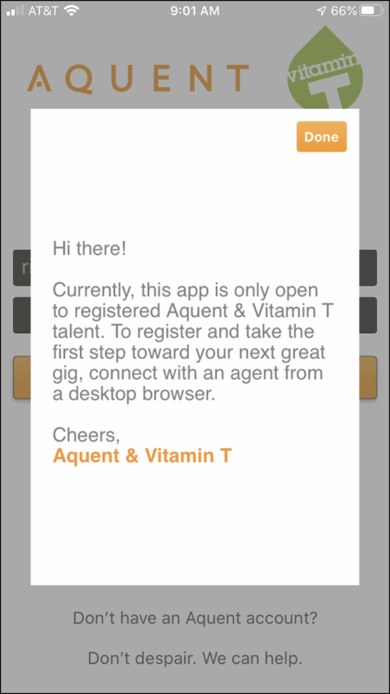
Onboarding Flow page - Minor Usability Problem
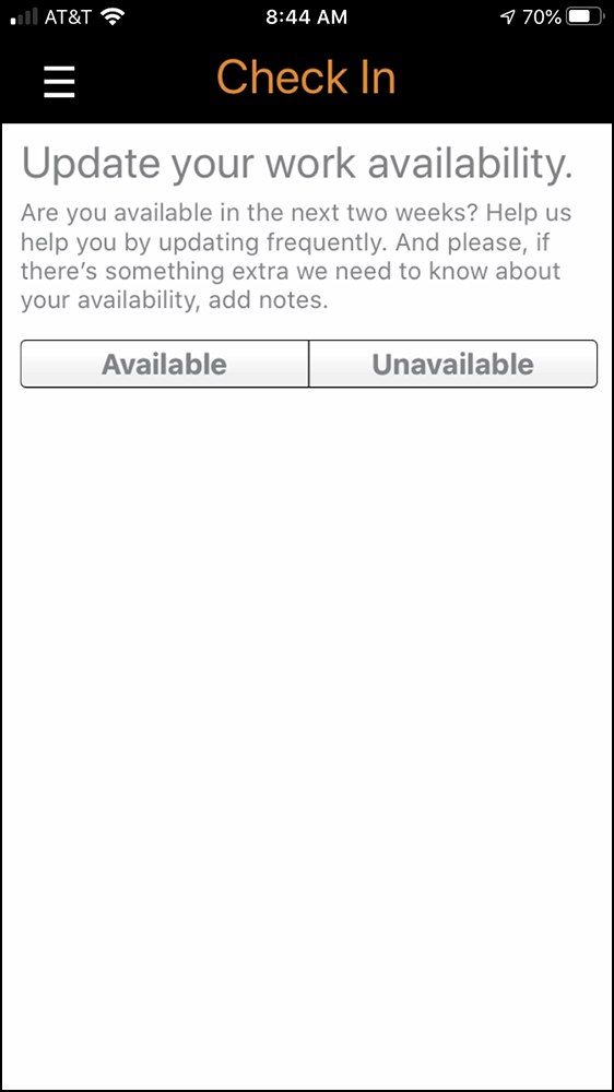
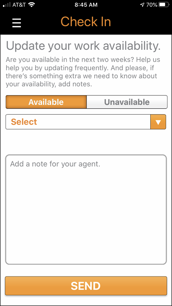
Check In process page - Major usability problem
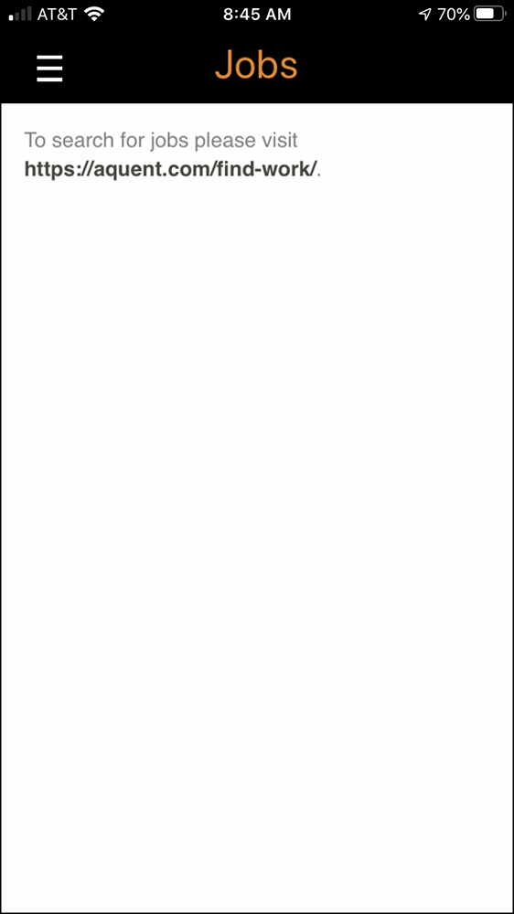
Job Search page - Usability catastrophe
There were a few more UX and technical issues in the app, but these four items have the highest priority to be corrected.
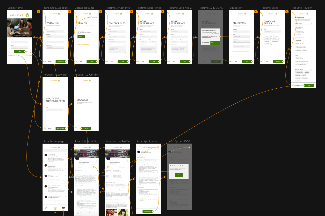
Armed with all this information, I took it upon myself to construct a more robust and easier to use app. I gave myself a few days to produce a workflow, sketch up a few pages, and dive right in to HIGH DEF wireframes. The latter was much more challenging than I imagned and probably wouldn’t recommend to most anyone.
Overall, I believe it’s a vast improvement on the current app and I’m making continuous updates. The prototype can be found here.
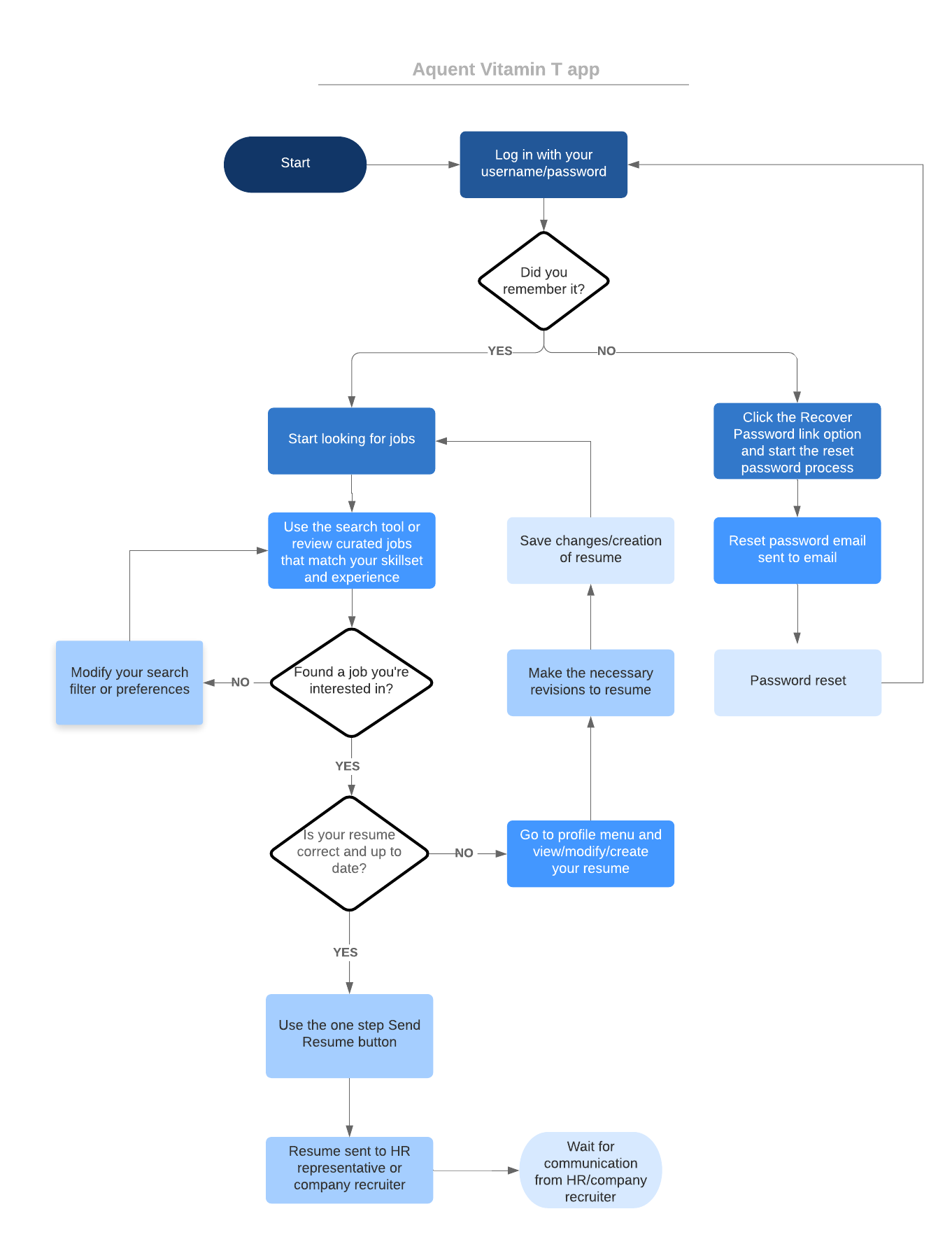
Workflows
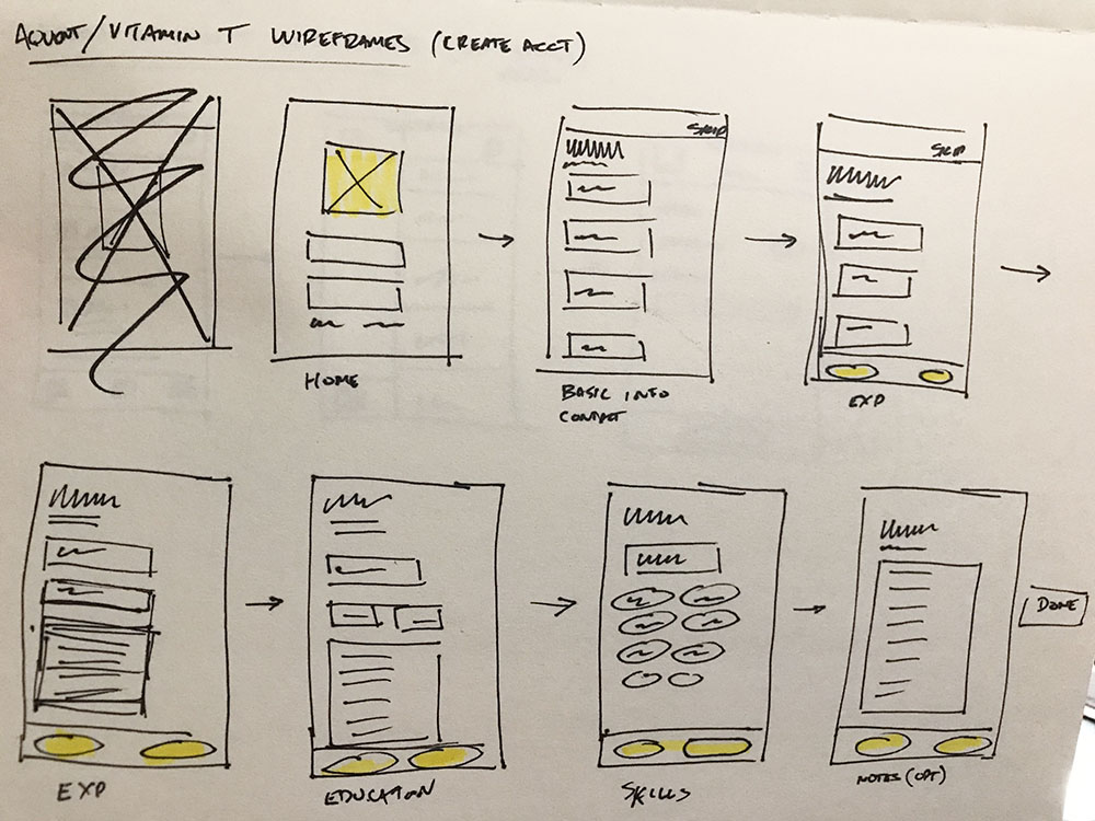
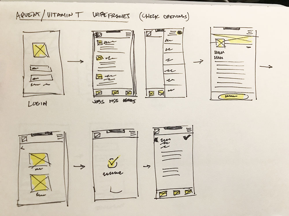
Sketches
Hi-def wireframes
Prototyping